Eight residential kitchens enhanced by banquette seating
Zwaag house

Traditionally reserved for cafes and restaurants, banquette seating can dramatically transform home kitchens. Our latest lookbook collects eight examples, from Australia to the Netherlands.

Named after the French word for a bench, a banquette is built-in upholstered seating that can be straight or curved and is typically placed against a wall.

A staple of hospitality spaces, the banquette can be traced back to medieval European taverns and dining halls, where the seating was used to improve space and circulation within public meeting houses.

Since around the late 19th century, banquettes have been a recognisable interior fixture of classic Parisian bistros, where they are often clad in leather or velvet and create intimate booths.

In recent decades, architects and designers have incorporated the seating into residential renovation projects to negotiate tricky floor plans, save space or simply add visual interest to home kitchens and dining rooms.

This is the latest in our lookbooks series, which provides visual inspiration from Dezeen’s archive. For more inspiration, see previous lookbooks featuring statement pivot doors, light-filled London basements and dining rooms with cantilevered chairs.


Kitchen with perforated breeze black walls and a timber ceiling
Top: photo by Daniëlle Siobhán. Above: photo by Tom Ross

Sunday, Australia, by Architecture Architecture

Local studio Architecture Architecture extended this Melbourne home with hollow breeze-block walls and clerestory glazing that allow sunlight and air to pass through its interior spaces easily.

The home’s kitchen island doubles as a banquette with a cantilevered seat, saving space and enhancing the dining area’s open plan.

Upholstered in a muted textile, the built-in seating was paired with a slender timber table and boxy wooden dining chairs.

Find out more about Sunday ›


Kitchen interior of Pacific House designed by Alexander & Co
Photo by Anson Smart

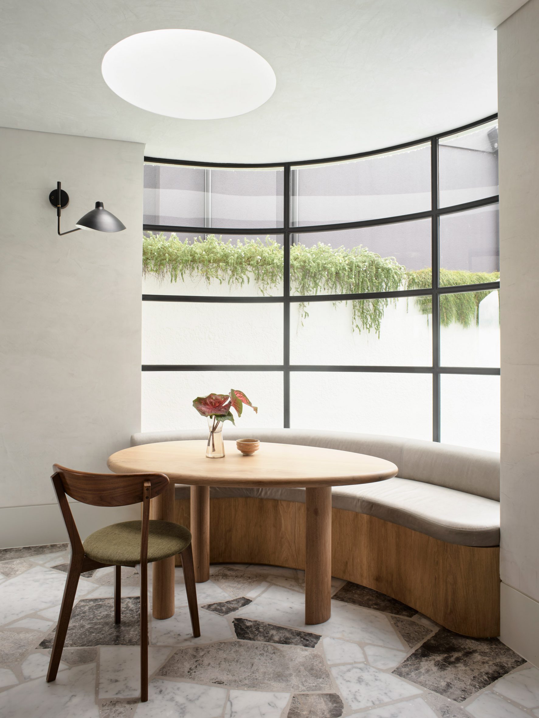
Pacific House, Australia, by Alexander & Co

Pacific House is a Sydney oceanside home by Australian architecture office Alexander & Co, which was overhauled to make it more suitable for family life.

The studio added a cosy breakfast nook to the kitchen, anchored by a curved banquette positioned against a gridded concave window.

Clad in smooth timber and topped with powdery grey cushions, the seating nods to the neutral hues of the jagged-edged marble flooring.

Find out more about Pacific House ›


Wood-lined dining room with a built-in seating nook
Photo by Daniëlle Siobhán

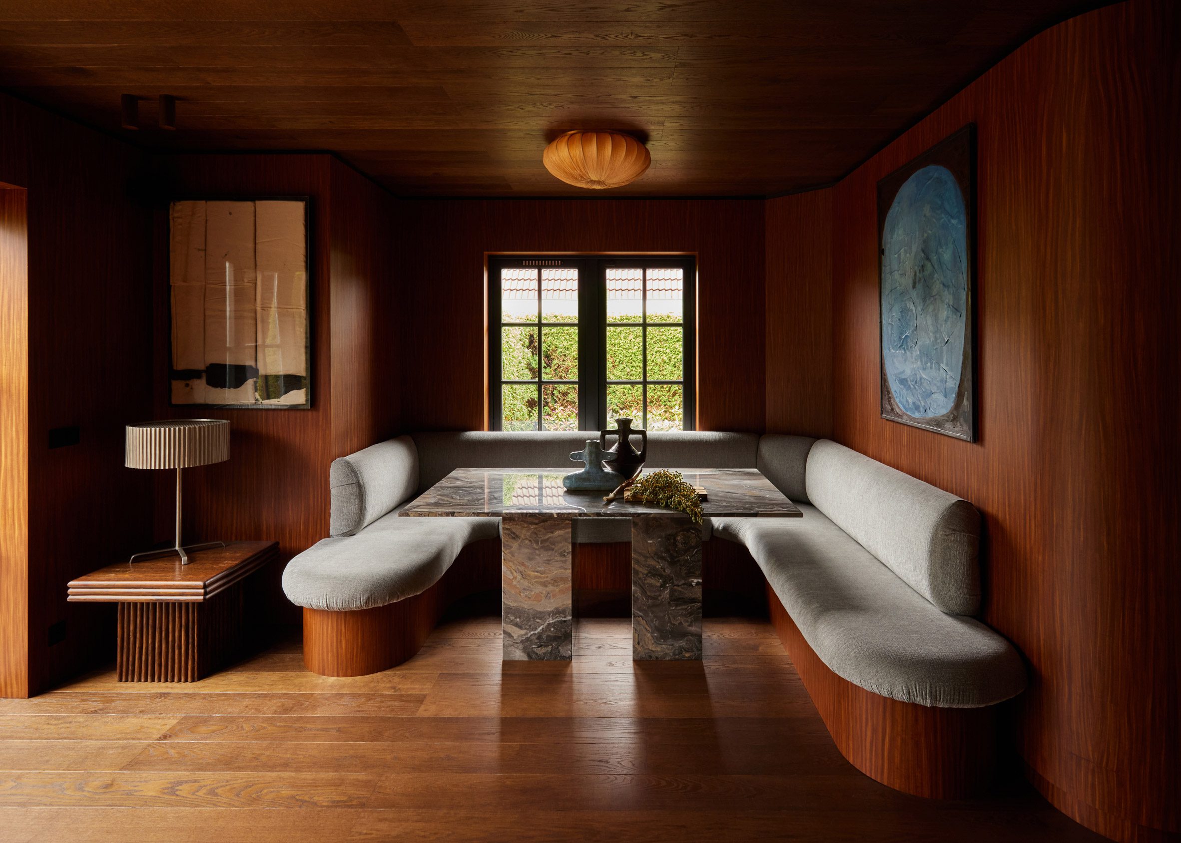
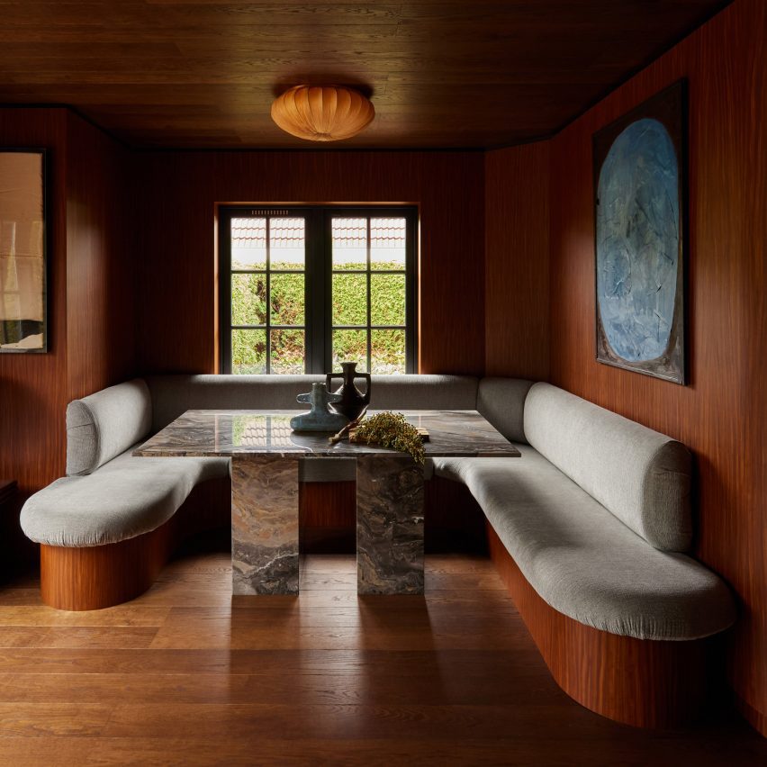
Zwaag house, the Netherlands, by DAB Studio

Dutch interior design practice DAB Studio transformed the kitchen of this home in Zwaag, the Netherlands, with floor-to-ceiling oak and Afromosia wood.

Afromosia was also applied to the base of a large, rounded banquette, which forms built-in seating for the dining space and contrasts with a bespoke geometric Arebaescato Orobico marble table.

Find out more about this Zwaag house ›


Dining table with built-in banquette in Nido House by Angelucci Architects
Photo by Dave Kulesza

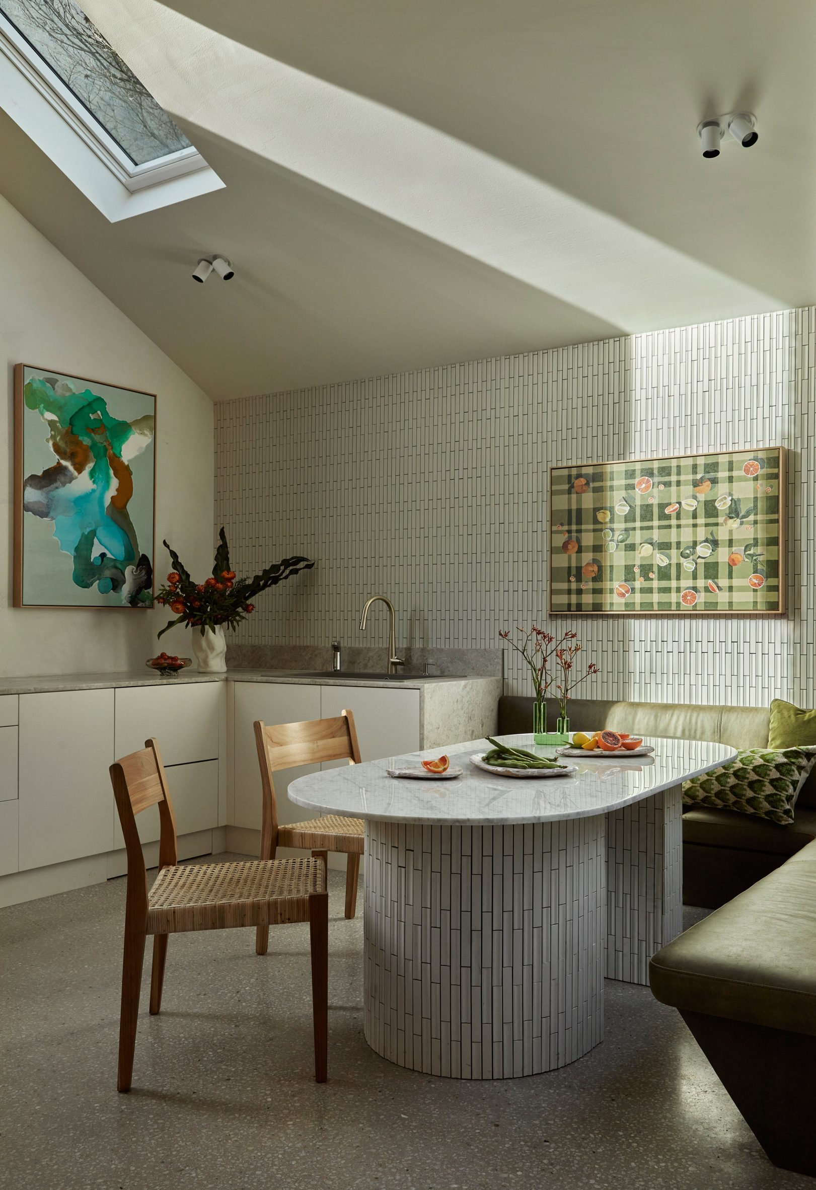
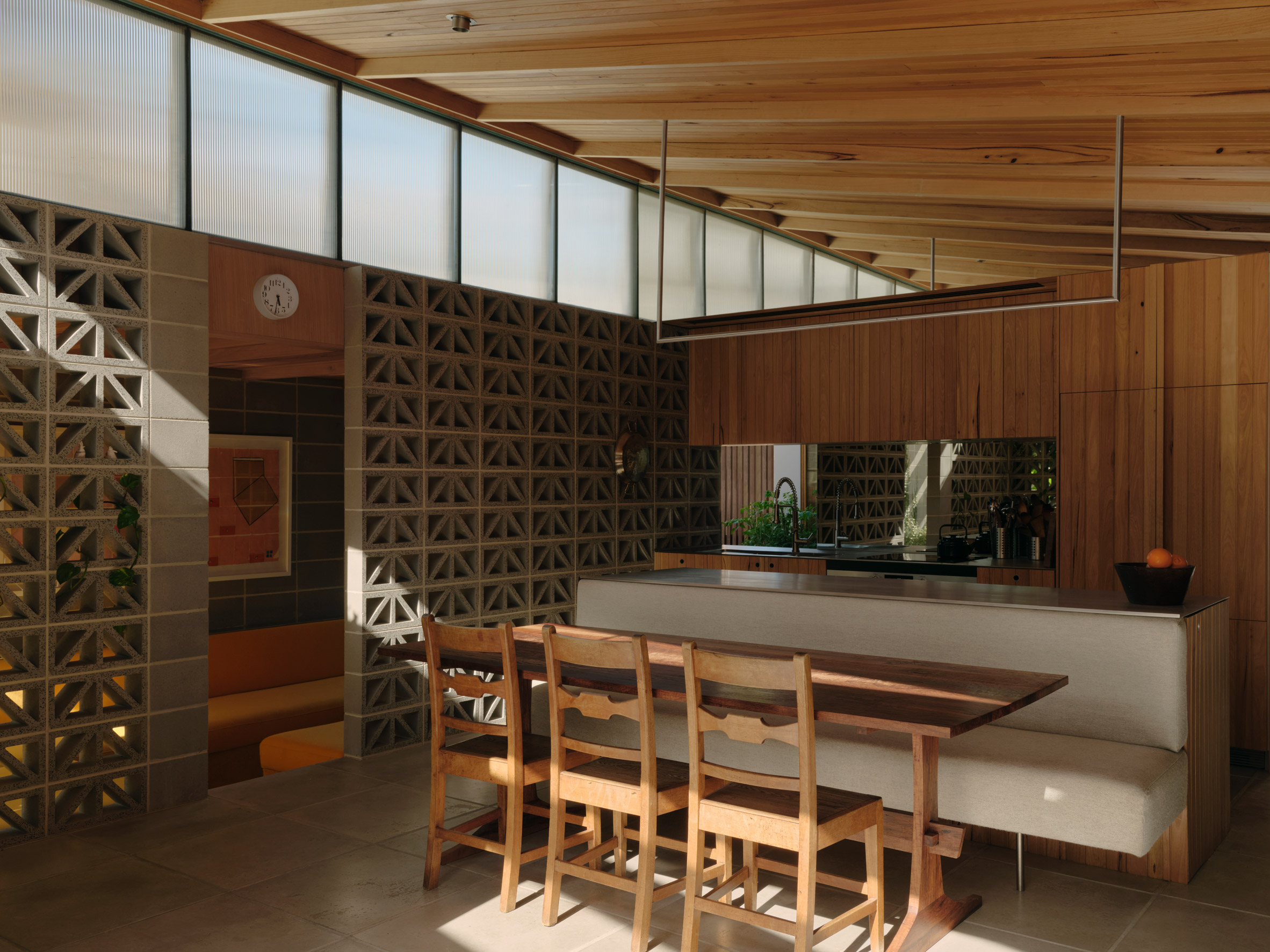
Nido House, Australia, by Angelucci Architects

Local studio Angelucci Architects added a decorative slate tile-clad extension to a Victorian terrace in Melbourne to create Nido House.

Green leather upholstery was selected for the kitchen’s jade-toned banquette, which hugs a distinctive dining table clad in ceramic tiles and topped with marble.

Angelucci Architects chose the L-shaped built-in seating to complement the home’s floor plan and provide maximum space for entertaining guests.

Find out more about Nido House ›


Interior of Australian home
Photo by Peter Bennetts

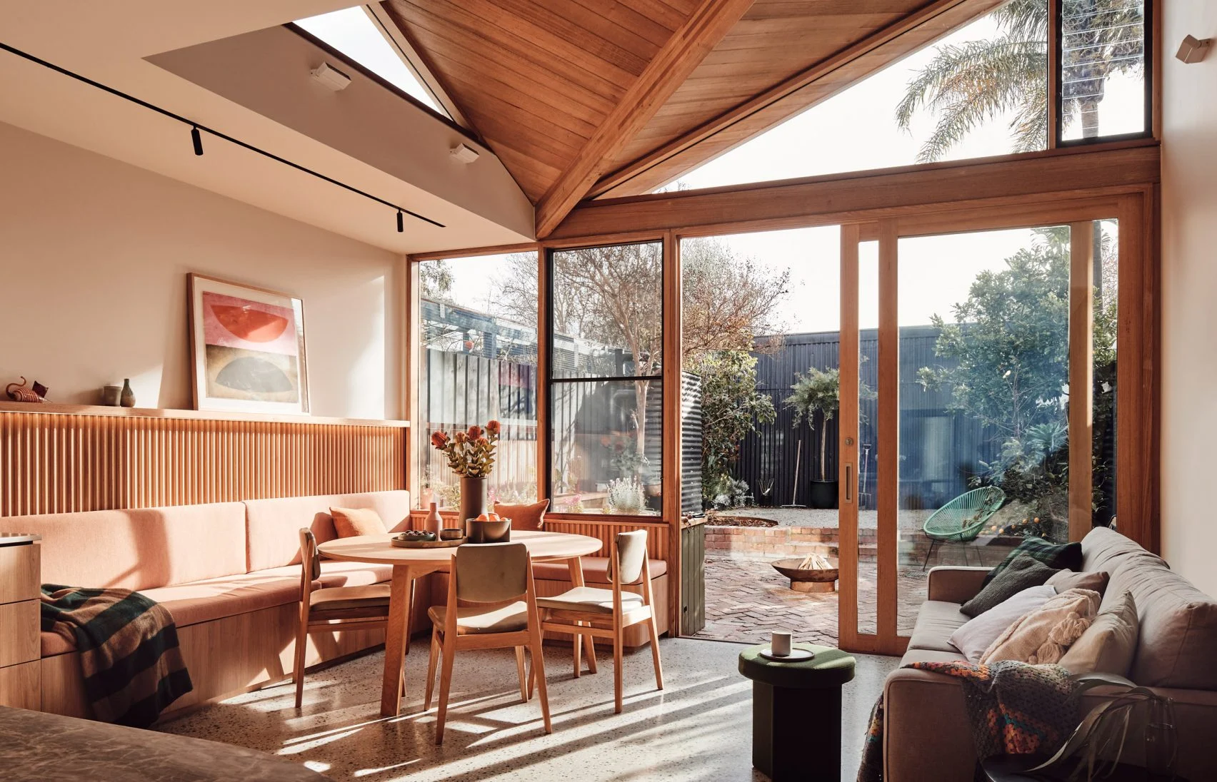
10 Fold House, Australia, by Timmins + Whyte

10 Fold House is a Melbourne home that Australian office Timmins + Whyte updated with an extension characterised by a chunky folded roof.

Inside, the light-filled open-plan kitchen features a timber corner banquette clad with peach-hued upholstery and paired with ribbed wooden cabinetry.

The built-in seating was chosen to enhance the “considered and crafted” feel of the house, which includes low-slung mid-century-style interior elements.

Find out more about 10 Fold House ›


Budge Over Dover house in Sydney designed by YSG
Photo by Prue Ruscoe

Budge Over Dover, Australia, by YSG

Budge Over Dover is a home in Sydney’s Dover Heights suburb, renovated by local studio YSG with terracotta brick, aged brass and aubergine-hued plaster.

The studio sought to fit seating into the kitchen’s unusual floor plan, which incorporates a curved wall, by adding a bespoke banquette to the corner of the room.

Upholstered with brown and wine-coloured cushioning, the seating creates a snug breakfast nook illuminated by an oversized white lantern.

Find out more about Budge Over Dover ›


Mews house in Knightsbridge
Photo by Taran Wilkhu

London house, UK, by Echlin

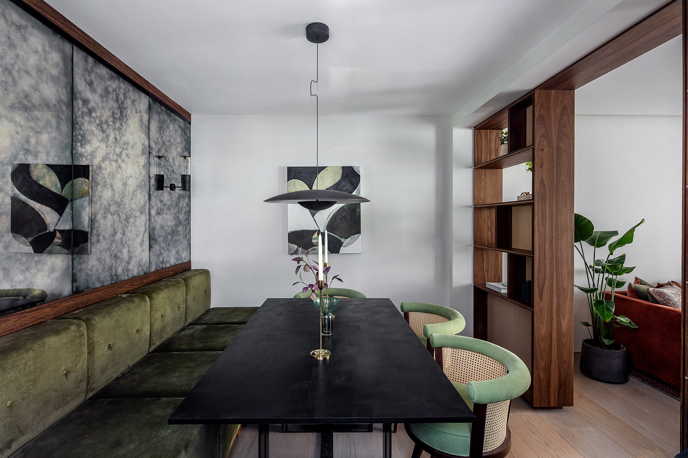
Local design and development firm Echlin remodelled this mews house in London’s Knightsbridge neighbourhood to include a basement floor with a walk-on skylight and a green wall stretching almost six metres in height.

The dining space is tucked behind floor-to-ceiling timber shelving and features a plush green banquette paired with rounded rattan-accented chairs and a contrasting coal-coloured table.

Find out more about this London house ›


Valetta House by Office S&M
Photo by French & Tye

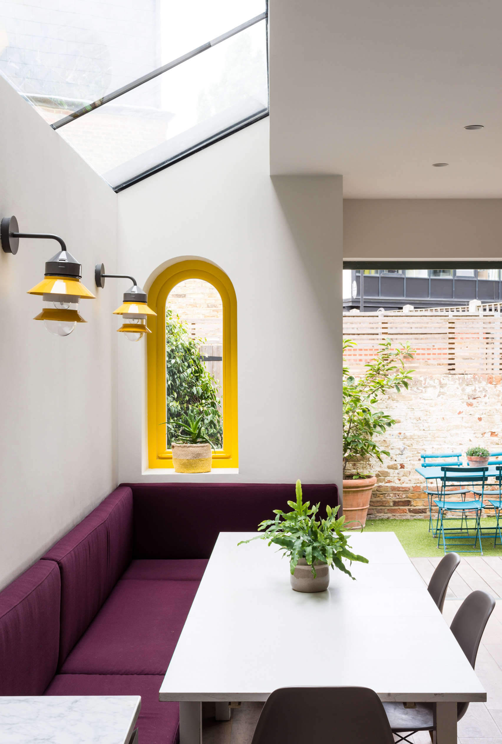
Valetta House, UK, by Office S&M

Also in London, Valetta House is an Ealing family home that was revamped by local Office S&M to include a loft extension covered in scale-like wooden shingles.

The house was transformed with architectural elements designed to appeal to the clients’ three young daughters, such as a multicoloured bannister and arched windows.

In the kitchen, a vibrant purple fabric-clad banquette adds a pop of colour to the white-hued room, which also includes plywood finger pulls on the cabinets to enhance the space’s varied texture.

Find out more about Valetta House ›

This is the latest in our lookbooks series, which provides visual inspiration from Dezeen’s archive. For more inspiration, see previous lookbooks featuring statement pivot doors, light-filled London basements and dining rooms with cantilevered chairs.

The post Eight residential kitchens enhanced by banquette seating appeared first on Dezeen.

Eight homes with hardwearing and decorative terracotta floors
Living room with terracotta floor

For our latest lookbook, we’ve gathered eight homes with decorative and practical terracotta floors, from a living room in a Menorcan barn to a Los Angeles home informed by ryokans.

Terracotta-brick floors can give homes a warm, rustic feel and have the advantage of being hardwearing and low-maintenance.

Made from reddish-brown earthenware clay fired at a low temperature, terracotta was used to create sculptures as early as 3,000 BCE.

Today, the material has had a comeback in interior design and is used for both flooring and walls everywhere from kitchens to balconies.

This is the latest in our lookbooks series, which provides visual inspiration from Dezeen’s archive. For more inspiration, see previous lookbooks featuring cantilever chairs, wood-clad ceilings and statement pivot doors.


Photo by Carlos Naude

Hacienda Granada, USA, by Working Holiday Studio

Los Angeles-based Working Holiday Studio gave this midcentury home, which the founders designed for their own family, a Mexican hacienda-style makeover.

Carlos Naude and Whitney Brown “wanted [the interiors] to feel neutral, earthy and warm with a few pop accents”. In the kitchen, handmade terracotta tiles were placed in a decorative herringbone pattern.

Find out more about Hacienda Granada ›


Photo is by Justin Chung

Duane House, US, by OWIU

Japanese ryokans – traditional inns – informed the interior of this California home, which is located inside a house once owned by Swiss architect Pierre de Meuron.

The original brick floors were kept and complemented by Japanese design elements such as shoji screens and sculptural Akari lamps by designer Isamu Noguchi.

Find out more about Duane House ›


Menorca farmhouse conversion, Estancia San José, by Atelier du Pont and Aru Arquitectura
Photo is by Maria Missaglia

Estancia San José, Spain, by Atelier du Pont

An old Menorcan farmhouse was converted into a summer house for this project, with the traditional stone barn turned into a living room.

Here, Paris studio Atelier du Pont added more windows to create a light-filled space with a tactile terracotta floor. A colour palette of natural materials complements the flooring and nods to the building’s history.

Find out more about Estancia San José ›


Budge Over Dover house in Sydney designed by YSG
Photo is by Prue Ruscoe

Budge Over Dover, Australia, by YSG

A colour palette of rosy, pale pink, purple and green hues demarcates Budge Over Dover, a Sydney home in a coastal suburb by local studio YSG.

Terracotta bricks were combined with aubergine-coloured plaster and aged brass to create the interior of the house. The entire living space was elevated to sit on a platform made of handmade terracotta tiles, which were also used for the garden patio.

Find out more about Budge Over Dover ›


Elemental House by Archmongers
Photo is by French + Tye

Elemental House, UK, by Archmongers

The terracotta floor in this revamped London 1970s house connects the kitchen with the outside terrace, creating an indoor-outdoor feel that makes the house seem bigger.

Archmongers architect Johan Hybschmann chose terracotta alongside concrete, galvanised steel and softwood timber to make the home “incredibly sturdy”.

“We designed the house with the intention of not being afraid to use it,” he told Dezeen.

Find out more about Elemental House ›


Hygge Studio by Melina Romano
Photo by Denilson Machado of MCA Estúdio

Hygge Studio, Brazil, by Melina Romano

Brazilian designer Melina Romano filled this entire apartment in São Paulo with terracotta flooring, which she told Dezeen lends the space a “rustic charm”.

Even the bathroom has terracotta floors, as well as a sculptural terracotta sink. Their red hues are contrasted with a forest-green wall and plenty of plants.

Find out more about Hygge Studio ›


Dining area in Farley Farmhouse by Emil Eve Architects
Photo is by Mariell Lind Hansen

Farley Farmhouse, UK, by Emil Eve Architects

Terracotta tiles feature inside and out at this Wiltshire farmhouse, which London-based studio Emil Eve Architects upgraded to create more space for dining and cooking.

The exterior is clad in terracotta arrowhead tiles, while the interior has terracotta-brick flooring. In the kitchen and dining room, the floor is complemented by matching clay pendant lights.

Find out more about Farley Farmhouse ›


Photo is by Prue Ruscoe

Checkmate, Australia, by YSG

The second interior design by Australian studio YSG on this list, Checkmate, is a seaside home in Byron Bay with retro spaces and furnishings that evoke the 1970s.

The “laid-back” house has terracotta pavers in the dining room, organised into the geometric grid that gave the project its name. Vintage Italian dining chairs and a colourful lounge chair add to the surfer-style atmosphere.

Find out more about Checkmate ›

This is the latest in our lookbooks series, which provides visual inspiration from Dezeen’s archive. For more inspiration, see previous lookbooks featuring cantilever chairs, wood-clad ceilings and statement pivot doors.

The post Eight homes with hardwearing and decorative terracotta floors appeared first on Dezeen.

Black Madre’s Handcarved Campaign for Corona Elevates Folklore in ‘Fishermen Storytellers’

Slick digital campaigns and AI-generated imagery dominate our screens these days, but Brazil-based visual arts studio Black Madre has carved — quite literally — a compelling case for the power of craft. Their latest work, a collaboration with Africa Creative for Corona’s “Fisherman Storytellers” campaign, proves that branding rooted in authenticity, tactility, and human touch still reigns supreme.

Unfolding through a stunning blend of hand-carved woodwork, stop-motion animation, and book design, the campaign captures a rarely seen intersection of branding, folklore, and social responsibility. It tells the story of Brazil’s coastal fishing communities, where seasonal fishing prohibitions leave families without income and where Corona is stepping in to offer an alternative: storytelling.

Rather than relying on tropes or digital spectacle, Africa Creative and Black Madre chose a narrative-driven path by translating the region’s rich oral traditions into physical storytelling experiences. At the heart of the campaign lies a series of wooden key visuals and a 60-second animation crafted entirely by hand. Each visual piece reimagines traditional fisherman’s tales: “The Cracked Island,” “The Smallest Fish,” and “The Fisherman of Fishermen”, through dimensional carved layers that evoke both wonder and weight.

The boat is the symbol that ties everything together. It’s the vehicle between the fisherman and the sea, and in this campaign, it also becomes the metaphor for bridging past and present.

André Maciel, creative director for Black Madre

From the swirling tentacles of an octopus to a giant hand reaching through the sea, every detail was sculpted from raw wood. The textures are sunworn and weather-beaten, a deliberate nod to Caiçara aesthetics and the coastal realities that frame these stories.

What elevates this campaign beyond beautiful visuals is the painstaking method behind it. Every object — fish, boats, hands, islands — was hand-carved using traditional gouges. Each layer was lit individually to create depth and dimension, then composited into richly cinematic scenes that feel at once intimate and epic.

The stop-motion animation for “The Cracked Island” is particularly compelling, turning a parable about greed and respect for nature into a gorgeously fluid narrative. It’s also a nod to Corona’s evolving brand ethos, which increasingly centers on environmental stewardship and local impact.

For a brand like Corona, which has long used idyllic beachscapes to sell serenity, this campaign marks a meaningful pivot that pairs aesthetic polish with purpose. Not simply showing a picturesque snapshot of a beach, it invites us to hear its stories, understand its people, and consider how our consumption affects real communities.

For Corona, it’s a chance to expand storytelling across touchpoints while grounding it in genuine cultural exchange.

As if the carved visuals weren’t enough, the campaign will soon launch a handmade pop-up book to further immerse audiences. Designed to resemble a boat and built using nautical materials such as sailcloth, fishing nets, and bamboo, the book transforms five traditional stories into three-dimensional experiences.

In a media landscape where digital scrolls have replaced page turns, the pop-up book is a tactile rebellion and a branding masterstroke. For Corona, it’s a chance to expand storytelling across touchpoints while grounding it in genuine cultural exchange.

From a branding and design perspective, the “Fisherman Storytellers” campaign is an exemplar of how creative direction, craft, and cultural insight can elevate a brand far beyond product placement. It’s a reminder that when visual identity stems from place, tradition, and material truth, it doesn’t need to shout to be heard.

Black Madre, known for its analog-first approach to visual storytelling, has once again shown why its work resonates across industries. Their ethos is simple: build beautiful things, by hand, that make people feel something.

In this case, what they’ve built is more than a campaign. It’s a bridge between worlds — digital and analog, myth and reality, community and consumer. And like all good stories, it sticks with you long after the last page (or frame) is turned.

The post Black Madre’s Handcarved Campaign for Corona Elevates Folklore in ‘Fishermen Storytellers’ appeared first on PRINT Magazine.

FIFA Unveils Host City Posters for the 2026 World Cup, Designed by Local Artists

Between the WNBA draft last week, the MLB season now in full swing, and my beloved Liverpool FC on the cusp of winning the English Premier League title across the pond, our sports fandom is being pulled in dozens of directions across a slew of sports around the world. Of course it’s easy to get caught up in what sporting events and narratives are unspooling right here and right now, but we’d be remiss to not look down the field at what’s to come— especially when the United States is set to co-host the men’s FIFA World Cup in the summer of 2026 with Mexico and Canada.

In an attempt to drum up some excitement for a tournament that’s over a year away, FIFA smartly turned to the power of eye-catching artwork. Last week, they released a collection of 16 posters, one from each of the host cities across the United States, Mexico, and Canada, in which World Cup games will be played. This marks the first time FIFA has created official city-specific posters for a World Cup, with the intention of the designs reflecting the unique cultural and artistic spirit of each host city, while showcasing a shared love of the beautiful game.

So what do I make of the designs? I’m not going to be coy or contrarian: these posters slap. Of course, I’m personally drawn to some more than others—Miami, Seattle, and Toronto rise to the top of my list, with Kansas City, Los Angeles, and Philadelphia bringing up the rear—but as a collection, they are incredibly strong. A different local artist designed each poster, save for the three representing the host cities in Mexico, which were all created by Mexican illustrator Cuemanche.

Let’s take a look, shall we?


Atlanta – Jose Hadathy


Boston – John Rego


Dallas – Matt Cliff


Guadalajara – Cuemanche


Houston – Stephanie Leal


Kansas City – Jadie Arnett


Los Angeles – Thieb Delaporte-Richard


Miami – Rubem Robierb


Mexico City – Cuemanche


Monterrey – Cuemanche


New York/New Jersey – Rich Tu


Philadelphia – Nick McClintock


San Francisco Bay Area – Leroid David


Seattle – Shogo Ota


Toronto – David Murray


Vancouver – Jamin Zuroski


Which of the 16 tops your list? I’m a total sucker for Miami aesthetics, pink-and-aqua color palettes, and literally anything with a flamingo on it, so Rubem Robierb’s Miami poster is pure catnip to me. David Murray’s design for Toronto stands out from the pack because of his distinct retro geometric style. I have to add that I would like to have seen more women designers represented in the collection, seeing as 14 of the 16 posters were created by men. FIFA is far from a moral authority on anything, though, so this comes as no surprise. Obviously, everyone checking out these designs will have their own opinions, too, and that’s entirely the point! With this in mind, I couldn’t help but reach out to my go-to sports design specialist, Todd Radom, for his gut check on the collection.


When asked what makes a successful World Cup host city poster, Radom said, “The host cities are so varied, so I’d say that capturing a piece of that city’s essence and conveying a sense of place would be really important.” A few of his favorites align with mine, including Miami and Toronto. “The Miami poster is fun and unmistakably Miami,” he said. “It has a strong and effective focal point and a beautiful palette.” He added, “I’m a huge fan of Dave Murray’s work—he created the Toronto poster, which harkens back to something that Cassandre might have done a century ago.”

Radom also called out a few more standouts: “I love the posters for all three Mexican host cities, rich and colorful and full of local symbolism. The San Francisco Bay Area version gives us Oakland and San Francisco and soccer, all delivered with impact. And I love Boston’s, which is just fun and silly, attributes that Boston hasn’t always been known for.” He mentioned Vancouver’s poster as the design that lacked the same level of panache as the others. “It’s a little flat,” he said. “A pop of northwest green or aqua or vivid blue might have helped things pop a little more.”

In summation, we’re all very proud of FIFA for doing something fun and cool in the design space, instead of their usual flair for doing something corrupt and anti-human rights.

See, FIFA, doesn’t that feel better?


Featured image credit: EPA Images via Free Malaysia Today.

The post FIFA Unveils Host City Posters for the 2026 World Cup, Designed by Local Artists appeared first on PRINT Magazine.

Forest Carbon’s Purposeful Rebrand Visualizes the Sounds of Eco-Integrity

Every Earth Day, many of us find ourselves slowing down — even just a little — to take stock of the world around us. Maybe it’s while tending to a windowsill herb garden, out on a morning walk in the park, or in those small, hopeful conversations that seem to surface more easily this time of year. There’s a collective awareness in the air, a reminder that this planet is something we all share responsibility for and shouldn’t take for granted.

Within the design community, there’s increasing discussion about our role in that shared responsibility. What does it truly mean to create work that contributes to environmental healing, not just visually, but meaningfully?

Take something as simple as choosing to support a company that gives back to the planet. Some of us have started doing that by buying furniture from businesses that plant trees with every order, or choosing brands that utilize plastic-free, biodegradable packaging. They’re not revolutionary acts, but these small moments add up. They’re moments of intention. And that kind of thoughtful alignment is exactly what makes the Forest Carbon rebrand by Design Bridge and Partners feel so resonant right now.

Forest Carbon isn’t your typical carbon offset operation. They restore degraded wetland forests across Southeast Asia, which house some of the most carbon-rich and biologically diverse ecosystems on Earth. But in a society where carbon credit schemes often face scrutiny for being performative or opaque, Forest Carbon is doing something rare: they’re backing their impact with science, transparency, and now, a beautifully resonant brand.

Design Bridge and Partners approached the rebrand with an idea both poetic and precise: “In Tune with Nature.” That’s not just a metaphor — it’s literal. Forest Carbon uses bioacoustics to monitor forest restoration. This means recordings of returning birds, frogs, and even the calls of endangered species like the Sumatran tiger. Those soundscapes are translated into Chladni patterns, which are visual representations of sound waves, and become the core of the visual identity.

The identity doesn’t just look like nature, it is nature, rendered in waveform.

It’s one of the most refreshing uses of generative design and sonic branding I’ve seen in a while, not just because it’s gorgeous, but because it’s grounded in purpose. The identity becomes a living portrait of environmental recovery. It doesn’t just look like nature, it is nature, rendered in waveform.

What I find especially meaningful is the brand’s rejection of commodification. Rather than relying on the tired tropes of greenwashing, Forest Carbon leans into credibility. Design Bridge and Partners layered in a visual language inspired by scientific journals, evoking trust, data, and grounded fieldwork. The result is elegant, quiet, and confident, like the work itself.

“We wanted to focus on the core value of nature,” said Forest Carbon co-founders Jeffrey Chatellier and Devan Wardwell, “not just the commodification often seen in carbon and environmental markets.” That sentiment feels especially poignant on Earth Day, when sincerity can sometimes get lost behind marketing campaigns and hashtags.

Jonathan Brodie, creative director at Design Bridge and Partners, summed up the process beautifully: “Their willingness to break from convention and challenge expectations was liberating.” That kind of freedom, paired with integrity, is what allows truly impactful work to emerge.

As designers, we know how much branding can shape perception. But it’s when design starts shaping behavior — urging people to listen more carefully to the planet and trust the people working to protect it — that the real magic happens.

This Earth Day, I’m celebrating work that not only honors the natural world but collaborates with it. And I’m reminded again that when we give nature a voice, through sound, image, and story, people will listen. I encourage you to take a moment today to reflect on the brands you support and consider making one intentional choice for the planet moving forward. Even the smallest action can create meaningful impact.

The post Forest Carbon’s Purposeful Rebrand Visualizes the Sounds of Eco-Integrity appeared first on PRINT Magazine.

Ten dining rooms where cantilever chairs sit pretty around the table
Babendiekstraße 23 by NOTO

The cantilever chair is an icon of 20th-century modernist design. This lookbook compiles ten elegant dining spaces with different versions of the classic chair.

Cantilever chairs deviate from traditional four-legged seats as they are supported by a continuous frame that stretches from the front of the seat downwards, forming the front two legs, the base and the backrest in one.

While the original inventor is contentious, eminent designers – including Marcel Breuer, Mart Stam, Ludwig Mies van der Rohe and Alvar Aalto – all contributed to its popularity by developing their own variations from the 1920s onwards.

Classic examples are comprised of a metal frame and fabric, leather or cane seats; however, designers Verner Panton, Jasper Morrison and Alexander Begge have all created monobloc iterations from plastic and fibreglass.

Metal, fibreglass and plastic are suitable materials for cantilever chair frames as they have high tensile strength, allowing them to support the sitter’s weight despite having fewer points of contact with the floor.

This is the latest in our lookbooks series, which provides visual inspiration from Dezeen’s archive. For more inspiration, see previous lookbooks featuring unfitted kitchens, living areas with rammed-earth walls and art deco-informed interiors.


Babendiekstraße 23 by NOTO
Photo by Hannes Heitmüller

Babendiekstraße 23, Germany, by NOTO

The dining area in this Hamburg home by architecture studio NOTO sits on a tiled platform within the residence’s split-level living space.

Four black-and-cane cantilever chairs are arranged around the dining table, which has matching metallic legs.

Find out more about Babendiekstraße 23 ›


Extension with kitchen and dining spaces within it
Photo by Lorenzo Zandri

ZigZag House, UK, by Dan Marks

Pale blue and white plastic cantilever Panton Chairs stand out against the stone and wood surfaces in this kitchen diner by Dan Marks, founder of Mata Architects.

Contrast also exists between the chairs’ sweeping, continuous forms and the straight, linear shapes of the kitchen units, island and dining table.

Find out more about ZigZag House ›


Dining space separated from kitchen by a gold-leaf wall

Barcelona apartment, Spain, by Raúl Sánchez

Metallic elements in this Barcelona apartment include the reflective metal frames of its cantilever dining chairs and the gold-leaf-clad wall that separates the dining area from the kitchen.

These sheeny details are counteracted by the chairs’ cane-and-wood seats and backrests, as well as the paper lampshade suspended above.

Find out more about Barcelona apartment ›


Well by Memo Architectuur in Mortsel, Belgium
Photo by Evenbeeld

Mortsel house, Belgium, by Memo Architectuur

Six leather-and-metal cantilever chairs are tucked in nearly around the dining table in the verdant extension of this Belgian house by local studio Memo Architectuur.

The seats, backrests and armrests are made from a dark, petrol green leather, tying them into the green-toned polished concrete floor, the cluster of houseplants and the garden beyond.

Find out more about Mortsel house ›


Dining area with stone table surrounded by cantilever chairs
Photo by Genevieve Lutkin

St Pauls Road townhouse, UK, by Tabitha Isobel

Huddled around the stone table in the lofty dining room of this Victorian townhouse are six matching cantilever chairs.

These chairs have sweeping, curvilinear bases and lipped backrests, which contribute to the home’s subtly futuristic aesthetic.

Find out more about St Pauls Road townhouse ›


Dining space with bookcase and cantilever chairs around small circular table
Photo by Jan Voigt

Kier, Germany, by Demo Working Group

A trio of purple-upholstered, armless cantilever chairs is arranged around a three-legged, circular dining table in this 1970s high-rise Cologne apartment.

Their all-in-one metal frames match the apartment’s metal-dominated design scheme, while the purple fabric provides a pop of colour.

Find out more about Kier ›


Dining space with mismatched chairs and house plants
Photo by Yevhenii Avramenko

BH apartment, Ukraine, by Modektura

The informal, mismatched dining setup in this Kyiv flat includes two cantilever chairs – one with armrests and leather accents, and another with cane detailing.

The dining area sits between the kitchen and the glazed balcony-turned-conservatory, which is filled with plants.

Find out more about BH apartment ›


Interior of a white Barcelona apartment with square columns and glass doors leading to a patio
Photo by Adrià Goula

House 1616, Spain, by H Arquitectes

Curvaceous fibreglass cantilever chairs with characterful cut-outs are among the seating options in this Spanish residence’s living areas.

The white chairs form part of an eclectic interior design scheme that also features ornate lighting, artwork and ornamental objects.

Find out more about House 1616 ›


Powerscroft Road by Daytrip
Photo by Jake Curtis and Elliot Sheppard

Powerscroft Road townhouse, UK, by Daytrip

Positioned around a round marble table in this London townhouse basement are four black, cane and metal cantilever chairs.

Local studio Daytrip used an earthy, neutral colour palette for the residence’s interior, which was echoed in the appearance of the dining chairs.

Find out more about Powerscroft Road townhouse ›


Annex by Studio Bower
Photo by Jennifer Hughes Photography

Solit-Garreau Residence, USA, by Studio Bower

In a departure from typical silver-coloured cantilever frames, the duo of seats in this Washington DC home have a white finish.

The chairs also sport arms that extend out horizontally and are capped by wooden details, in reference to the kitchen worktop and the garden outside.

Find out more about Solit-Garreau Residence ›

This is the latest in our lookbooks series, which provides visual inspiration from Dezeen’s archive. For more inspiration, see previous lookbooks featuring unfitted kitchens, living areas with rammed-earth walls and art deco-informed interiors.

The post Ten dining rooms where cantilever chairs sit pretty around the table appeared first on Dezeen.

Eight living room interiors warmed by wood-clad ceilings
Palissade by Naturehumaine

Ceilings clad with timber, larch and oak feature in our latest lookbook, which rounds up eight homes where wooden ceilings add a sense of warmth.

While often used for flooring within the home, wood can also be used for ceilings, adding texture and warm hues to create inviting and cosy living spaces.

Among the eight interiors featured below is a lakeside home in Québec cloaked in cedar planks and a converted rectory in New York adorned by reeded oak panelling.

This is the latest in our lookbooks series, which provides visual inspiration from Dezeen’s archive. For more inspiration, see previous lookbooks featuring homes with pivot doors, dining areas with mismatched chairs and soothing bedroom interiors.


House in Serra by Cimbre
Photo by Francisco Nogueira

House in Serra, Portugal, by Cimbre

Architecture studio Cimbre designed this single-storey home in rural Portugal to evoke both a sense of “seclusion and openness” for its owners.

Contrasting with the home’s exposed concrete walls, the living room’s vaulted ceiling is wrapped in warm-toned birch wood that is offset by a statement black metal fireplace.

Find out more about House in Serra ›


Casa Quinto Sol
Photo by César Bejar

Casa Quinto Sol, Mexico, by Estudio Cristina Grappin

Coastal breezes are drawn through large openings that flank this stone house in Punta Mita, Mexico, which looks onto the Pacific Ocean.

Locally-sourced wood decorates the home’s spaces and is contrasted by cool-toned marble floors that extend across the interior and exterior spaces.

Find out more about Casa Quinto Sol ›


Palissade by Naturehumaine
Photo by Raphaël Thibodeau

Palissade, Canada, by Naturehumaine

A pyramidal roof draws light into this lakeside home in Québec, Canada, which was designed by architecture studio Naturehumaine with minimal front-facing openings.

Inside, the home is centred around an open-plan living space where cedar planks, chosen to create a “warm and cosy atmosphere”, cloak the ceilings and walls.

Find out more about Palissade ›


L-shaped sofa and armchair inside cabin
Photo by Tom Bird

Looking Glass Lodge, UK, by Michael Kendrick Architects

Timber was used to echo the forested surroundings of this holiday retreat in East Sussex, England, completed by British studio Michael Kendrick Architects.

Extending from the lodge’s exterior, timber was also used to clad the ceilings across the interior, where it’s complemented by birch plywood used for partition walls and cabinetry.

Find out more about Looking Glass Lodge ›


Harlem conversion by GRT Architects
Photo by Jason Schmidt

Harlem Rectory, US, by GRT Architects

Brooklyn-based GRT Architects renewed the historic Rectory of St Thomas in Harlem, New York, converting its derelict four-storey structure into a home.

Among the elaborately decorated spaces is a lofty living space, which features reeded oak panelling and is overlooked by an oak-wrapped mezzanine library.

Find out more about Rectory of St Thomas ›


Q8 Residence by Ménard Dworkind
Photo by David Dworkind

Q8 Residence, Canada, by Ménard Dworkind

Ceilings clad with larch wood shelter this partially-outdoor seating space within the Q8 Residence in Québec, Canada.

Completed by Montreal-based design studio Ménard Dworkind, the home is wrapped in a combination of cedar, larch and pine wood intended to immerse its residents in the tranquillity of its forested site.

Find out more about Q8 Residence ›


Photograph of a minimalist living room interior
Photo by David Zarzoso

Ático Curvo, Spain, by Destudio

Spanish architecture firm Destudio completed the Ático Curvo penthouse apartment in Valencia, encasing it with a large outdoor terrace overlooking the city.

The home was finished with a pared-back, minimalist interior, with the open-plan living areas topped with wood-clad ceilings.

Find out more about Ático Curvo ›


Yngsjö by Johan Sundberg Arkitektur
Photo by Markus Linderoth

Yngsjö, Sweden, by Johan Sundberg Arkitektur

Natural materials were used throughout the Yngsjö holiday home in southern Sweden, which Swedish studio Johan Sundberg Arkitektur designed to blend into its wooded site.

Externally, the single-storey home was clad in Siberian larch panels, while the interior is complete with oak floors, trimmings, doors and bespoke carpentry, as well as larch ceilings.

Find out more about Yngsjö ›

This is the latest in our lookbook series, which provides visual inspiration from Dezeen’s archive. For more inspiration, see previous lookbooks featuring homes with pivot doors, dining areas with mismatched chairs and soothing bedroom interiors.

The post Eight living room interiors warmed by wood-clad ceilings appeared first on Dezeen.

Super Okay Dreams up ‘The Great American Cannabis Company’ With THC Design Rebrand

Brand studio Super Okay has announced the completion of a comprehensive rebranding initiative for THC Design, a California-born cannabis company poised for national expansion.

Brands like THC Design prove that great design is more than just aesthetics; it’s how you earn trust, navigate complexity, and build bridges across a fractured landscape. THC Design is helping shape a new visual and narrative language for cannabis, one rooted in education, transparency, and respect for the plant’s history and future.

THC Design sought to reinvigorate its brand identity as it transitioned from a regional California player to a multi-state operator. The employee-owned company tasked Super Okay with developing a cohesive brand system to navigate diverse state regulations, educate consumers, and position them as a leader in the cannabis industry. “Our goal was to transform THC Design from a well-established California brand to a national icon,” said Rob Hubbert, Super Okay’s partner and managing director.

Using THCD’s hard-won trust and unique position in the market, we sought to define what “good” looks like for cannabis without any gimmicks.

Rob Hubbert, parter and managing director, Super Okay

Super Okay began the rebranding effort with a refinement of THC Design’s molecule logo, accompanied by the introduction of a bold red logo system and a distinctive color palette anchored in the brand’s signature purple. The team selected Dia Type Extended Bold for its approachable feel, giving the typography a confident voice when it visually shows up in the world. Purple frosted glass jars and mylar bags give the packaging system a cohesive, premium look. User-friendly jar tops and a universal box with an adaptive labeling system were introduced to accommodate varying state regulations. “We completely overhauled the brand identity using its core equities, turning it into a fully fledged brand system that boldly stands out on the shelf,” said Hubbert.

A bento box system communicates flavor profiles and terpene information, addressing both regulatory requirements and consumer education needs. Super Okay also incorporated motion design and animation to spur engagement and understanding. Human-centered lifestyle photography softens the brand’s scientific image and connects with a broad range of consumers by emphasizing the brand’s SoCal roots.

“We needed to create a brand that not only stood out on dispensary shelves but also resonated with consumers on a deeper level,” said Anthony Cappetta, partner and creative director at Super Okay.

The bento box system, in particular, allows for flexible storytelling and educational content, deepening the brand story and enriching the consumer experience. Ultimately, it leads to richer storytelling within the brand.

Anthony Cappetta, partner and creative director, Super Okay

“Working with Super Okay on our brand refresh was an essential process of self-discovery for THC Design. Through our sessions, we refined our visual identity and our core narrative—honoring our legacy while defining the next chapter of who we are as a company,” said THC Design CEO Marlon Coburn. “The rebrand wasn’t just about aesthetics; it was about capturing the essence of our evolution. Super Okay helped us translate our values, vision, and history into a look and feel that resonates with longtime fans and new consumers, ensuring that THC Design continues to grow with authenticity and purpose.”

The refreshed and updated packaging system has already significantly impacted THC Design’s expansion. Retailers are eager to stock the updated look, resulting in an increase in reorder rates. The refreshed look has also been crucial in supporting the brand’s initial expansion into Nevada, where it helped establish a strong launch presence, making its products stand out on shelves and driving growth. 

The overhauled brand identity solidifies THC Design’s position as a leading cannabis company built for the long term. By focusing on consistency and consumer education, THC Design is now poised to rightfully claim its spot as one of the major cannabis players on the market that’s built to last.

The post Super Okay Dreams up ‘The Great American Cannabis Company’ With THC Design Rebrand appeared first on PRINT Magazine.

The Folio Society Celebrates 78 Years of Visual Storytelling Through the Art of Book Illustration

This spring, bibliophiles and art lovers alike have reason to celebrate. The Folio Society, the London-based independent publisher revered for its exquisite hardcovers, will unveil its first major exhibition in the United States: “The Art of Folio.” Hosted at the Society of Illustrators on New York’s Upper East Side from April 16 through July 12, 2025, the show marks a landmark moment in the intersection of illustration, design, and publishing.

Across nearly eight decades, The Folio Society has elevated the experience of reading through a steadfast commitment to visual storytelling. Since 1947, their books have been as much about what you see as what you read; thoughtfully designed editions that celebrate the tactile, emotional, and imaginative power of book design.

Illustration by Taylor Dolan

The two-floor, immersive exhibition features 91 illustrators from around the globe, with over 100 artworks curated by genre to transport viewers from the magical realism of A Wizard of Earthsea to the haunting landscapes of The Underground Railroad — a vibrant living archive of illustration’s role in literature that showcases how artists, through medium and imagination, make a good story unforgettable.

Left: Lela Harris; Right: Anagh Banerjee

Design enthusiasts will be drawn to the ground floor’s dedicated installation for The Great Gatsby, commemorating the novel’s 100th anniversary. Featuring new illustrations by acclaimed artist Yuko Shimizu, this darkly sumptuous edition channels the decadent dissonance of Fitzgerald’s Jazz Age classic. Shimizu’s linework crackles with longing, disillusionment, and dangerous beauty—qualities that mirror the fragile glitter of Gatsby’s world. The display includes original artwork as well as a behind-the-scenes look at the craft behind every Folio book, offering a rare peek into the publisher’s meticulous design process.

Illustrations © Yuko Shimizu ​2025, from The Great Gatsby

“The Art of Folio” is a vibrant living archive of illustration’s role in literature that showcases how artists, through medium and imagination, make a good story unforgettable.

The lower floor dives deep into Folio’s storied past, presenting a timeline of artistic evolution through printed and original works from 1957 to 2024. Names like Quentin Blake and Beryl Cook are honored here, alongside contemporary voices who are reshaping what illustrated literature can look like in the 21st century. The exhibition also features documentary footage of illustrators discussing their collaborative work with Folio—underscoring how design, authorship, and interpretation intersect to form the holistic identity of a book.

Illustration by Neil Packer
Illustration by Sam Weber

Celebrating New Voices Through the Folio Book Illustration Award

In tandem with the exhibition, the Folio Society has opened submissions for its 2025 Folio Book Illustration Award—an international competition that invites new talent into this storied legacy. With a top prize of £2,500 and £500 in Folio vouchers, the award offers the winning illustrator a chance to be featured in a future Folio edition. Five runners-up will receive £500 vouchers each.

“The illustration is at the heart of everything we do at Folio,” says Rose. “We are passionate about discovering and fostering new talent, whether they paint in oils, carve wood engravings, or create digital masterpieces.”

The deadline for entries is Friday, May 23, 2025. You can find details and submission guidelines here.


Illustrations left to right: Nate Sweitzer, Evangeline Gallagher, Daniel Lievano.

In an industry often dominated by speed and scale, The Folio Society remains defiantly devoted to quality. As an employee-owned publisher, decisions are guided by passion rather than profit. Each book is a thoughtful synthesis of story, illustration, typography, and materials, designed to be read, held, and treasured.

More than a tribute to illustration, “The Art of Folio” offers a compelling look at the cultural and emotional value of the physical book. As publishing continues to evolve in a digital age, this exhibition acts as a love letter to publishing that underscores how design isn’t an afterthought; it’s essential to how we experience and interpret stories by deepening the reader’s emotional connection to a story.

This is not just an exhibition; it’s a testament to a publishing philosophy that values beauty, intention, and craft. For anyone who has paused over a perfectly illustrated page, it’s a reminder that design enhances not just the visuals but the emotional depth of a narrative.

Don’t miss the opportunity to experience this love letter to the art of book design and illustration.

“The Art of Folio” runs from April 16 through July 12, 2025, at the Society of Illustrators, Museum of Illustration in NYC.

And for emerging illustrators with a story to tell, now might be the time to put pen to paper and join the conversation.

Illustration by Clive Hicks-Jenkins

Imagery courtesy of The Folio Society. Header illustration by © Yuko Shimizu ​2025, from The Great Gatsby.

The post The Folio Society Celebrates 78 Years of Visual Storytelling Through the Art of Book Illustration appeared first on PRINT Magazine.

Windows, WordArt, & What’s Next: A 90s Kid Reflects on Microsoft’s 50-Year Brand Evolution

As a kid, I would spend hours in Microsoft Paint sketching what I thought were pixel-perfect purple dolphins and my own sticker designs. A few years later, I was introduced to Clippy and WordArt, and suddenly, Microsoft Word wasn’t just for book reports; it became a creative playground for binder designs and birthday invites. Being a 90s kid, Microsoft was my constant companion, threaded through early creativity, awkward adolescent presentations, and the thrill of getting your first Hotmail address — you know the one — that your 13-year-old mind thought was cool; discochick00@hotmail.com anyone? So when brand and digital studio Koto released Microsoft’s 50th Anniversary identity, I excitedly braced for nostalgia and got something much richer.

Rather than lean into sentimental retrospection, Koto’s work reframes Microsoft’s legacy through the lens of makers: those who shaped, built, and dreamed across five decades. The strategy, anchored in the phrase “Change needs makers,” doesn’t just look backward; it invites the next generation to join in the making. And in doing so, it reclaims Microsoft’s brand not just as a tech platform, but as a creative force rooted in empowerment.

The campaign is built on a dynamic, modular identity system that feels alive. Visual compositions move between three main structures: “Worlds,” “Iconic Moments,” and “Then & Now.” These are less design gimmicks and more storytelling tools. “Worlds” places people at the center of richly imagined environments, surrounded by products and ideas that shaped their creativity. “Iconic Moments” looks back on milestones, such as the launch of Xbox or the first versions of Windows, not as static achievements but as cultural shifts. And “Then & Now” plays with time, pairing historic innovations with today’s breakthroughs to show a brand that never stopped evolving.

This identity system is distinctly Microsoft in tone but unmistakably Koto in execution; expressive, intentional, and full of movement. Typography plays a big role in keeping it grounded: Segoe Sans Display, Microsoft’s familiar typeface, lends continuity and clarity while subtly signaling evolution. And the six heritage-inspired gradient backgrounds used across the campaign are pure energy — warm, modern, and unified without feeling uniform.

What makes this work resonate isn’t the polish. It’s the pulse.

But what makes this work resonate isn’t the polish. It’s the pulse. Koto smartly avoids the trap of building a retrospective shrine. Instead, the design lives in the present and points toward the future. From a reimagined 50th-anniversary logo that riffs on the original Windows mark to playful digital artifacts used in motion and 3D, every detail feels purposeful and people-centered. The campaign spans digital platforms, physical signage, internal comms, and real-world activations, proving that even the most tech-centric brands still live and die by how human they feel.

This campaign had to honor Microsoft’s legacy without feeling nostalgic for nostalgia’s sake.

Cassidy Moriarty, strategy director at Koto

As someone whose earliest interface with technology was through a Windows desktop, this campaign hit differently. It reminds me how much design, particularly brand identity, can shape the way we understand legacy. Microsoft isn’t waxing poetic about its past; it’s inviting us to help write what’s next. Cassidy Moriarty, Koto’s strategy director, put it best: “This campaign had to honor Microsoft’s legacy without feeling nostalgic for nostalgia’s sake.” That’s exactly what they pulled off.

What’s most impressive here is the clarity of voice. Whether you’re a Millennial who remembers Encarta or a Gen Z creator using Copilot, the identity bridges time without pandering. It balances reverence with relevance. And it serves as a blueprint for how major brands can celebrate a milestone without turning it into a museum exhibit.

In a sea of anniversary campaigns that often feel like corporate scrapbook pages, Microsoft’s 50th stands out for its vitality. A reminder that the tools of change are in our hands, and always have been.

The post Windows, WordArt, & What’s Next: A 90s Kid Reflects on Microsoft’s 50-Year Brand Evolution appeared first on PRINT Magazine.