Solum carves “labyrinthine” alleyway through coastal home in Italy
Patio House in Sicily by Solum

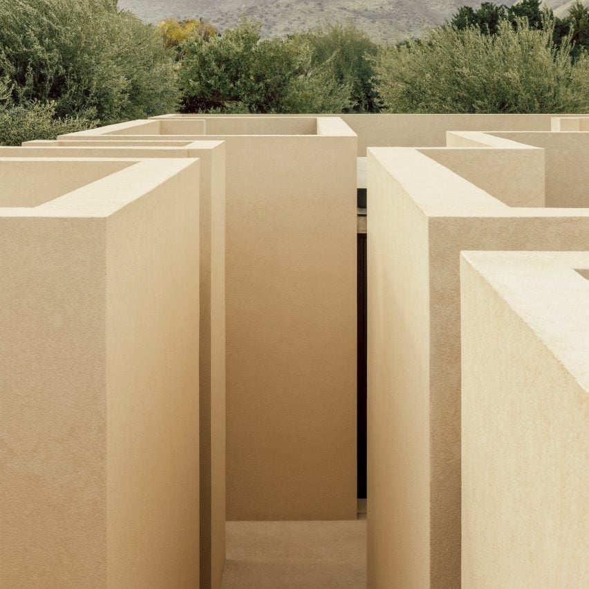
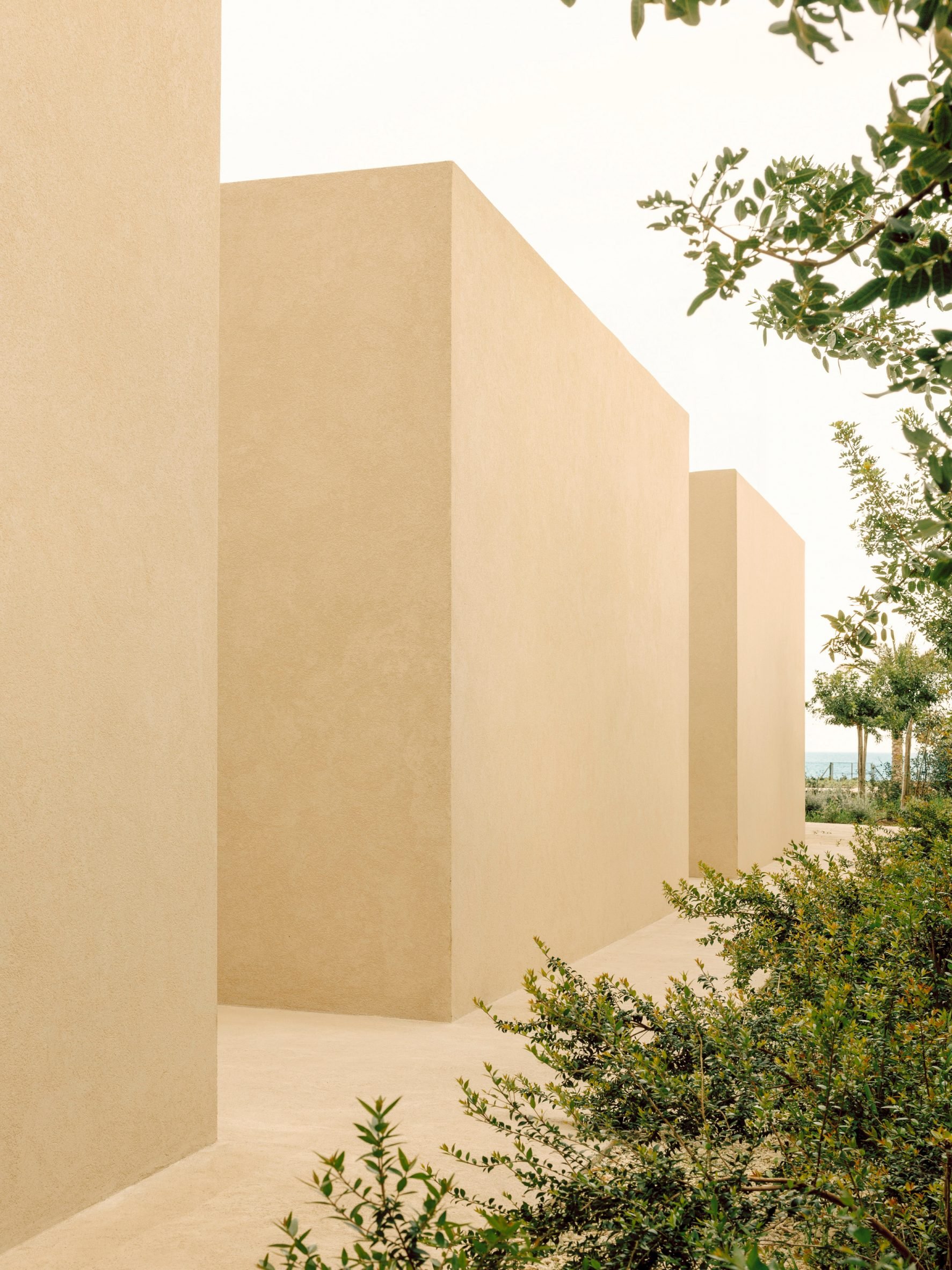
A narrow alleyway winds between the monolithic, blocky volumes and patios of this coastal home in Sicily, designed by Italian architecture practice Solum.

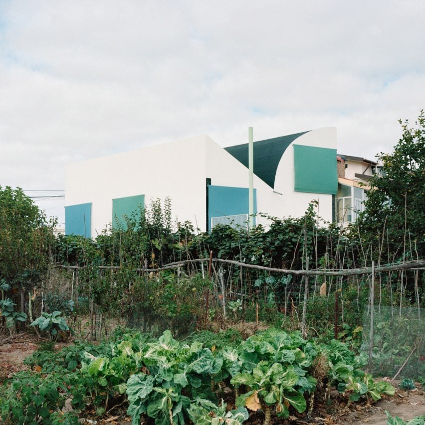
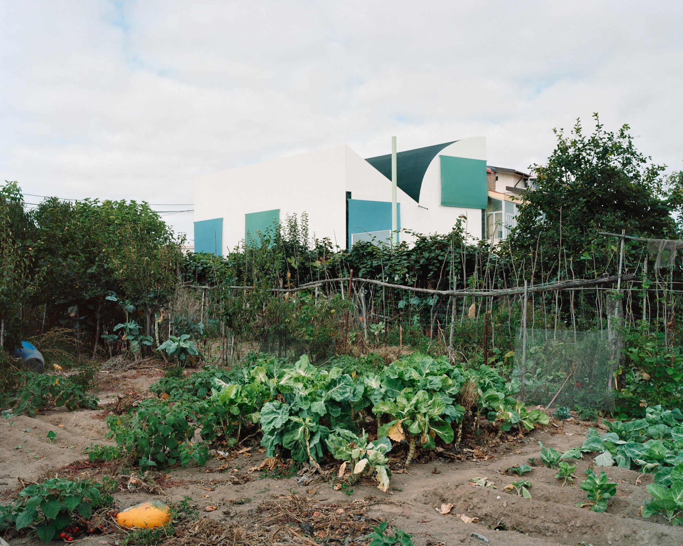
Named Patio House, the home is located on a long, narrow site in Avola that stretches out towards the sea and ends in a rocky cliff.

Patio House in Sicily by Solum
Patio House has a labyrinthine layout

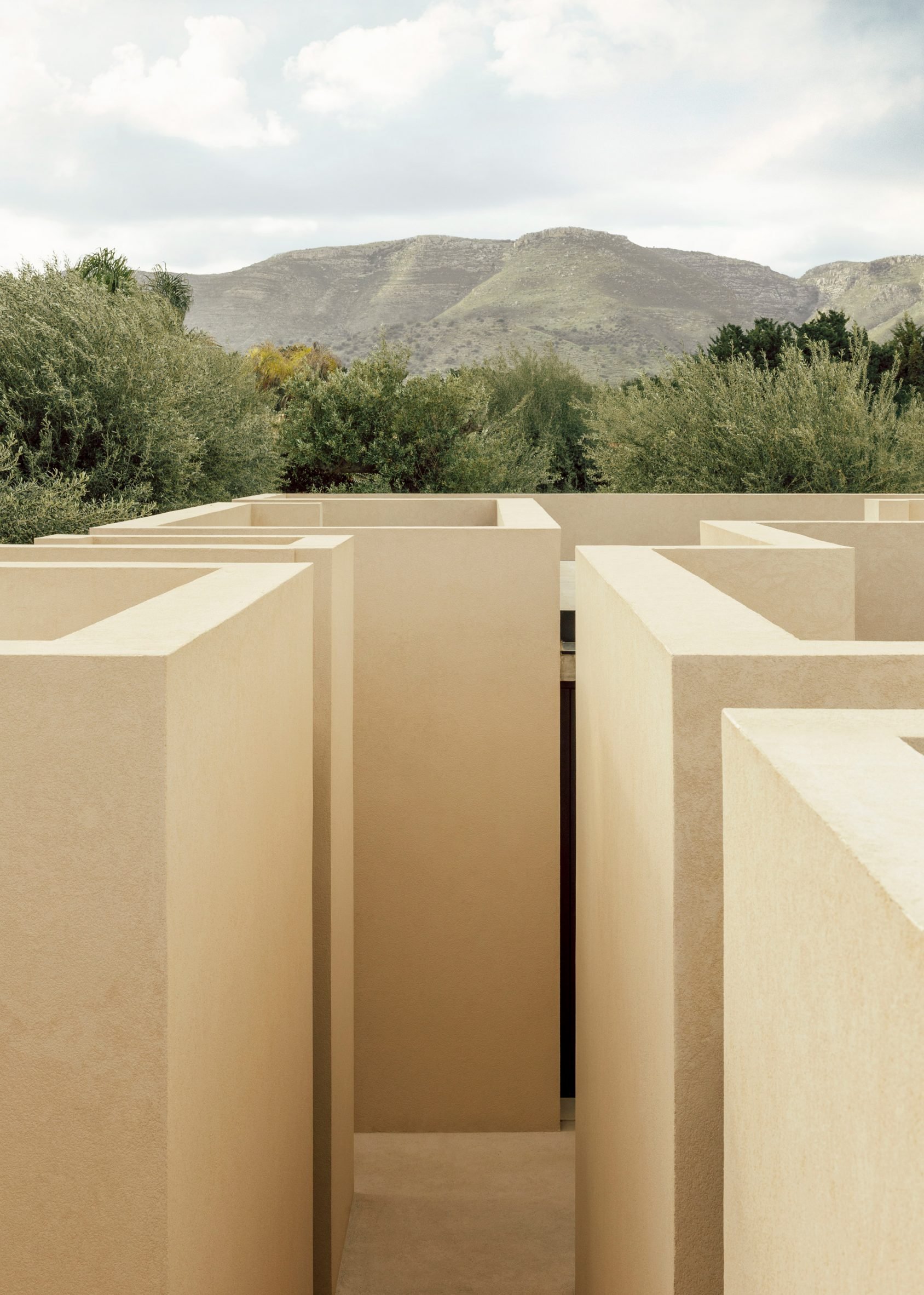
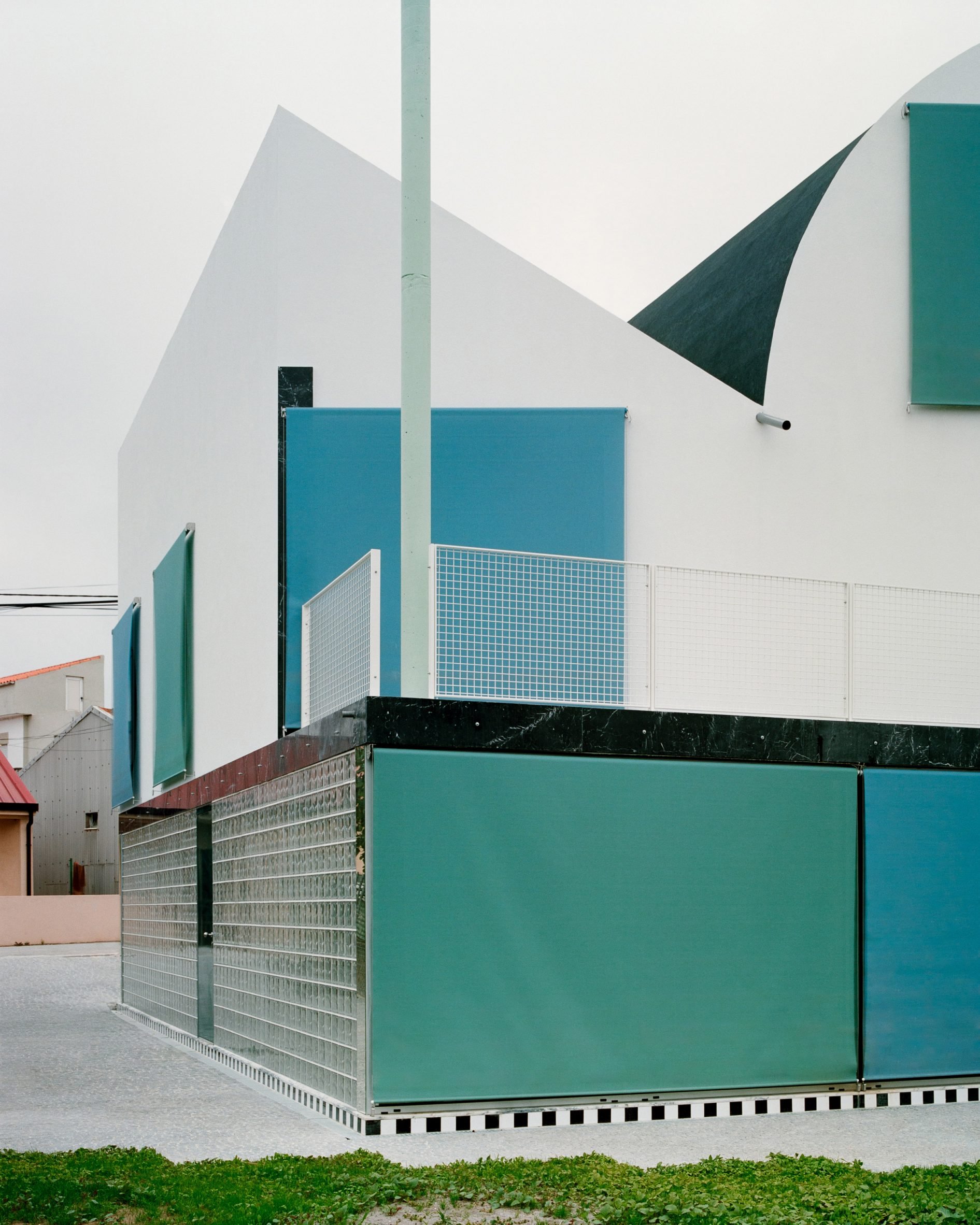
Looking to balance open views of the coast with the feel of an “introverted oasis”, Solum split the home’s spaces into individual, cubic volumes and private patios. These are united by a walkway carved out between high walls, which the studio described as “labyrinthine”.

“The project develops from the challenge of connecting the house’s entrance and circulation to the living area facing the sea,” said Solum co-founder Lorenzo Campagna.

Patio House by Solum
Alleyways weave between patios and cubic volumes

“The villa is thus conceived around this issue, creating a promenade that connects the entrance to the sea while distributing the more private spaces along the way,” he added.

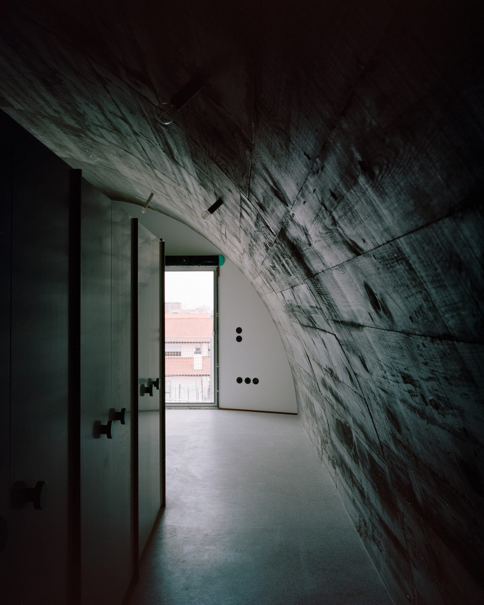
“This alley winds through the house, generating transitional spaces and two small squares that provide access to the bedrooms. The walls are designed as a continuous gesture, producing a labyrinth-like effect visible from the rooftop terrace.”

Patio House in Sicily by Solum
A perforated brick wall creates a screen in front of a bedroom

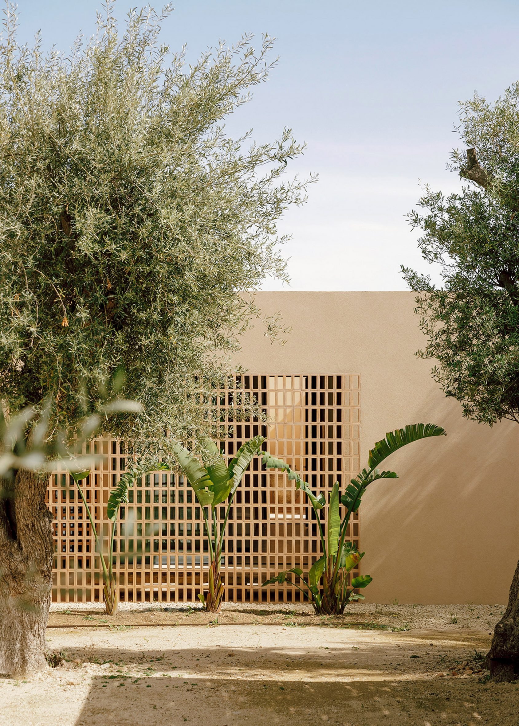
The route through the home begins in a landscaped parking area, from which a front bedroom is screened by a perforated brick wall and leafy plants.

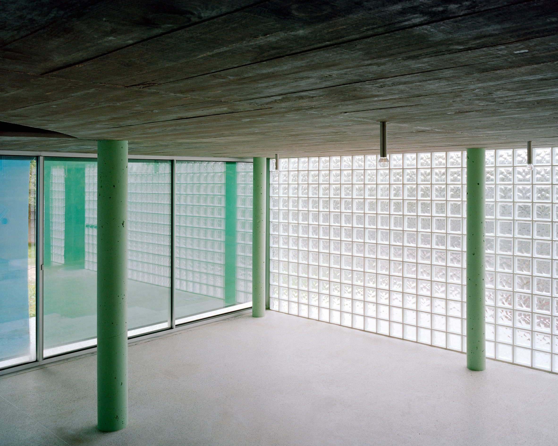
Beyond this entrance space, the home’s open-air alleyway connects four additional bedrooms. Each of these is wrapped by rendered walls with minimal openings, save for glass doors that provide each with access to a dedicated, private patio.

The route culminates at the rear of the home where the living, dining and kitchen area opens out onto an external patio through full-height sliding glass doors. Here, a staircase leads up to a rooftop terrace.

The monolithic forms created by the home’s masonry walls, as well as their pale rendered finish, were chosen to reference the colours and forms of the surrounding soil and cliffs.

Interior of Patio House in Sicily by Solum
Interior spaces have exposed concrete ceilings

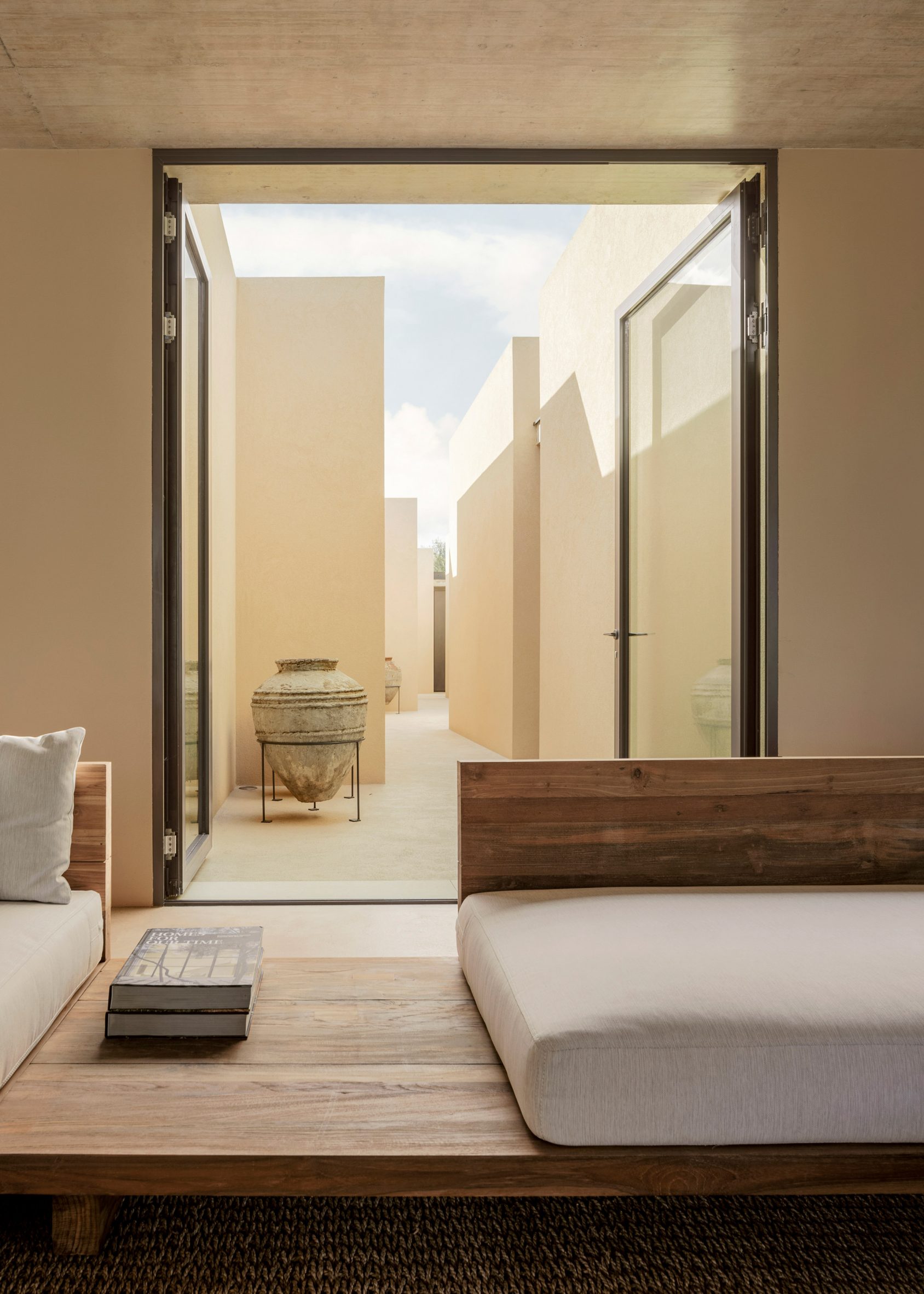
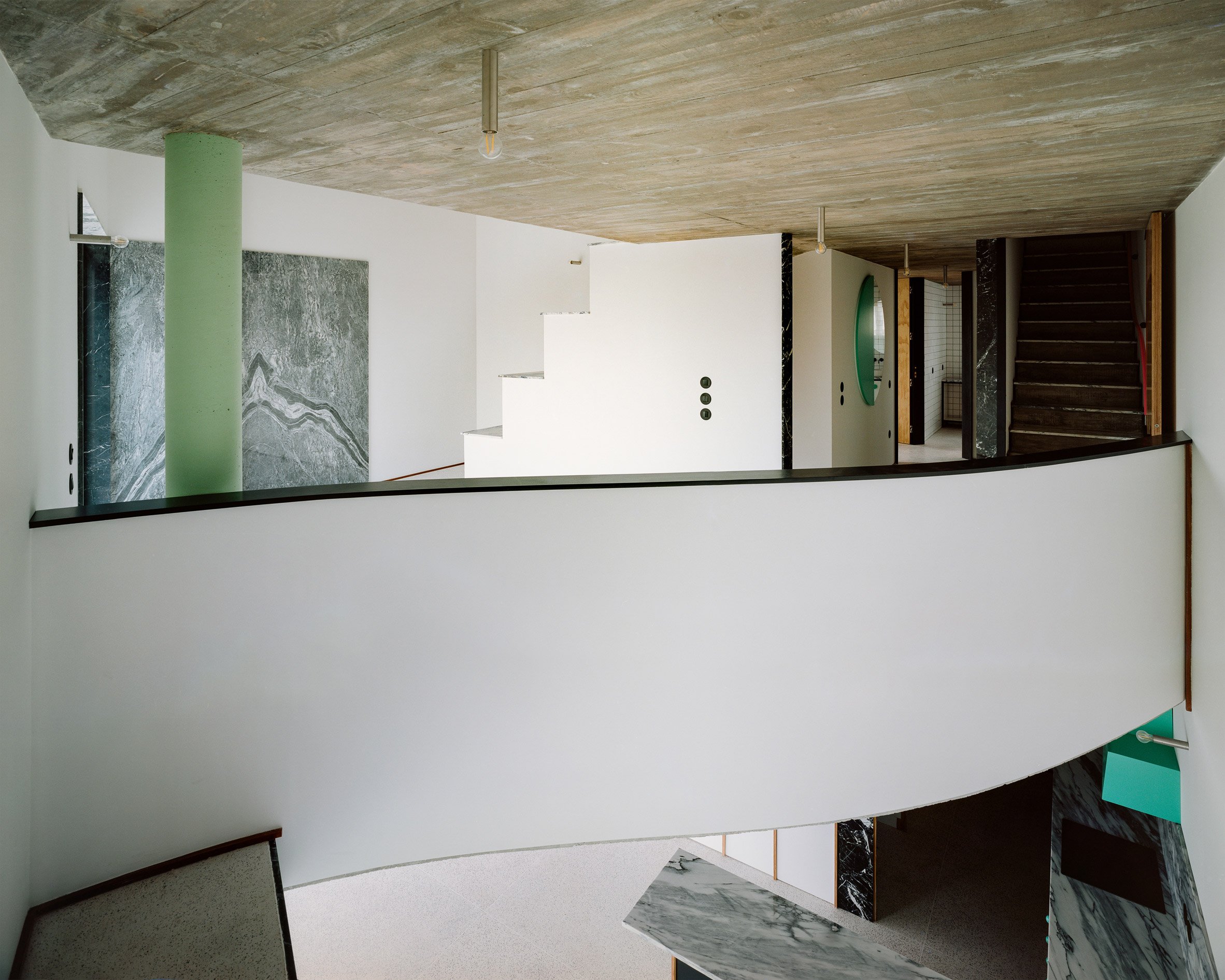
The same finishes were also used internally, paired with exposed concrete ceilings and a palette of natural materials and earthy tones for the bedroom furnishings.

“A key intention of the project is to minimise its impact on the surrounding landscape. It is built entirely in masonry, matching the colours of the soil and concealing the glazed openings from the outside,” Campagna said.

“Within this neutral palette – comprising walls, ceilings, and concrete floors – dark-stained okoumé wood or marine plywood inserts are used to define elements such as doors, wardrobes, and the kitchen,” he added.

Swimming pool at a home in Sicily
A swimming pool overlooks the coastal landscape

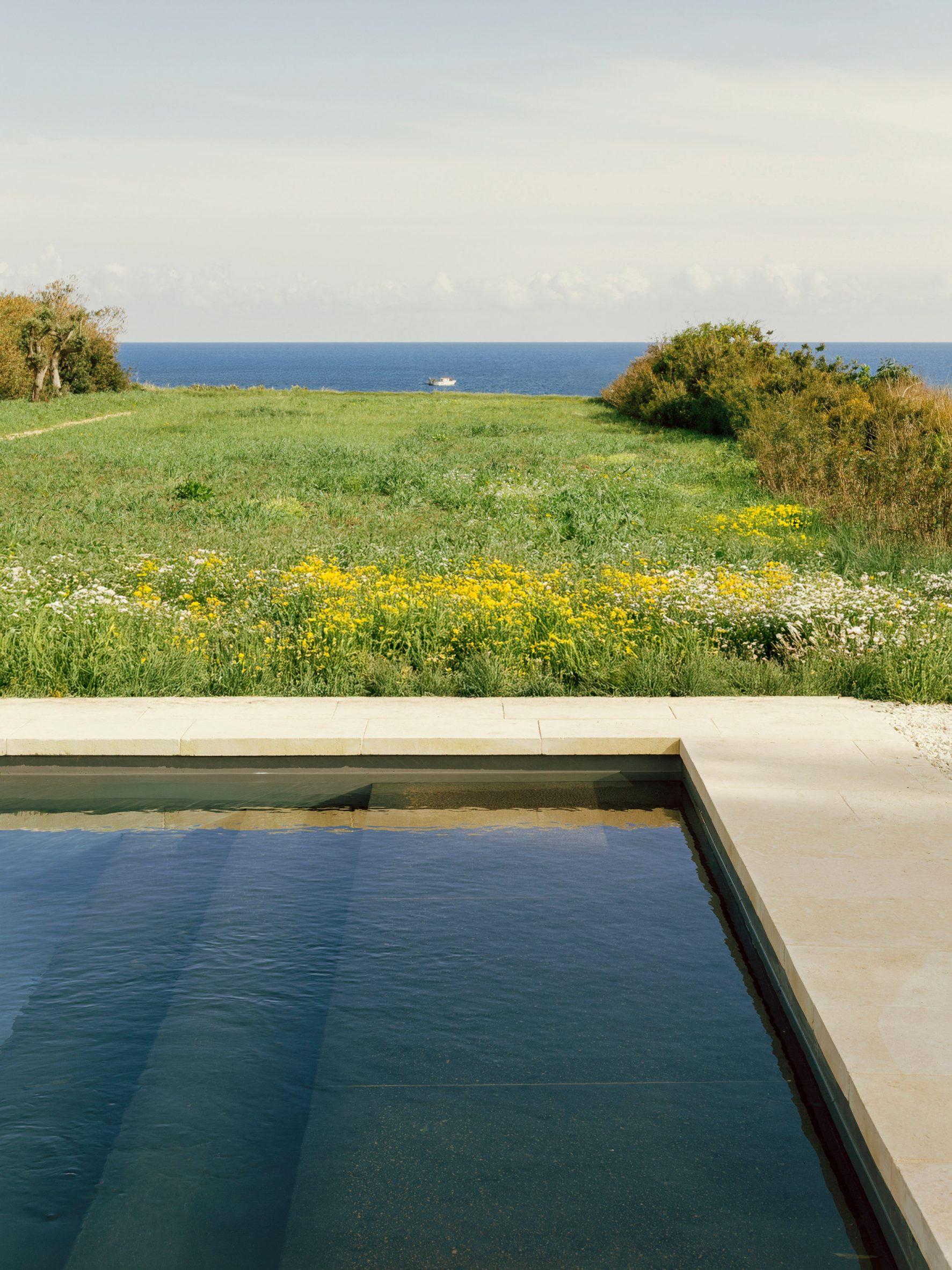
Outside, a dining area sheltered by a canopy leads to a swimming pool surrounded by a lava stone terrace, followed by a stretch of lawn that leads to the coastal cliffs.

Based in Milan, Solum was founded in 2019 by Campagna alongside Mattia Agates, Filippo Gismondi and Alessandro Loda.

Patios also played a central role in the recently completed Casa Tres Patis in Spain by Twobo Arquitectura, in which living spaces and external patios are connected by a covered concrete walkway.

Italy recently revealed plans to build the world’s longest suspension bridge, which would connect Sicily with the mainland.

The photography is by Nicolo Panzeri.

The post Solum carves "labyrinthine" alleyway through coastal home in Italy appeared first on Dezeen.

Feilden and Mawson completes restoration of 12th-century Norwich Castle
Norwich Castle restoration by Feilden and Mawson

Norwich Castle in Norfolk has reopened following the restoration of its 12th-century keep by British architecture studio Feilden and Mawson, which added glazed elements to modernise the Grade I-listed building.

Feilden and Mawson aimed to make spaces easier to navigate for visitors while respecting the history of the castle, which was originally built between 1095 and 1110 at the request of William the Conqueror.

Norwich Castle restoration by Feilden and Mawson
The 12th-century keep at Norwich Castle has been restored by Feilden and Mawson

The Norman castle keep was used as a county jail in the 1300s and later transformed into a museum in the 1880s. Feilden and Mawson’s intervention aimed to improve accessibility around the building and transform the interior to its original 900-year-old layout.

With funding from The National Lottery Heritage Fund and Norfolk County Council, Feilden and Mawson restored the castle keep’s floor levels to their original design and added furnishings to evoke what the medieval royal setting may have looked like.

Glass bridge at Norwich Castle
The studio added a glazed bridge to the historic building

The keep’s main level is on the third floor and contains a chapel, the king’s chamber and the Great Hall. Feilden and Mawson added an enclosed glass and timber bridge at this level, linking it with the castle’s 1960s extension.

A gallery space created in partnership with the British Museum wraps around a mezzanine level, displaying over 900 medieval objects.

A staircase and elevator were installed to give access to all floor levels in the keep, including the rooftop battlement.

“Our role was to technically deliver detailed elements using modern materials and construction methods, while ensuring they faithfully reflected the look, feel, and craftsmanship of the Norman period,” said Feilden and Mawson partner Erin Davidson.

“It was a careful balance of precision, innovation, and deep respect for the original fabric, bringing the spirit of the medieval castle to life for contemporary audiences.”

Interior of Norwich Castle restoration by Feilden and Mawson
Interiors were restored to their original layouts

Designed to blend in with the historic building, a new entrance space was built next to the keep, illuminated by a glazed atrium.

A museum shop is located on the ground floor next to the atrium, a cafe is located above on the first floor, and the second floor contains an education space.

Feilden and Mawson also repaired the castle keep’s roof, Caen limestone walls and structure.

Rooftop battlements in Norfolk
The rooftop battlement was made accessible

“Our aim was to create a seamless dialogue between the old and the new, introducing modern interventions like the lift, new circulation routes, and rooftop terrace in a way that enhances access, interpretation, and visitor experience while remaining deeply respectful of the castle’s medieval fabric,” said Davidson.

“The new entrance, education space, and bridge not only open up the site physically, but also symbolically, inviting broader audiences to engage with its rich history in fresh, meaningful ways.”

Other castle restorations in the UK include the 800-year-old Clifford’s Tower in York, which Hugh Broughton Architects updated by adding a timber viewing deck, and a larch tower entrance added to Auckland Castle by Niall McLaughlin Architects.

The photography is by Norfolk Museums Service.

The post Feilden and Mawson completes restoration of 12th-century Norwich Castle appeared first on Dezeen.

Snøhetta adds curving outdoor space to 1960s office renovation in Milan
Pirelli 35 office transformation in Milan by Snøhetta and Park

Architecture studio Snøhetta has collaborated with Italian architecture studio Park to overhaul the 1960s Pirelli 35 office block in Milan, intending to make the site more open to the public.

Snøhetta and Park aimed to create an example of sustainable urban regeneration with its transformation of the Pirelli 35 offices, which are located in Milan’s Porta Nuova district next to the Biblioteca degli Alberi Milano (BAM) park.

Pirelli 35 office transformation in Milan by Snøhetta and Park
A bridged element was added to the Pirelli 35 offices

Completed in 1964 to the design of Italian architect Melchiorre Bega, most of the building’s structure has been retained to minimise carbon impact.

One of Snøhetta and Park’s biggest changes to the building was the removal of a central wing, which opened up the site to allow for an outdoor public space with curved planting.

Gardens at the Pirelli 35 office transformation in Milan by Snøhetta and Park
Public outdoor space with curved planting was added to the site

A ground-floor level with curving glazed facades wraps around the outdoor space, and a bridged element spans overhead to connect the original Pirelli 35 structure with a new office building.

Snøhetta and Park added two floor levels to the building, with accessible rooftops offering outdoor meeting space with views across the city.

Office transformation in Milan by Snøhetta and Park
A two-storey extension was added to the building

“We are delighted with the forward-leaning possibilities of creating a building that is given back to the public of Milan,” said Snøhetta cofounder Kjetil Trædal Thorsen.

“This is very much in accordance with how Snøhetta has been thinking since its very inception, understanding that desegregation of cities, making building indoors accessible for the larger public, creating public ownership of these buildings, and increasing the accessibility for the public,” he continued.

“Pirelli 35 is a good example of how regenerative architecture should look in European cities such as Milan.”

While floor-to-ceiling glazing defines the facades on the ground floor, above, one side of the office facades was clad in a concrete-effect finish, and the other side was covered with terracotta-coloured aluminium to mimic the nearby residential buildings.

Snøhetta and Park aimed to reduce solar heat gain in the interior spaces by placing the facades behind the existing column structure to add shade.

Office rooftop in Milan
Roof terraces overlook the surrounding city

“This building presents a captivating multiplicity of facets, and as you walk around the perimeter and through the courtyard, you feel the sensation of experiencing several different buildings simultaneously,” said Snøhetta lead project architect Tommaso Maserati.

“A key factor behind this architectural dialogue is the study behind each facade, crafted to respond to the unique characteristics of its surrounding environment.”

Office transformation in Milan by Snøhetta and Park
Pirelli 35 is located next to the Biblioteca degli Alberi Milano park

“What emerges is not an imposing monument demanding attention, but rather a thoughtful composition that weaves itself into the existing urban fabric with quiet and elegant confidence,” Maserati continued.

“The building breathes with its context rather than competing against it, creating a dialogue between old and new that enriches the neighbourhood’s architectural narrative.”

Other projects recently completed by Snøhetta include a trio of stepped buildings designed to reconnect parts of a Belgian city and a sloping community centre in Sweden with a walkable roof.

The photography is by Barbara Rossi.

The post Snøhetta adds curving outdoor space to 1960s office renovation in Milan appeared first on Dezeen.

YSG decorates Alémais office with custom-made globe lights and shimmering mosaics
Inside Alémais office in Surry Hills

Interiors studio YSG has created an office for Australian fashion brand Alémais in Sydney, designed to “make you feel like you’ve entered a galaxy of limitless imagination”.

YSG completed a full remodel of the Alémais office in Surry Hills, using warm cream shades as the backdrop while retaining some of the building’s original brick walls.

The studio wanted the 491-square-metre office to reference Alémais’ print design collaborations with artists and illustrators, drawing on mythological kingdoms, folklore and planets to decorate the space.

Desks inside office in Surry Hills, Sydney
The office features adaptable spaces for a fashion brand

“[Alémais founder] Lesleigh [Jermanus] and I both share Middle Eastern heritage and a love for the cosmos and beyond, so references to mystic and divine elements are sprinkled throughout,” YSG studio director Yasmine Ghoniem told Dezeen.

“My favourite is our custom ‘eye’ dining table,” she added. “We hand-painted its embossed, pale timber, elliptical surface in pastel tones to highlight the natural woodgrain patterns.”

Table with eye motif
A custom ‘eye’ table was the designer’s favourite piece

The space consists of a communal office space, two private offices and an open-plan kitchen that’s also used for meetings. In-built banquettes were added in the far corners and near the reception.

YSG aimed for the office’s design to be conducive to interaction and adaptation according to the daily needs of the fashion brand.

Lounge-like corner in Australian office
Lounge areas provide space for relaxation and inspiration

“Escapist as it may appear, the space’s efficiency is seamless,” Ghoniem said.

“The central nucleus comprises a conjoined design and pattern-making zone with dedicated storage and archival space at arm’s reach from the pattern-makers,” she added.

“The lounge-like design hang nestled within the far corner of the floorplan is where new collection ideas take flight.”

Private office by YSG
The Alémais space also has two private offices

The studio worked with colours to define the different areas of the office, using bold hues for the ends of the room, and mint and plum tones for the main design spaces.

“We upholstered the entrance reception’s banquette with a vibrant tribal fabric, reminiscent of a Congolese cloth that marries tangerine chenille with rugged linen,” Ghoniem explained.

“Past the design team over in the far corner, a trippy green and blue underwater scene floats the spirit of adventure.”

Inspiration board in Alemais office
Cork-pin boards on custom frames can be used to display ideas

To create an inspiring work environment, which the team can tailor however it wants, YSG added tools the designers can use to showcase their work and display moodboards.

“Several large custom timber frames support cork pin boards laid with inspiration images, new collection fabrics and sketches, and roam across the floorboards on casters,” Ghoniem said. “We also tucked Cozoni Knox drawer units on wheels under desks, should they need to migrate.”

Key materials in the interior include glass mosaics, shell inlay, palm reed, Calacatta Viola marble, bronze and velvet.

“Creative confidence and spirited discovery underpins our playful yet polished aesthetic for the space where myriad realms co-exist, so it was important to feature highly tactile, textural materials and compelling tones,” Ghoniem said.

Lounge-like corner in Sydney office
The reception area has banquette seating

Among the outer-worldly details in the space are the large, speckled globe lights in a variety of sizes and colours that hang everywhere in the office.

Custom-designed by YSG and made by local company Anomolous, the “fibreglass lunar spheres” underline the studio’s references to planets and mythology.

“They make you feel like you’ve entered a galaxy of limitless imagination from the moment you arrive,” Ghoniem said.

“With their delicious speckled tones and oversized form, they create the illusion of drawing the ceiling height down towards a more intimate human scale, which is also comforting.”

Mural in Sydney office
A welcoming mural depicts a “utopian” scene

At the entrance of the Alémais office, YSG added another eye-catching detail – a mosaic mural depicting mythical flora and fauna.

“Coated with shimmering mosaics, it depicts a utopian scene of half-human and half-animal forms floating amongst fantastical fauna under a blazing sun,” Ghoniem explained.

“We built the wall to set the tone for staff, clients and guests, and to buffer the hive of activity behind it. It took about two weeks to lay the tiles with a team of four.”

Kitchen in Alemais office
The kitchen cabinetry has playful door handles

The studio also added other figures throughout the space, including starfish-shaped handles on the kitchen cabinets, an eye on the kitchen wall, a snake-shaped door handle and decorative sculptures.

Other recent interiors by YSG include a cafe in Sydney with 1970s-style details and a Byron Bay home by the seaside.

The photography is by Anson Smart.

The post YSG decorates Alémais office with custom-made globe lights and shimmering mosaics appeared first on Dezeen.

Disappearing ink fades like memories in book that “rewrites the story of dementia”
4,4,4&2 book by Boom Saloon

Ink fades and disappears in the book 4,4,4&2, created by Scottish publisher Boom Saloon to reflect the experience of losing memories through dementia.

The book resembles a family cookbook, with handwritten recipes, scribbled notes, mementoes and various clippings all collected informally in one folder.

Many families have a cookbook like this, but in the case of 4,4,4&2, the contents are printed in a disappearing ink that fades from exposure to light and air.

Photo of the book 4,4,4&2 open to a torn yellow page with a basic recipe written in a childish scrawl
4,4,4&2 is designed to resemble a family cookbook

The book was co-designed by people with dementia, in particular one woman called Maggie Watson, who Boom Saloon founder Rachel Arthur describes as her “adopted gran”.

Arthur grew up cooking with Watson in her kitchen, and after the Boom Saloon team began their research into the syndrome, she was able to notice the symptoms within her friend.

“Developing the work together was highly personal,” Arthur told Dezeen. “Her inability to create the scrap cookbook we’d always planned to was one of the first signs that something was wrong.”

Photo of the 4,4,4&2 book open to a small fold-out page with pictures of a blackbird repeated. Under one it says Harry the Blackbird, on the others simply The Blackbird
The book is printed with disappearing ink so it fades over time

“When we began our work to rewrite the story of dementia, none of our small team had any lived experience,” she added.

“It was through the learnings we uncovered during our research that we became tooled with the knowledge to push for a diagnosis for Maggie, after multiple doctors and medical experts passed her off as nothing more than a forgetful old woman.”

The book was ultimately named after Watson’s shorthand for a sponge cake recipe – four ounces of butter, four of sugar, four of flour and two eggs.

Photo of the book 4,4,4&2 open to an albu-like page with two monochrome photos of a young girl transferring ingredients into a mixing bowl in a kitchen
The book reflects the real experiences of Boom Saloon founder Rachel Arthur and her “adopted gran”

Dementia is a form of cognitive decline that can affect memory, thinking, language, mood, behaviour and motor control. The most common cause is Alzheimer’s disease, but it can be brought on by many medical conditions or disorders and is usually associated with ageing.

Crucially, the Boom Saloon team discovered, dementia never affects two people the same way. This is a message that they were keen to communicate through the design of 4,4,4&2, with the disappearing ink deteriorating differently in every printing of the book.

“The publication mimics the complex and highly personal degeneration of the brain, which can take place during the dementia journey,” Arthur explained.

“Each copy warps, fades and jumbles in a wholly unique manner, reflecting the individualised degeneration of the brain throughout the dementia journey.”

Arthur and her team designed the publication to be the same size as the average human brain, albeit rectangular in format, and with no marks distinguishing one copy from another, so that the pattern of deterioration, triggered by air and light, would be unpredictable.

“To delay the process, each copy comes sealed – this slows down the change but does not stop it fully,” she said. “Many of our advance copies remain unopened in hopes they will not disappear.”

“Sadly, much like dementia itself, the process cannot be entirely halted. Instead, 4,4,4&2 commands us to better understand it and, vitally, the role we can play to support the dementia journey.”

Photo of the 4,4,4&2 book open to a page with a photo of Maggie Watson in her room on one side and scraps of documents about dementia on the other
Scraps of reading material about dementia make it into the cookbook

She points out that readers have the option to photograph the pages, write over them, share them or discuss them to preserve the fading fragments, highlighting the role played by carers, families and friends of people with dementia.

While handwritten recipes are the backbone of the book, there are also snippets of diary entries, photos, a map and a collage of pamphlets and notes about dementia, evoking the way in which these types of reading materials might be absent-mindedly tucked into the back of a folder.

4,4,4&2 is printed in monochrome purple on uncoated GF Smith papers, chosen for their tactility. The ink was developed by Boom Saloon in a process that involved multiple broken printers, according to Arthur.

Photo of the front cover of the 4,4,4&2 book showing a light blue plain cover with the numbers in large wobbly writing
Each book will fade differently over time

The production was beyond the capabilities of the publisher’s usual commercial printers, so all of the printing and finishing was done in-house, with support from Canon.

Boom Saloon focuses on “democratising creativity for good” by creating publications with people facing complex personal challenges. It has previously worked with people experiencing forced displacement but its projects on dementia have now spanned many years.

Other books printed with unusual inks include The Dehydrating Book, which can only be read when wet, and Naar Inkt Vissen (Fishing For Ink), which smells like the sea thanks to its use of squid ink.

The post Disappearing ink fades like memories in book that "rewrites the story of dementia" appeared first on Dezeen.

Images show construction of Buffalo Bills stadium with “world's largest snowmelt system”
New Highmark Stadium in New York

Photos show construction underway on a stadium in Buffalo, New York for NFL team the Buffalo Bills, designed by Kansas City-based architecture studio Populous with a canopy that’s heated to melt snow and engineered to amplify the crowd sounds in the stadium.

Located in the Bills’ hometown of Buffalo, the new Highmark Stadium is being constructed directly across the street from the previous stadium of the same name.

New Highmark Stadium in New York
Construction is underway on a new Buffalo Bills stadium designed by Populous. Top photo from June.

Informed by local venues such as the Rockpile, the city’s former outdoor soccer stadium, renderings of the stadium show its exterior clad in translucent precast perforated panels, a slightly curved roof and blue lighting lining the lower and upper levels.

Recent construction photos show the stadium’s completed canopy, which wraps around its perimeter and extends slightly over the interior bowl.

Buffalo Bills stadium
The most recent images show a completed canopy that wraps around the stadium’s perimeter

It is made of structural steel and metal decking, in part to create noise, according to Populous.

“It will reverberate the crowd noise, intimidate the opposing team and create an NFL gameday energy that will be second-to-none in the league,” Populous Americas managing director Jonanthan Mallie told Dezeen.

Photos also show several of the large exterior precast metal panels being installed on its black structural steel system, which will wrap around the entirety of the stadium when completed.

“The construction process reveals what’s behind the stadium’s finished materials,” said Mallie.

“You can see more of the foreboding black structural steel right now while it’s under construction. You can see more of the concrete precast seating bowl, and you can feel the power of the workforce that is out there every day bringing the new Highmark Stadium to life.”

According to Mallie, the stadium will be equipped with “the world’s largest and technically advanced snow melt system”, as Buffalo receives about 95 inches of annual snowfall.

The canopy will cover 60 per cent of the stadium seating and manage snowfall, while sensors will react to snowfall and activate the hydronic system, according to the Bills.

Buffalo Bills stadium by Populous
Precast panels are going up on the exterior

Upon the release of its design, some social media commentators likened the stadium’s design to a “bed pan”.

When asked about these comments, Mallie said they were “fun comparisons”.

“The public attention always garners fun comparisons during construction, especially with millions of eyes on the stadium design,” said Mallie.

“Public opinion will continue to evolve on the new stadium until one day when finished, its presence will transform both Buffalo and the NFL.”

Buffalo Bills stadium by Populous
The canopy is designed to reverberate noise

Designs for the Highmark Stadium were revealed in 2022, and according to Populous, construction is on track to complete the stadium for the opening of the 2026 NFL season.

Recently, Dezeen rounded up seven massive sports stadiums to be built across the US, including a new stadium for the Cleveland Browns and a renovation to the Jacksonville Jaguars home stadium in Florida.

The photography is courtesy of the Buffalo Bills.

The post Images show construction of Buffalo Bills stadium with "world's largest snowmelt system" appeared first on Dezeen.

Treevive shelving system by Qualy and Harvbrand

Dezeen Showroom: Thai design brands Qualy and Harvbrand combined their expertise in wood and recycled plastic to create a shelving system made entirely from waste materials.

The Treevive shelving system features melamine-faced panels made from Harvbrand‘s rubberwood waste, separated by pillars made from Qualy‘s recycled ABS plastic.

Treevive shelving system by Qualy and Harvbrand
The Treevive shelving system’s shelves are made out of waste rubberwood

“In the furniture industry, leftover rubberwood offcuts – often uniform in size – are typically discarded,” said Qualy and Harvbrand.

“Treevive demonstrates how thoughtful design can give new life to industrial waste, turning what was once discarded into something meaningful, sustainable and useful.”

Treevive shelving system by Qualy and Harvbrand
The connectors are recycled ABS plastic formed in the shape of branches

The Treevive system has a minimalist but characterful design, with a branch-like shape to the pillars evoking the product’s origin waste wood origins.

The system is modular and can be expanded with extra shelves. It is also available in a range of finishes, including ones with a wood grain on the shelves.


Product details:

Product: Treevive shelving system
Brand: Qualy and Harvbrand
Contact: design@qualydesign.com

Materials: rubberwood waste, recycled ABS plastic
Colours/finishes: Olive or Beige (poles), Green, Sand Stone, Honey Elm, Emperor Walnut or Black Terra Walnut (shelves)
Dimensions: 600 x 200 x 450 millimetres

Dezeen Showroom

Dezeen Showroom offers an affordable space for brands to launch new products and showcase their designers and projects to Dezeen’s huge global audience. For more details email showroom@dezeen.com.

Dezeen Showroom is an example of partnership content on Dezeen. Find out more about partnership content here.

Dezeen Showroom new releases newsletter

Click here to subscribe to our Dezeen Showroom new releases newsletter, a quarterly bulletin highlighting our editor’s pick of the products we have published in the previous season.

The post Treevive shelving system by Qualy and Harvbrand appeared first on Dezeen.

Inverted roof creates sculptural interiors for home in Porto by Fala Atelier
A House with an Inverted Roof by Fala Atelier

An inverted pitched roof creates sloping and curved ceilings that “blur structure and sculpture” at this home in Porto, Portugal, designed by local studio Fala Atelier.

Named A House with an Inverted Roof, the three-storey home was designed to disrupt what Fala Atelier describes as the “visual monotony” of its suburban surroundings in Matosinhos, a municipality to the northwest of Porto’s centre.

Elevated atop a glazed base, the home’s inverted roof pitch divides its upper storeys into two sculptural halves – one curved and one sloping – punctured by round and square windows that are sheltered by colourful blue and green blinds.

View towards sculptural home by Fala Atelier
Fala Atelier has completed a sculptural home in Porto

“The design intentionally disrupts the visual monotony of suburbia with its bold silhouette and lively facade,” the studio told Dezeen.

“This contrast becomes both a challenge and an opportunity – standing out in a uniform environment while reimagining what a suburban home can be, introducing an imaginative, collage-like form that blurs structure and sculpture,” it added.

The more open ground floor of the home contains its living, kitchen and dining areas, which open onto a back garden through full-height sliding glass doors and face the side elevation with a wall finished entirely in glazed bricks.

Close-up exterior view of A House with an Inverted Roof in Portugal
The inverted pitched roof sits atop a glazed base

The concrete floors of the home are supported by a series of concrete columns painted in pale green, which disrupt the interior spaces in unexpected ways and “obstruct daily routines”.

At the back of the home, one of these columns extends upwards through a first-floor terrace to go seemingly to nowhere, becoming a sculptural gesture.

Sculptural interior of Porto home by Fala Atelier
Concrete floors are supported by green-painted concrete columns

“Circulation flows around structural interruptions and spatial surprises, such as freestanding columns and angled walls,” the studio told Dezeen.

“The seemingly arbitrary placement of the green columns, especially the one on the terrace supporting nothing, is a poetic moment of both tension and humour,” it added.

While a secondary living area benefits from a double-height space created by the sloping section of the roof, the main bedroom has been tucked beneath the barrel-vaulted form of the curved section to create a more intimate, private feel.

In an approach that is characteristic of Fala Atelier, the interior finishes combine exposed concrete with pops of bold colour, stonework and timber, with the greens and blues of the columns and external blinds carried through into its fittings.

Interior view of A House with an Inverted Roof by Fala Atelier
The living spaces are held on the ground floor

“Materials like concrete, marble, and glass brick were chosen for their ability to define surface articulation and emphasise the geometry”s sculptural quality,” said the studio.

“Colour also played a crucial role, both in differentiating forms and in crafting a collage-like aesthetic across the facade,” it added.

Barrel-vaulted interior of Porto home by Fala Atelier
The main bedroom sits beneath a barrel-vaulted form

A House with an Inverted Roof is the latest in a series of characterful Porto homes designed by Fala Atelier, which include a home with curving walls and ceilings informed by a tent and an apartment masked by a screen of geometric, perforated metal screens.

The photography is by Francisco Ascensão.

The post Inverted roof creates sculptural interiors for home in Porto by Fala Atelier appeared first on Dezeen.

Striking red steelwork marks transformation of 1960s Liechtenstein home
Red steelwork Bretscha house exterior Liechtenstein

Local studio Dominic Spalt Architektur has renovated a 1960s house to create a multi-generational home characterised by red steelwork elements in Schaan, Liechtenstein.

The studio sought to transform Number 7 Bretscha through “minimal but precise interventions” that respect the existing structure while facilitating its use by three generations of the same family – parents, children and a grandmother.

Two residential units connected by red steel staircase and balcony
Dominic Spalt Architektur has renovated a 1960s house in Liechtenstein

Contrasted against the white facade, a red steel spiral staircase to the south of the property leads up to a balcony framed by scaffolding-like beams and a corrugated iron roof.

“The scaffolding in front of the balcony connects the house to the garden,” Dominic Spalt Architektur founder Dominic Spalt told Dezeen. “With its plants, it acts as a green filter for the rooms behind it, while also forming a new garden facade.”

Residential unit leading out to balcony in multigenerational family home
Number 7 Bretscha was designed to be a multi-generational family home

In order to accommodate the three generations who live in the house, the studio created two separate apartments on top of one another, connected by an internal staircase.

The lower-level residential unit, which is occupied by the grandmother and accessed via the garden, remains largely unchanged except for adjustments to colour accents and new openings for pipes.

Upstairs, in the unit intended for the parents and their children, a series of simple alterations were made to the bedrooms and a dividing wall was removed to allow for direct access to the bathroom.

Red steel staircase leading to upper level apartment
Striking red steelwork marks the transformation of the home

On the other side of the property, a set of red steel stairs emerging from two large overlapping stones serves as a separate entrance to the upper apartment and shared living space.

Dominic Spalt Architektur created a large, open-plan living space, which includes a kitchen, living room and mezzanine, in the former attic for all of the family to use.

Windows were carefully positioned to allow natural light into the space and to frame views of both the garden and the Drei Schwestern mountain range.

“One focus was on preserving the garden, and the spatial integration of a forty-year-old tree,” said Spalt. “The new living space now opens onto the garden and provides a direct connection to the treetop.”

Attic conversion housing living room
The original attic was converted into an open-plan living space

By replacing the pitched roof of an existing single-storey extension with a flat roof, the studio created a terrace which can be accessed via a large sliding window from the upstairs living space.

A red steel geometric pergola frames the terrace, while also providing a structure for plants to grow around.

“The structure with the gabled roofs was intended as a spatial enclosure for the terrace, which will gradually become overgrown with plants,” Spalt said.

Geometric red steel pergola
A geometric steel structure sits on top of a single-storey terrace

A simple material palette was used throughout the interior, with industrially manufactured plywood panels lining the walls and ceilings. Exposed flooring was sanded and sealed with a gloss finish.

The studio opted for a pale plywood finish in the living room, while a darker glaze was applied to the kitchen walls and a teal glaze was used in the bathrooms.

Kitchen and dining space inside multigenerational home
Stainless steel and glazed plywood were chosen for the interior finishes

To optimise the space, a mezzanine was added above the living space, with a semi-circular cut-out to allow light between the two levels where the structure meets the kitchen window.

“The mezzanine was conceived as an object in the living space – it divides the room and also provides additional space,” Spalt said.

Plywood mezzanine in living room of Liechtenstein house
A mezzanine level was added above the living space

Other multi-generational homes recently featured on Dezeen include a duplex in Toronto with two units connected by a courtyard and a “slick but not stiff” Sydney home renovation.

The photography is by Willem Pab.

The post Striking red steelwork marks transformation of 1960s Liechtenstein home appeared first on Dezeen.

Swedish city of Kiruna wheels entire 672-tonne-church intact to new location
Kiruna Church relocated in Sweden

Sweden‘s Kiruna Church is being transported in its entirety to a new location along a five-kilometre route to accommodate the expansion of the world’s largest underground iron-ore mine.

Weighing 672 tonnes, the church is being moved over two days at a cautious speed of half a kilometre per hour as part of a wider scheme to relocate the town of Kiruna, organised by Swedish mining company Luossavaara-Kiirunavaara (LKAB) and its owner, the Swedish government.

The church’s relocation, which is being broadcast live, has been named The Great Church Walk, with members of the public invited to walk along the journey at designated parts.


Kiruna Church is being transported in its entirety to a new location

Designed by Swedish architect Gustaf Wickman and inaugurated in 1912, Kiruna Church began its journey at 08:00 local time yesterday and is scheduled to arrive at its final destination between 15:00 and 17:00 today.

Measuring 40 metres wide, the church’s wooden structure was hoisted on steel beams perched atop self-propelled modular transporters for its five-kilometre-long relocation journey. In preparation for the move, some roads have been widened over the past year.

Kiruna Church is being moved in its entirety with the aim of minimising damage to the building, compared to if it were dismantled. Its accompanying bell tower will be relocated next week.

It was placed atop steel beams on transporters for the journey

“This is an important and carefully planned move, and we are approaching the finish line,” said LKAB project manager Stefan Holmblad Johansson.

“The church is truly unique and means a lot to many people beyond just being a landmark of Kiruna, and we want to give everyone the opportunity to follow and be a part of this historic event.”

The church is one of 23 cultural buildings to be moved by the state-owned LKAB, which has been extracting iron ore from under Kiruna for over 70 years in what the company claims is the world’s largest underground mine for iron ore.

The mining operations have caused a weakening in the ground above that is threatening parts of Kiruna, leading to the decision in 2004 to relocate the old town to a new town three kilometres east.

Masterplanned by White Arkitekter and Ghilardi+Hellsten, the new town features a circular town hall designed by Scandinavian firm Henning Larsen.

Kiruna Church in Sweden
The wooden church was inaugurated in 1912. Photo by Arild Vågen via Wikimedia Commons

At the end of its journey, Kiruna Church will be placed in its new location, situated between the cemetery and the new town centre. Other parish buildings are set to join it to form a unified setting.

Norwegian construction company Veidekke was tasked with transporting the church and bell tower, as well as constructing the relocation route and forming the foundations at the new site.

Once the building has been placed in its new setting, Veidekke will restore the relocation route and the church’s original site, which will become a temporary mining town park.

Recently completed churches that have been featured on Dezeen include a woodland church in Denmark by Henning Larsen and a fluted-concrete chapel extension in Australia by Studio Bright.

The photography and film are courtesy of Moa Strålberg, Kiruna municipality, unless stated.

The post Swedish city of Kiruna wheels entire 672-tonne-church intact to new location appeared first on Dezeen.