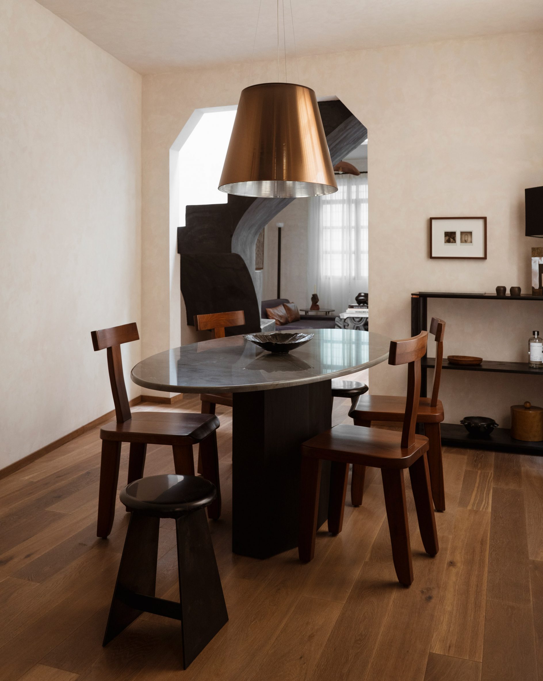
Eight living areas that make a feature of exposed rammed-earth walls
From India to South Africa, our latest lookbook collects living rooms that showcase the diversity in colour and texture of rammed-earth walls.
Rammed earth is a building method that is constructed by packing soil – made up of a combination of aggregate, sand, silt, clay and gravel – into formwork and compressing it to form a solid wall once the formwork is removed.
It is traditionally a low-carbon building method when constructed in its raw form. However, it is common for the earthen material to be stabilised with a binder, such as cement, to improve its strength while maintaining its characterful look.
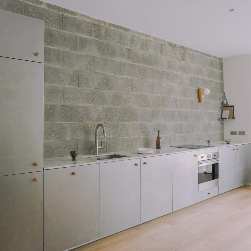
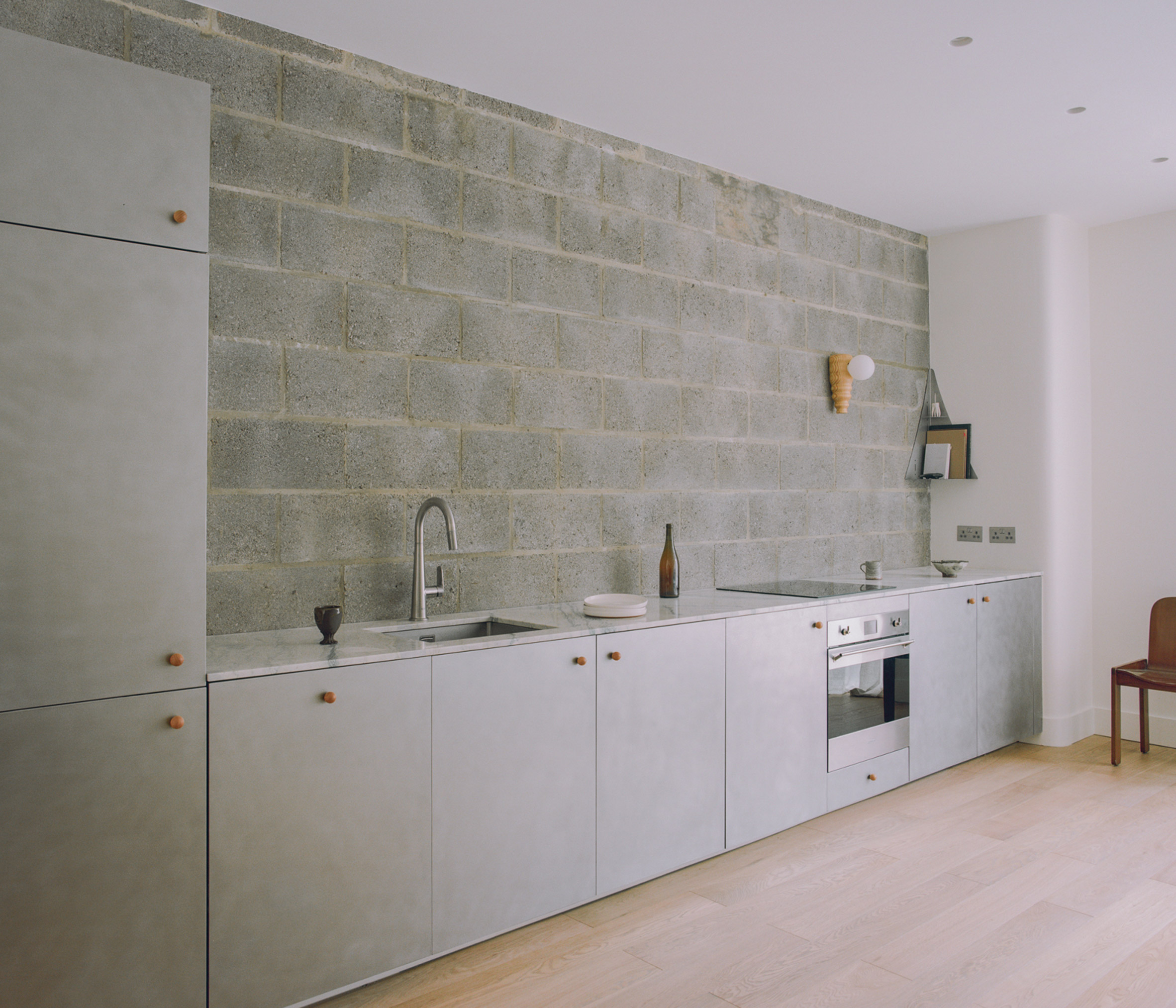
Rammed-earth walls come in varying colours and textures depending on the soil used. The examples below range from warm oranges, rich browns, cool greys, pinky hues and sandy tones.
Their textural surfaces make striking focal points in homes, with striped patterns formed by the layered process of compacting soil.
Rammed-earth walls also have a high thermal mass, helping regulate room temperatures in hot climates by cooling them in the day and warming them at night.
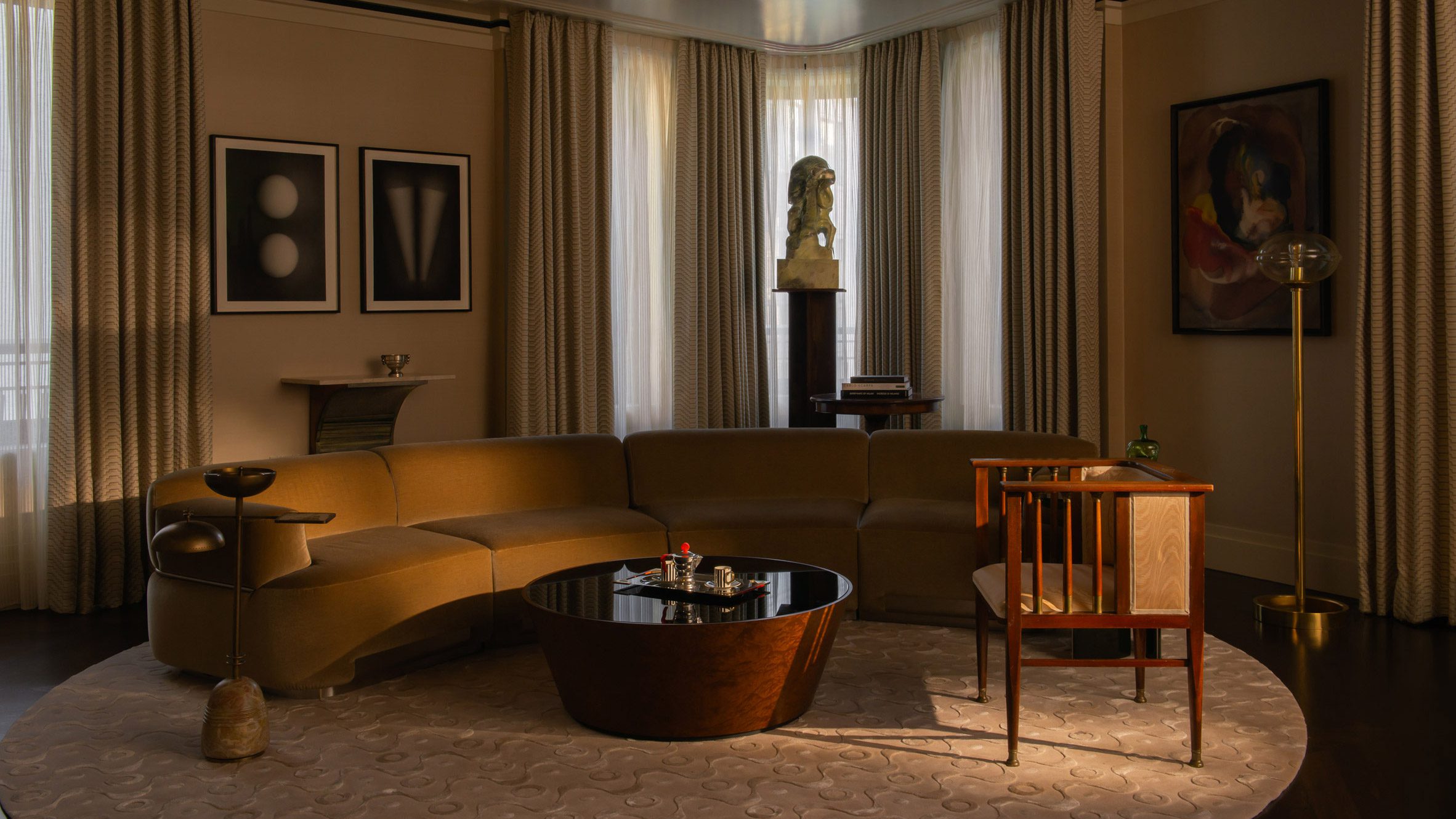
This is the latest in our lookbooks series, which provides visual inspiration from Dezeen’s archive. For more inspiration, see previous lookbooks featuring interiors with a modern take on art deco, living rooms that embrace the Mediterranean landscape and kitchens without wall cupboards.
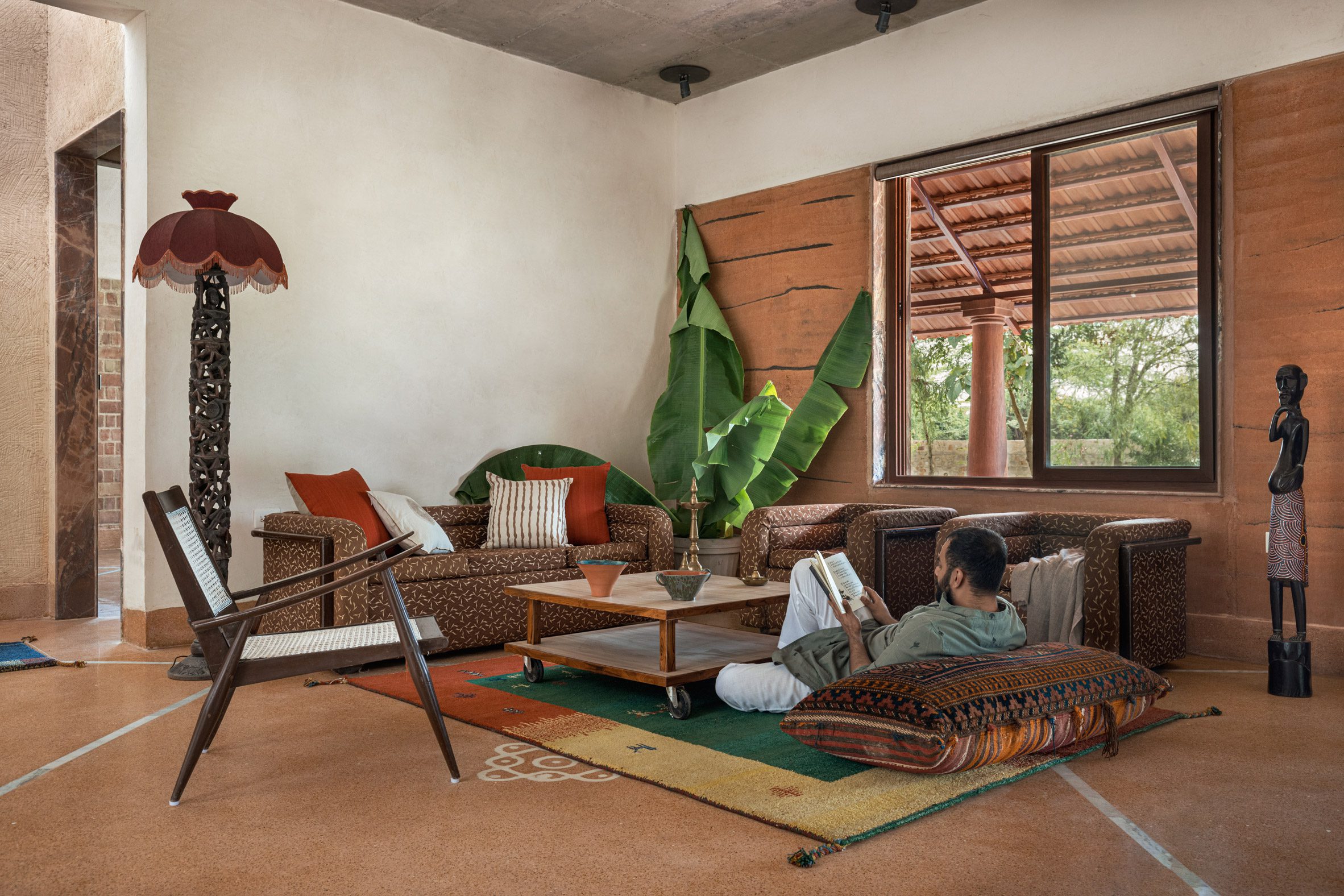
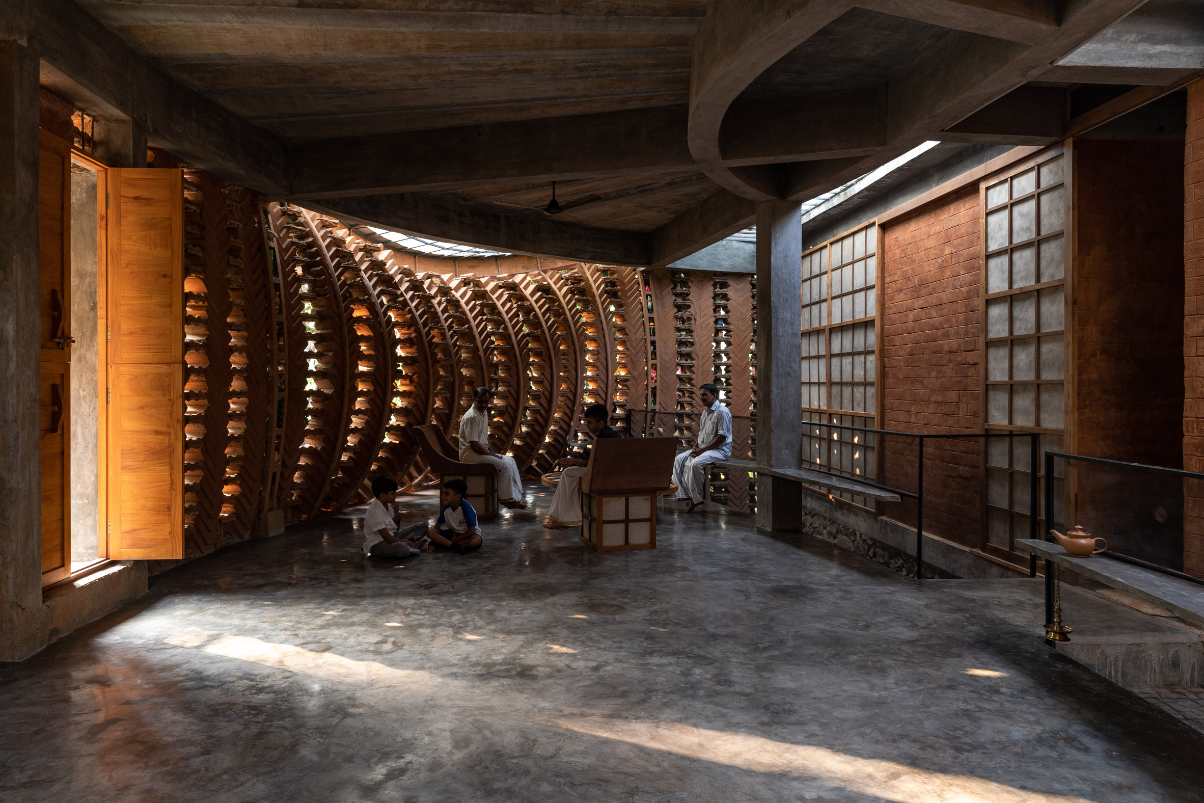
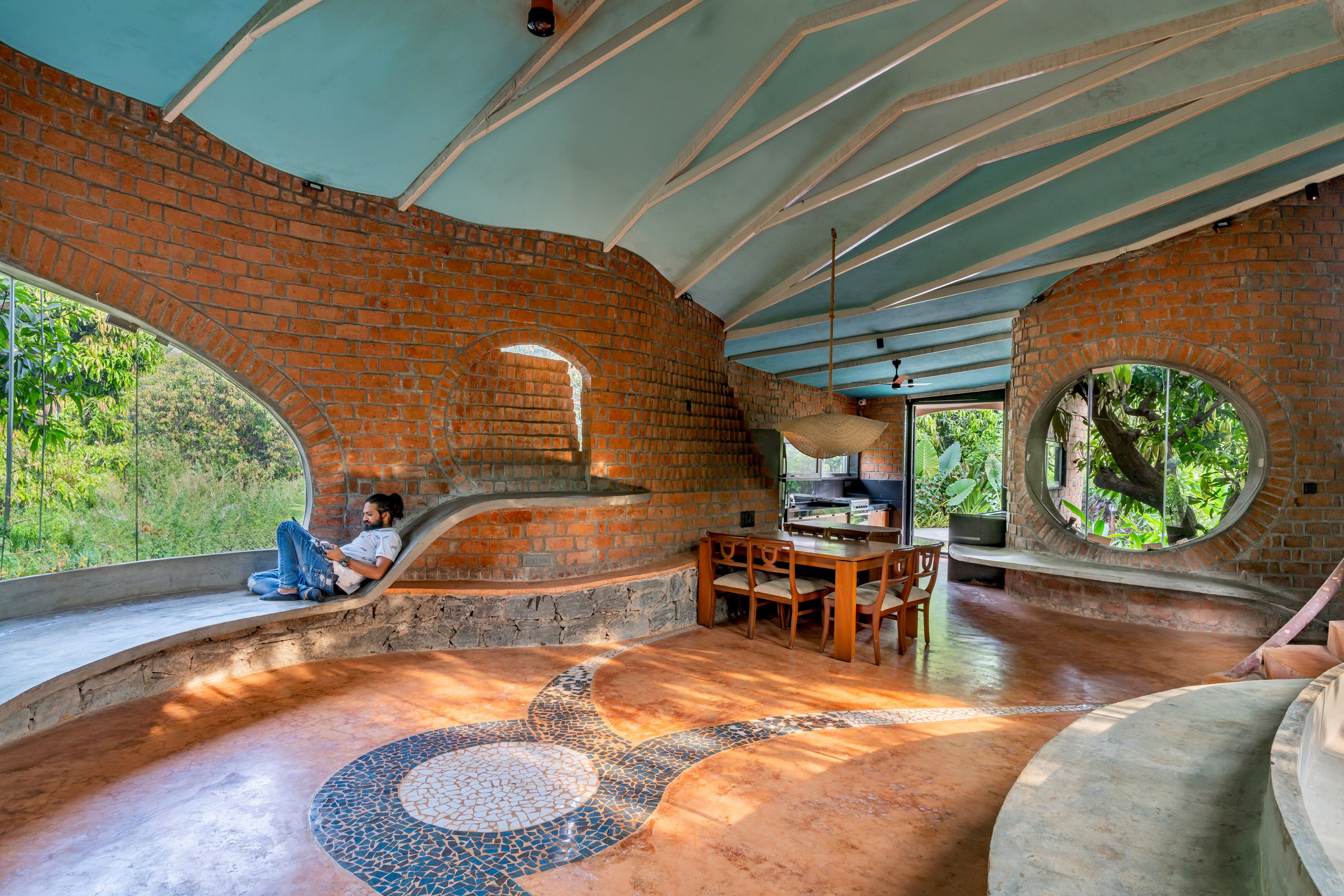
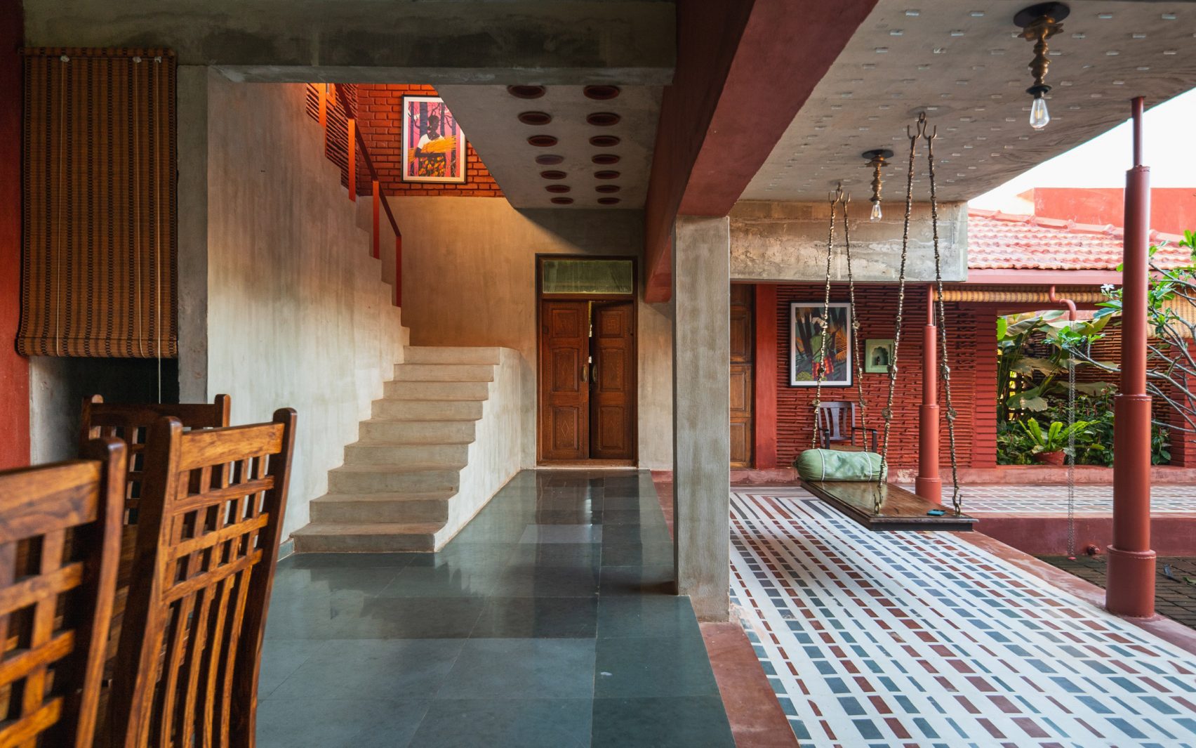
Hybrid House, India, by Sketch Design Studio
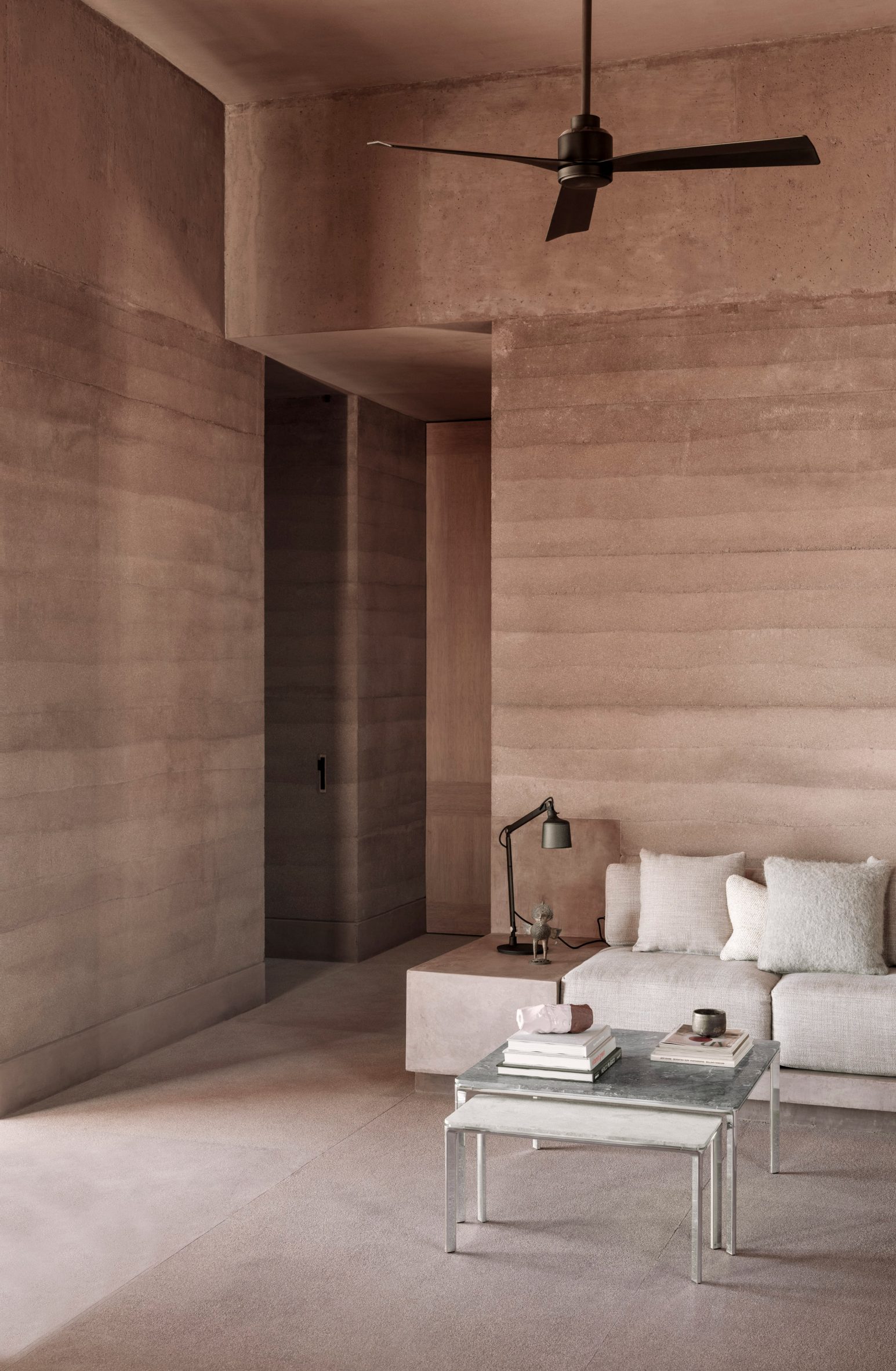
Architecture firm Sketch Design Studio combined vernacular building techniques from north and south India for Hybrid House, a three-bedroom home in Rajasthan.
The home’s rammed earth walls were covered in lime plaster with some areas left exposed to reveal the earthen structure, which has a pinky tone due to the higher volume of clay found in Rajasthan soil.
Find out more about Hybrid House ›
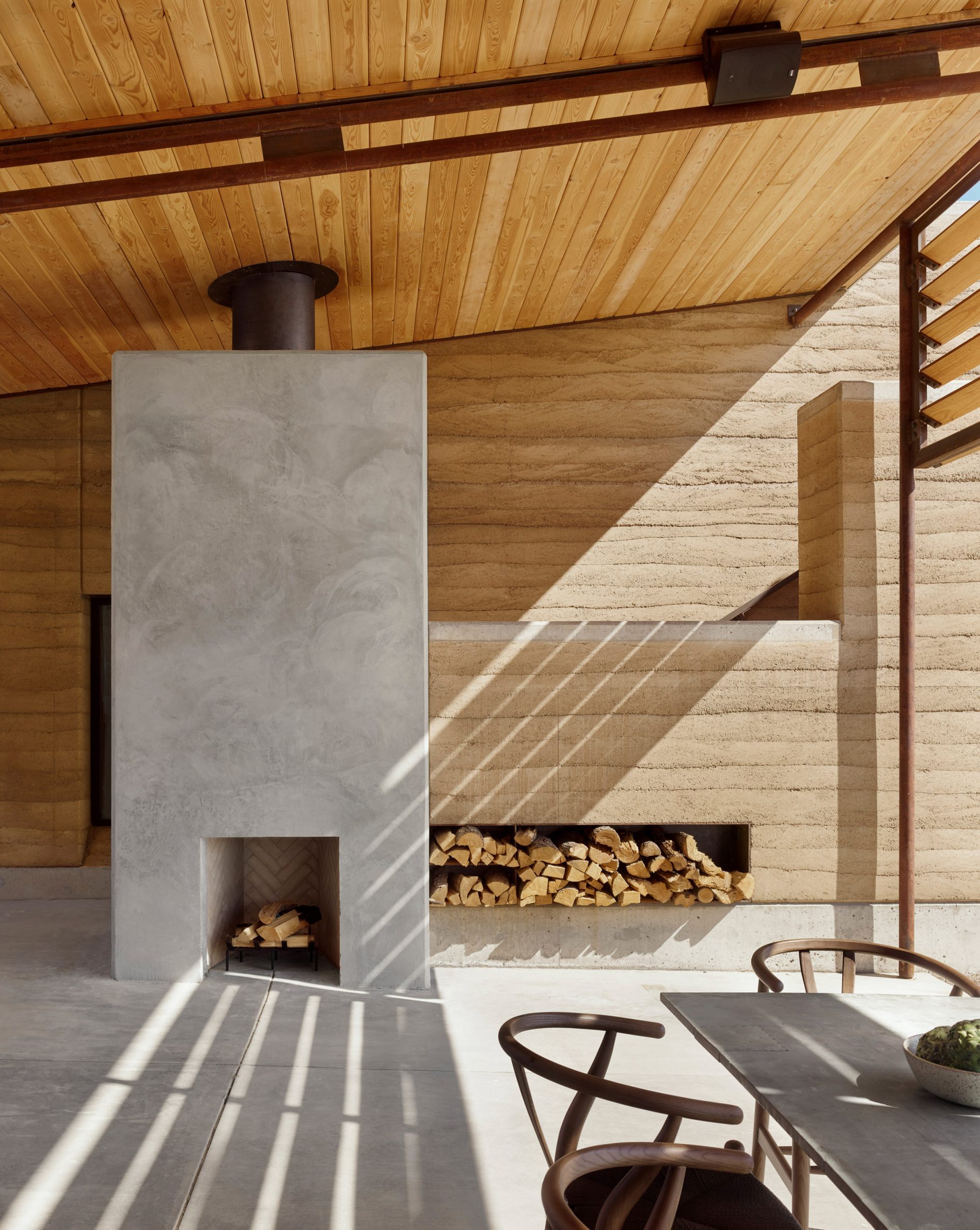
Vipp Todos Santos, Mexico, by PPAA
Aiming to blend the structure with the surrounding terrain, architecture studio PPAA opted for thick rammed-earth walls for this guest house on Mexico‘s Baja California peninsula.
The monolithic walls shelter semi-external living and dining areas, with the earthen material’s thermal mass helping to passively cool the spaces in the day and warm them at night.
Find out more about Vipp Todos Santos ›
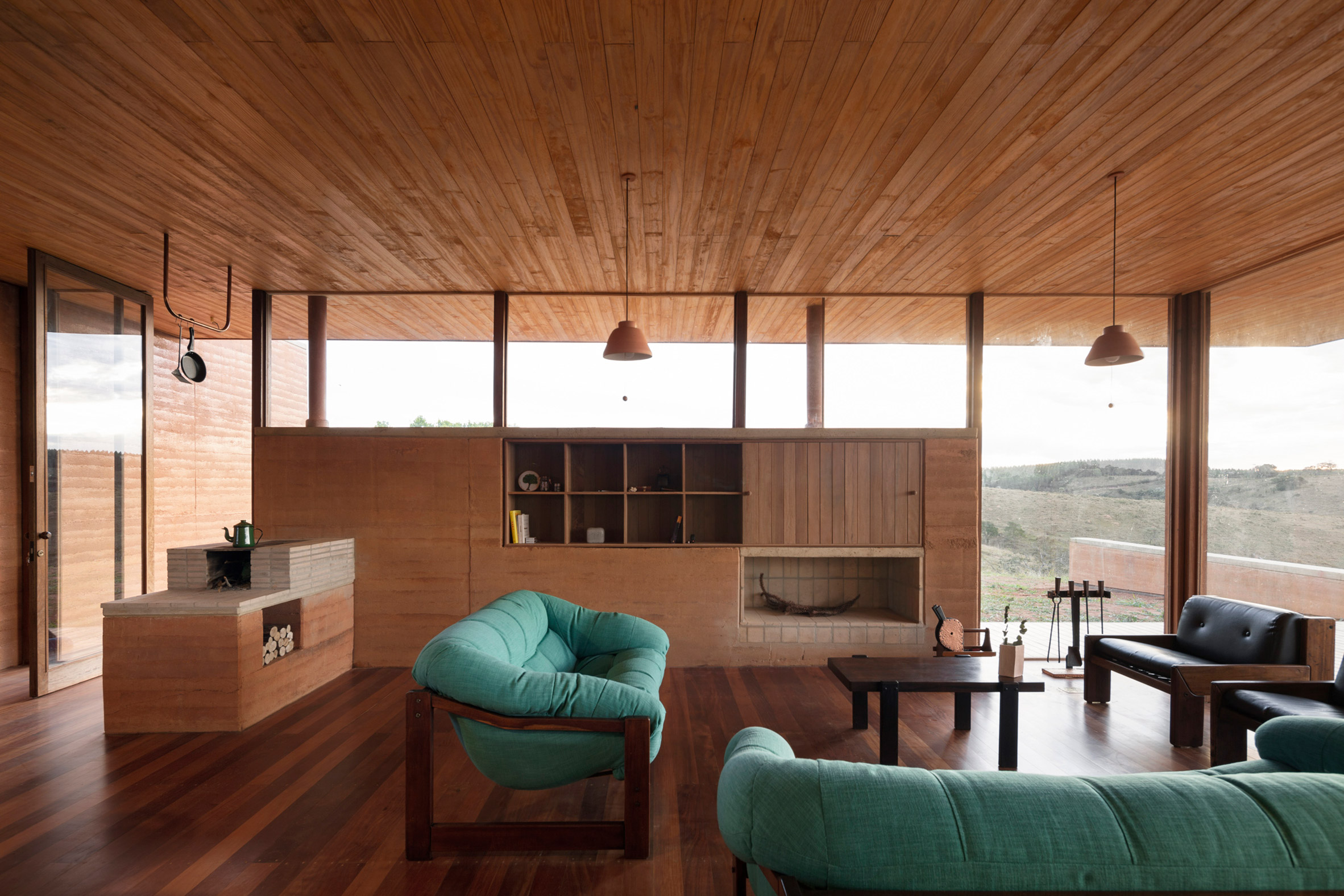
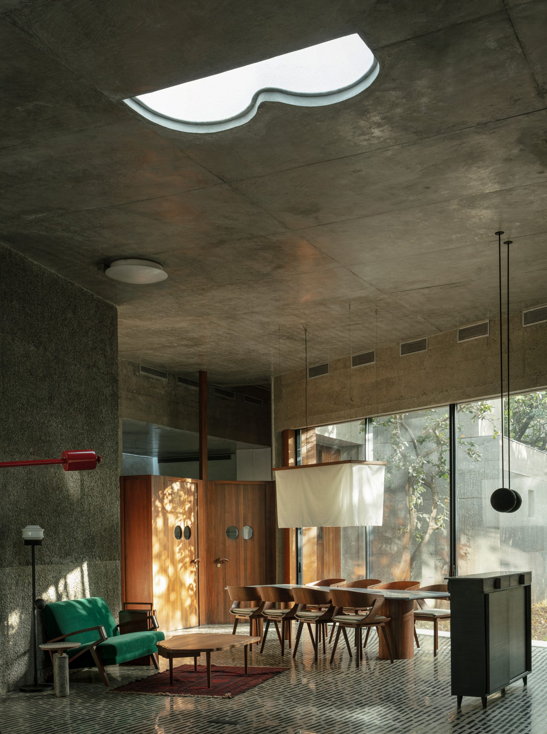
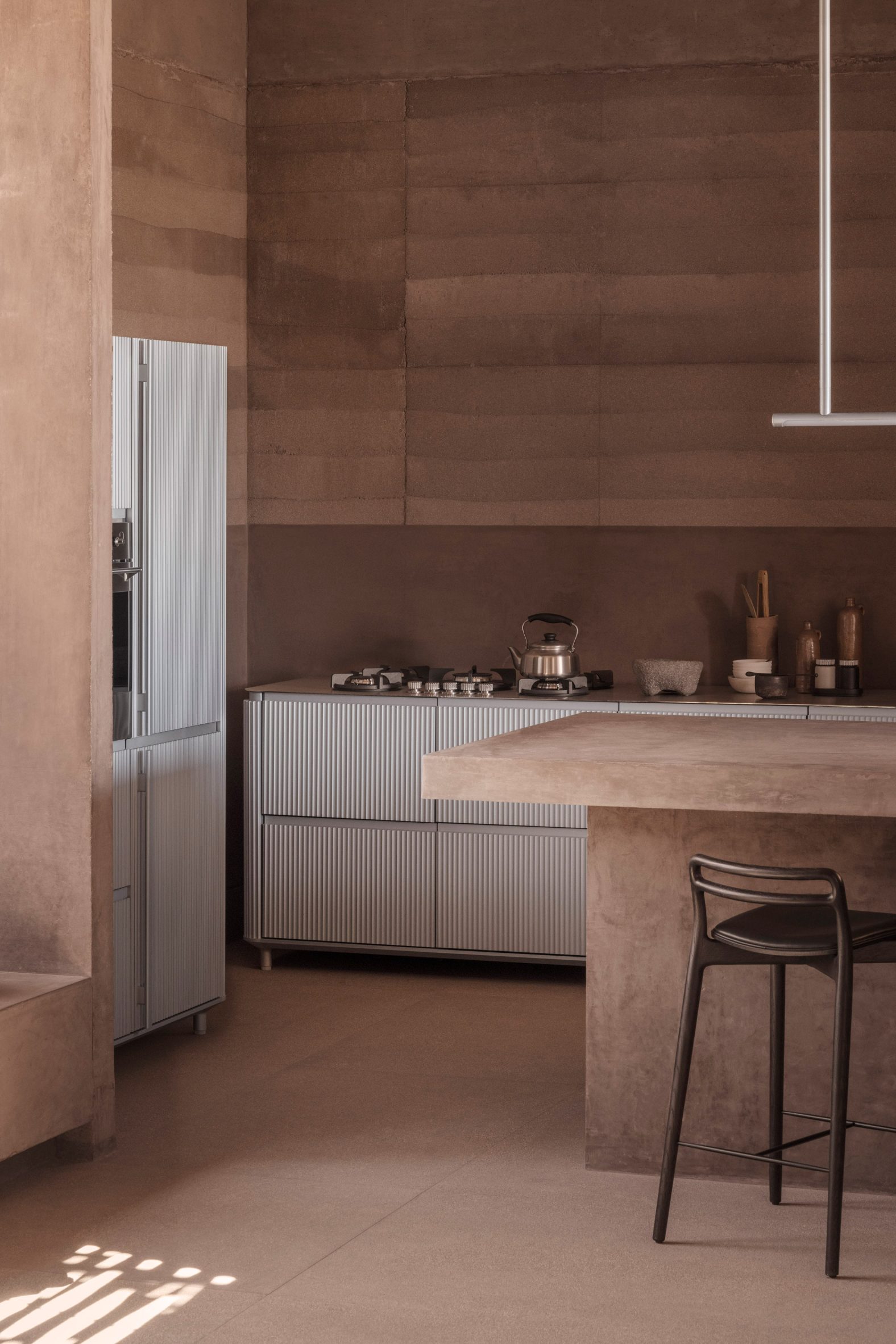
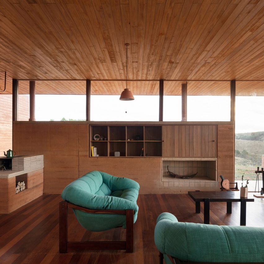
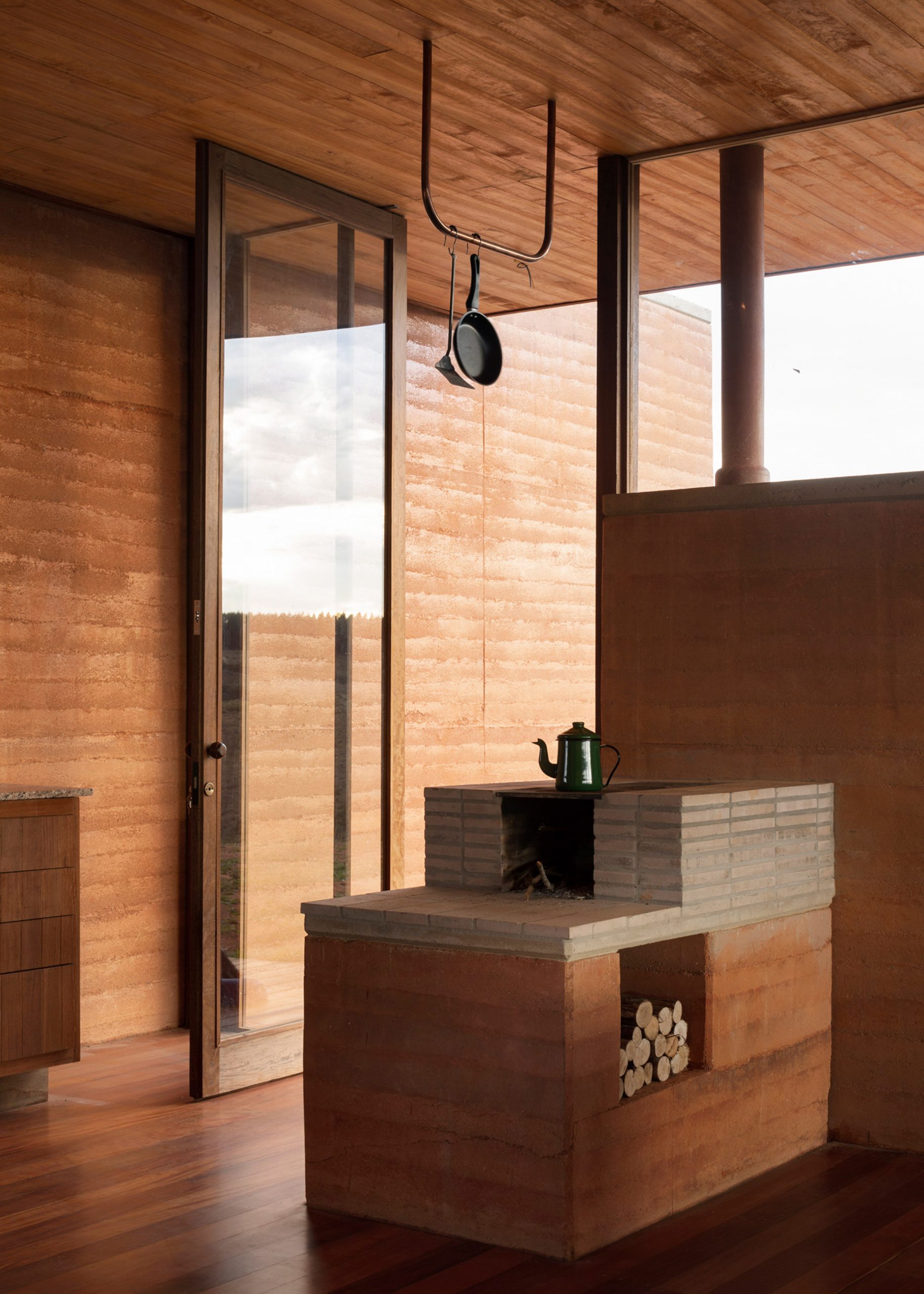
House in Cunha, Brazil, by Arquipélago Arquitetos
Rammed-earth walls were built on top of a concrete foundation and married with rich, deep-toned timber for this home in the countryside of Brazil, which was designed by São Paulo-based studio Arquipélago Arquitetos.
An external rammed-earth wall continues into the interior to form the back wall for an open-plan kitchen, while in the living space, a rammed-earth wall with built-in storage is surrounded by clerestory and full-height windows.
Find out more about House in Cunha ›
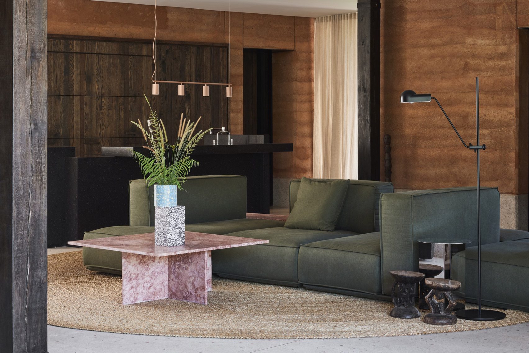
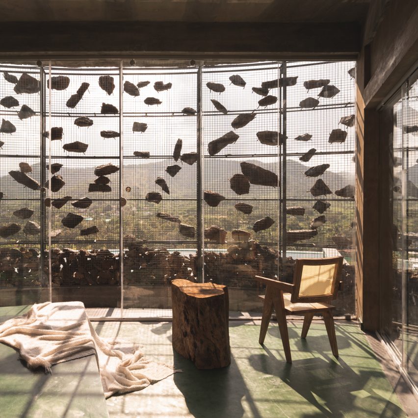
Tembo Tembo, South Africa, by Studio Asaï
Located on the edge of Kruger National Park in South Africa, French architecture practice Studio Asaï added touches of rammed earth to the Tembo Tembo lodge to emulate the materiality of the reserve’s towering termite nests.
Locally sourced rammed earth was mixed with a sealant and applied to the home’s structural skeleton throughout the exterior and interior. In the living room, the earthy shades were complemented with a dark green sofa in a nod to the foliage of the South African bush.
Find out more about Tembo Tembo ›
Casa di Campo, Australia, by Neil Architecture
A four-metre-high external rammed-earth wall was left exposed in the living room of Casa di Campo, a home in the city of Werribee South that was designed by local studio Neil Architecture.
The rough texture of the grey-toned wall was contrasted with smooth wood surfaces and a tiled fireplace.
Find out more about Casa di Campo ›

Casa Franca, France, by Déchelette Architecture
A three-storey monolithic rammed-earth facade fronts this townhouse in Paris, which was designed by French studio Déchelette Architecture.
The second floor, which contains an open-plan living, dining and kitchen area, was set back from the facade and clad in aluminium to create an outdoor terrace.
Find out more about Casa Franca ›
Marfa Ranch, US, by Lake Flato
Marfa Ranch is a home in the desert grasslands of Texas, with two-foot-thick rammed-earth walls in a sandy hue built around a central courtyard.
Designed by American architecture studio Lake Flato, living spaces feature sliding doors made from weathering steel that open onto outdoor areas.
Find out more about Marfa Ranch ›
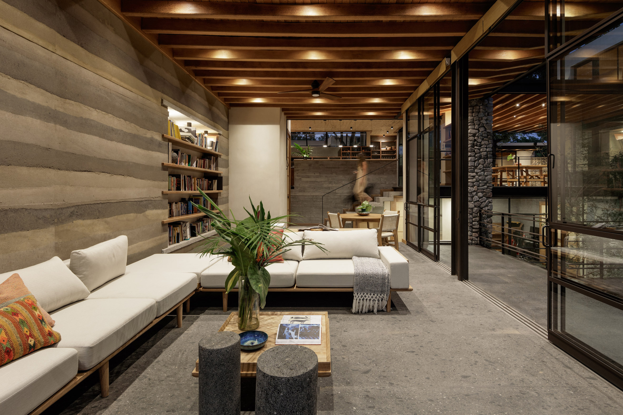
Espacio Kaab, Mexico, by Di Frenna Arquitectos
Designed by Mexican studio Di Frenna Arquitectos to appear as if emerging from the ground, Espacio Kaab is a home in Comala made from a combination of stone, rammed earth, woven carrizo weaves and stucco.
The living room features a rammed-earth wall with striking grey-toned stripes and a built-in bookshelf.
Find out more about Espacio Kaab ›
This is the latest in our lookbooks series, which provides visual inspiration from Dezeen’s archive. For more inspiration, see previous lookbooks featuring interiors with a modern take on art deco, living rooms that embrace the Mediterranean landscape and kitchens without wall cupboards.
The post Eight living areas that make a feature of exposed rammed-earth walls appeared first on Dezeen.