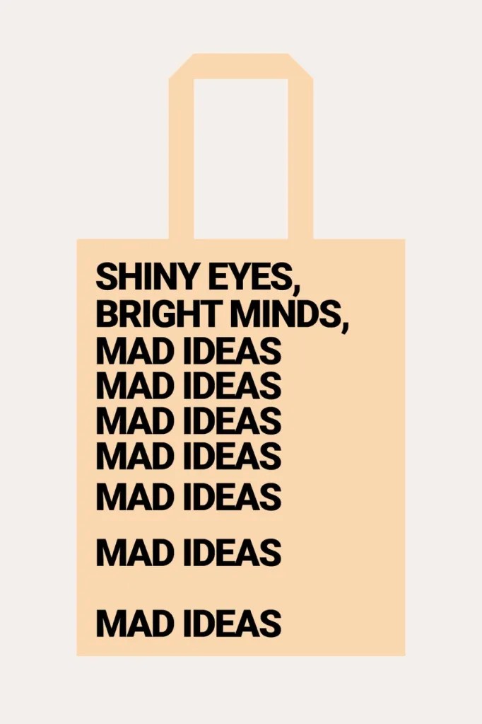
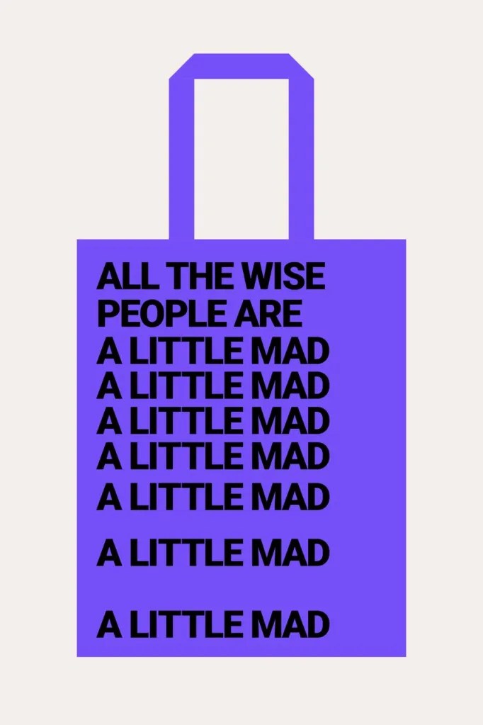
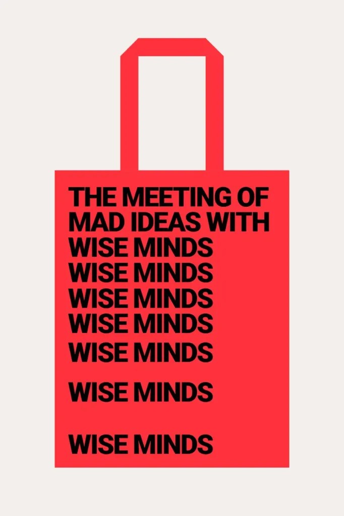
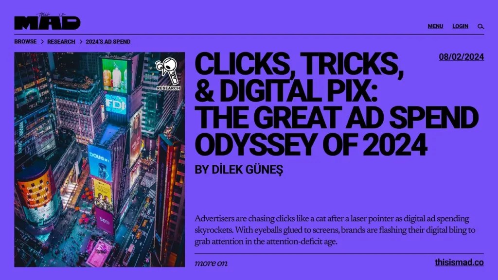
Ba’ndo’s Identity for MAD Captures the Madness of Creativity

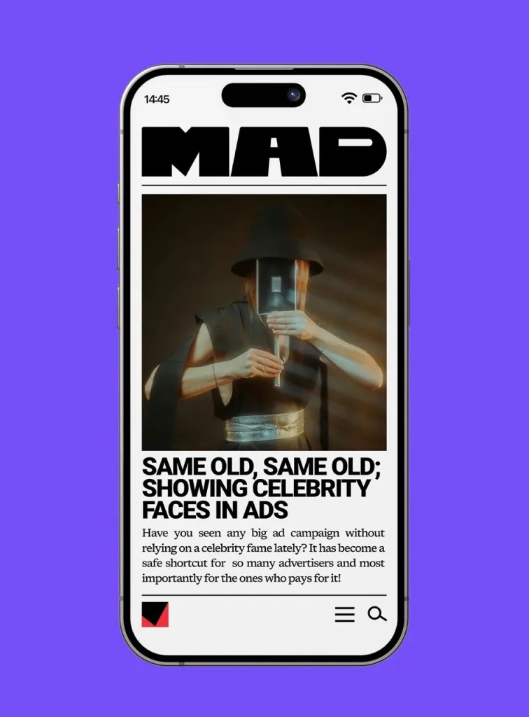
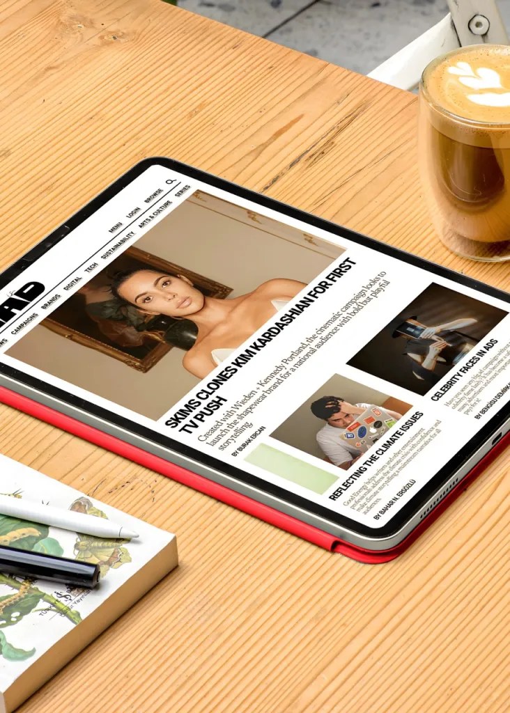
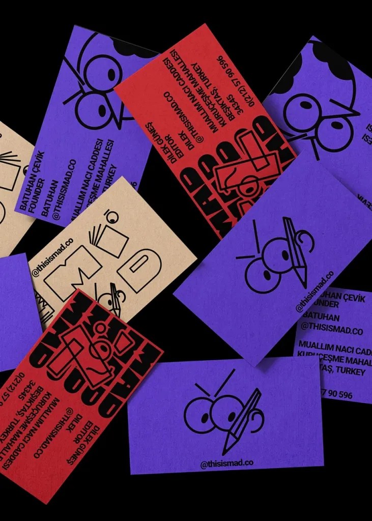
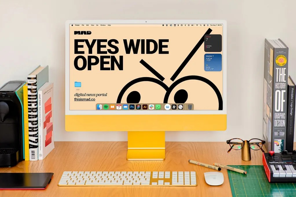
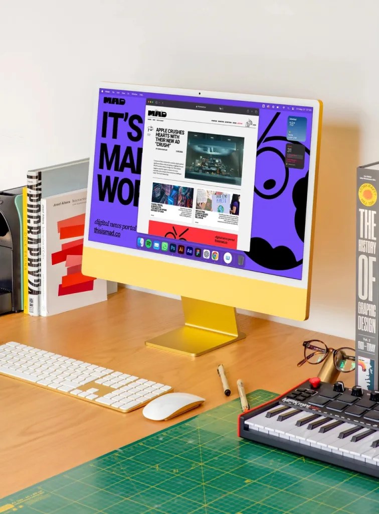
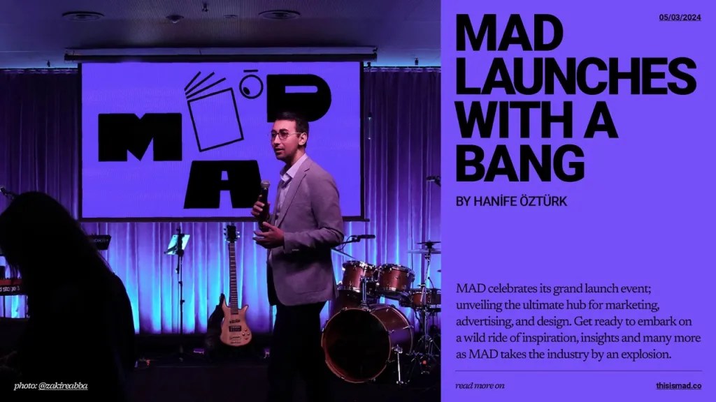
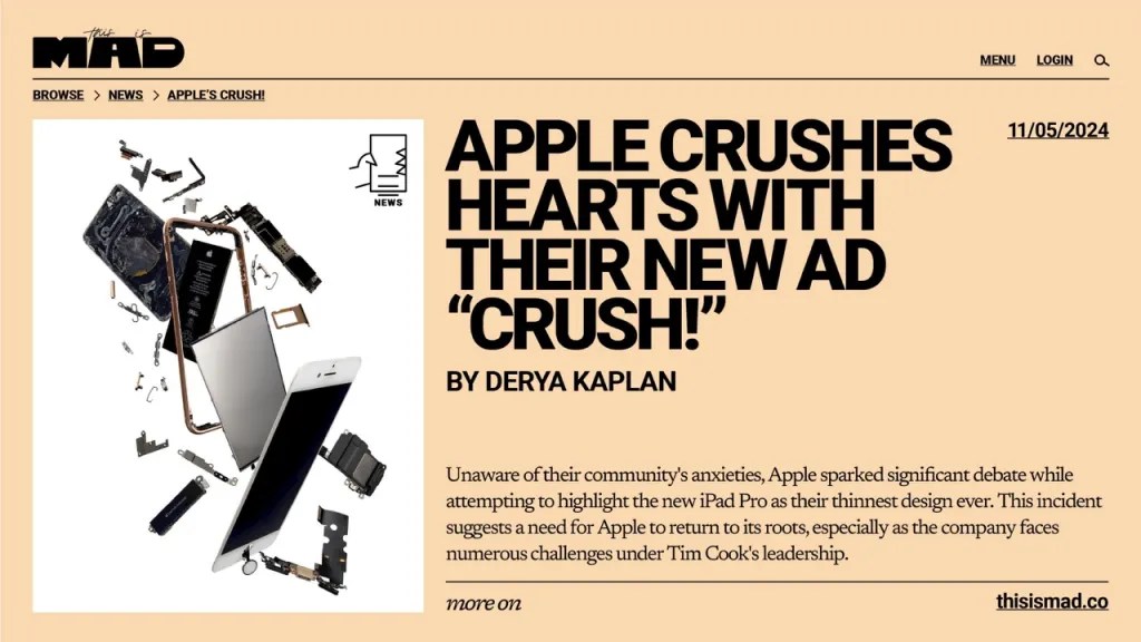
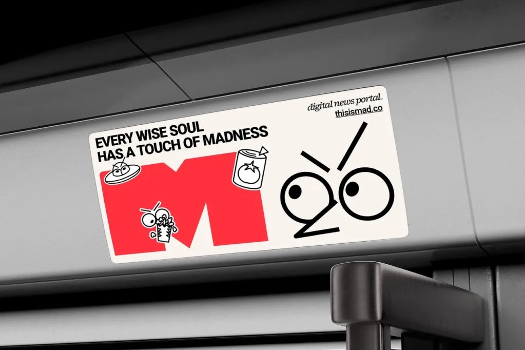
MAD, a new online creative news platform from Türkiye, needed an identity that could capture the energy and imagination of the industries it represents.

Not simply a news portal, MAD serves as a meeting point for creative minds to collide, where new ideas come to life and the boundaries between marketing, advertising, and design blur. The platform presented a unique challenge to the brand transformation agency Ba’ndo: express the “madness” of creativity in a structured and engaging way.

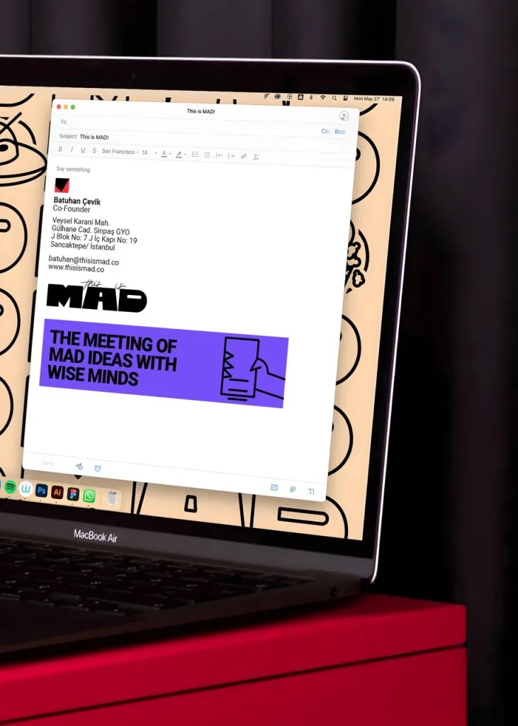
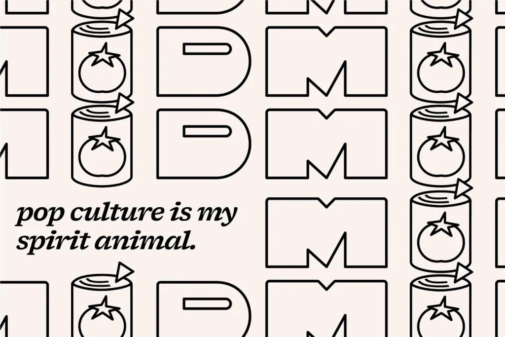
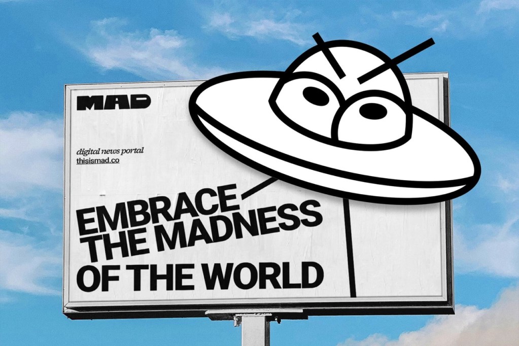
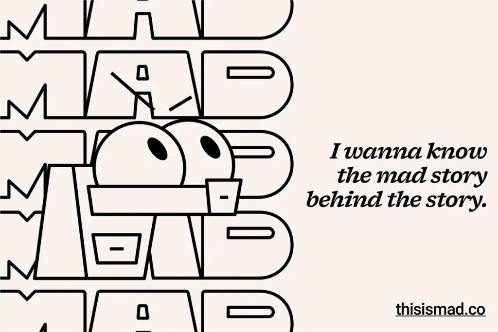
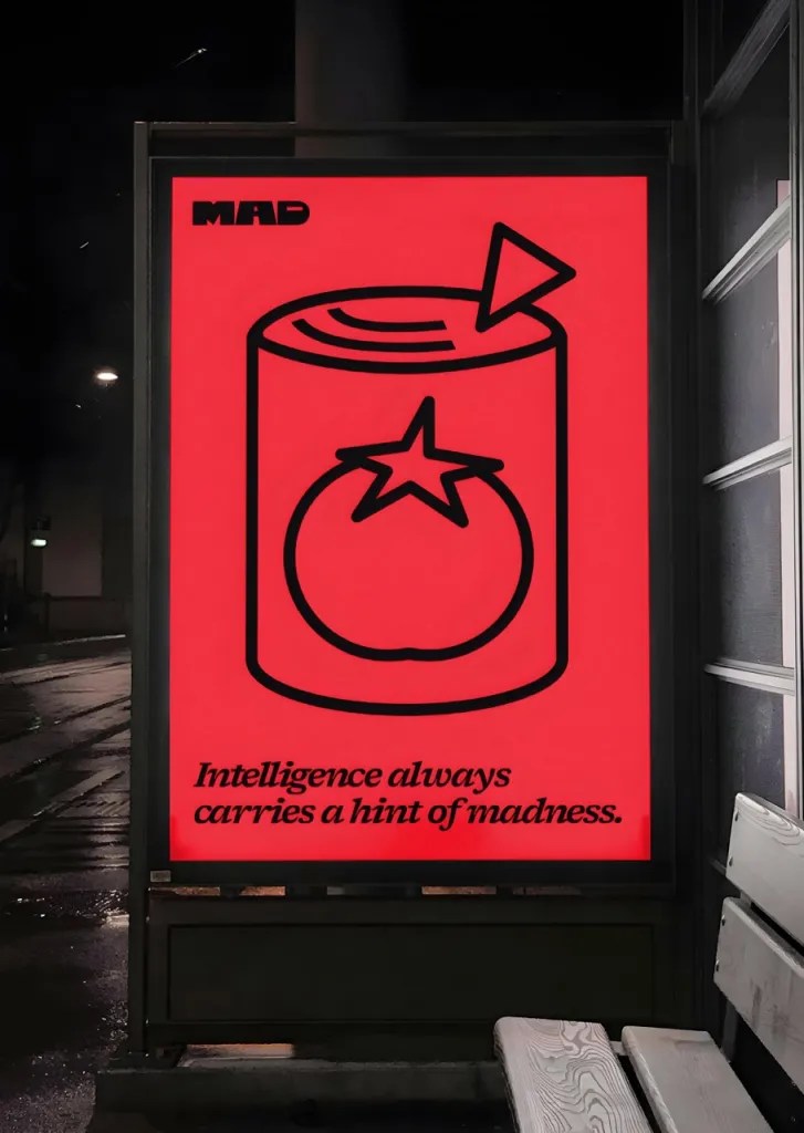
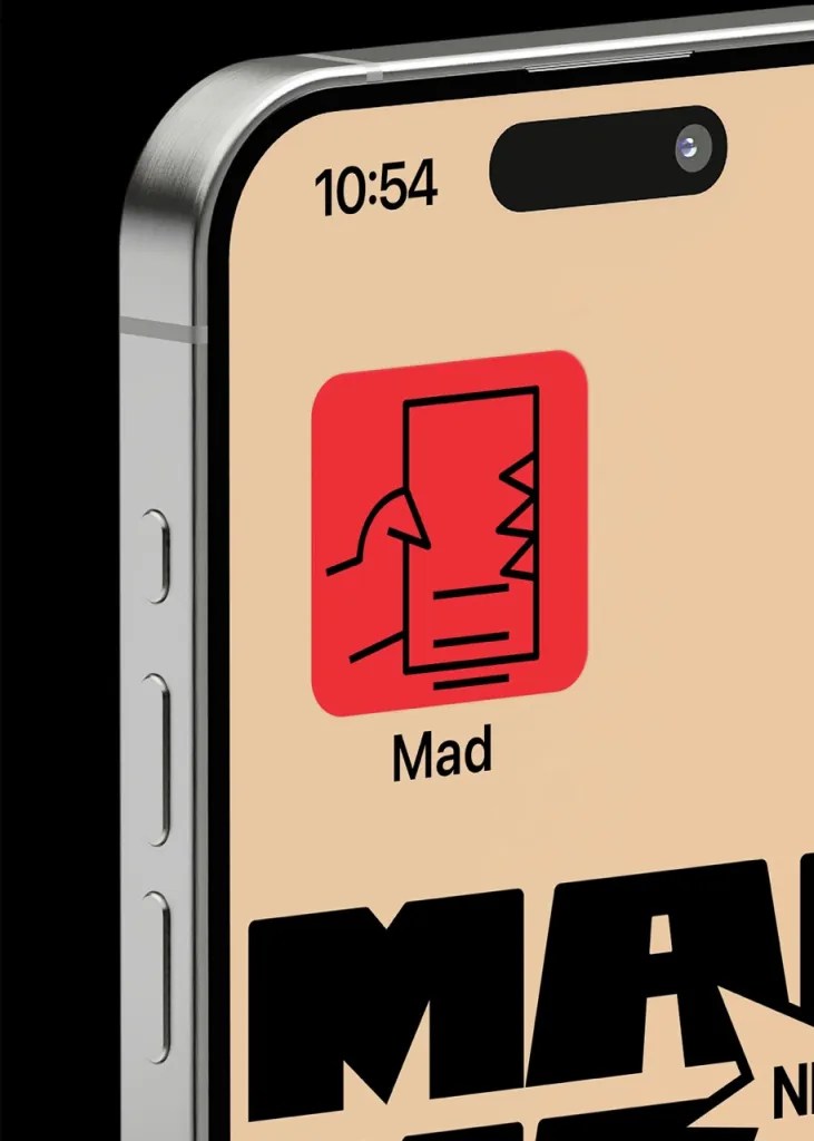
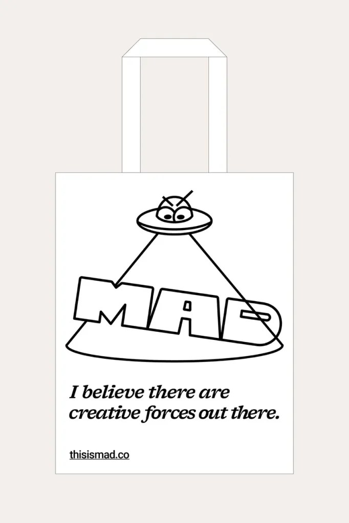
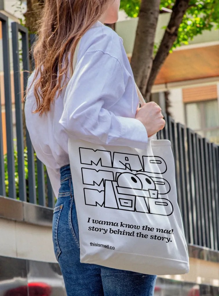
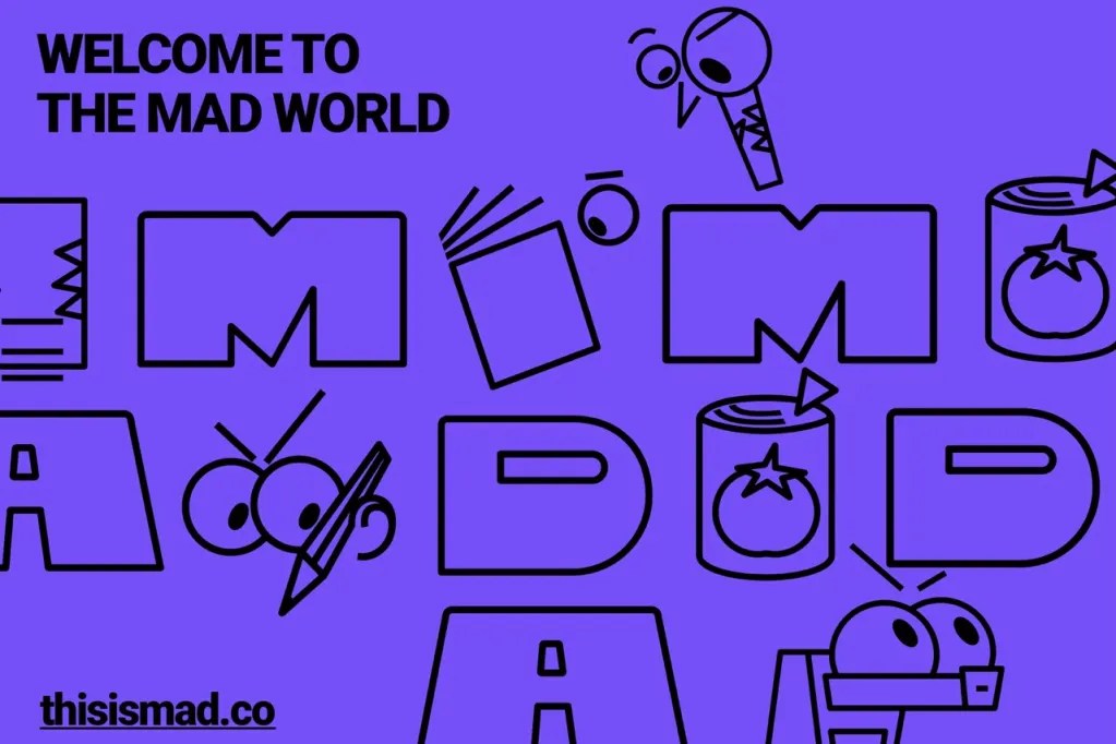
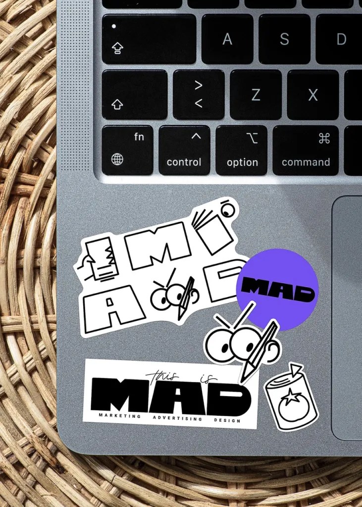
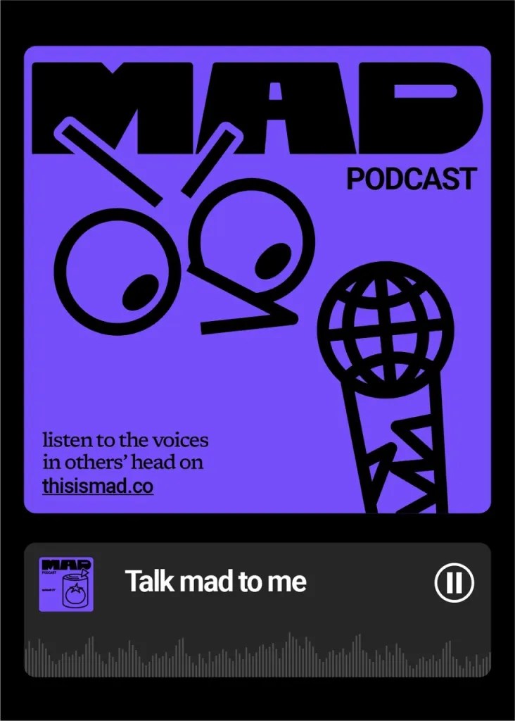
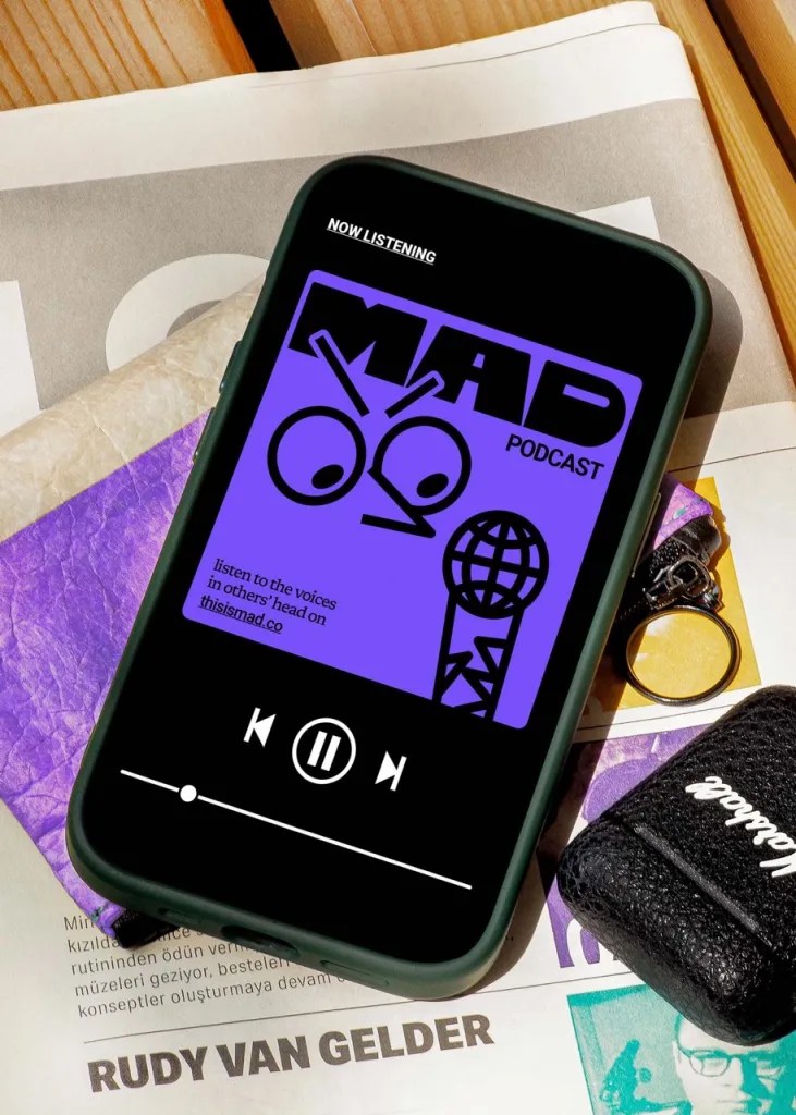
Ba’ndo tackled this project’s complexity by building a complete brand system, which included illustrations, animations, and mascots inspired by the letters in the logo. This system gave MAD a distinct voice that was energetic, curious, and full of life.
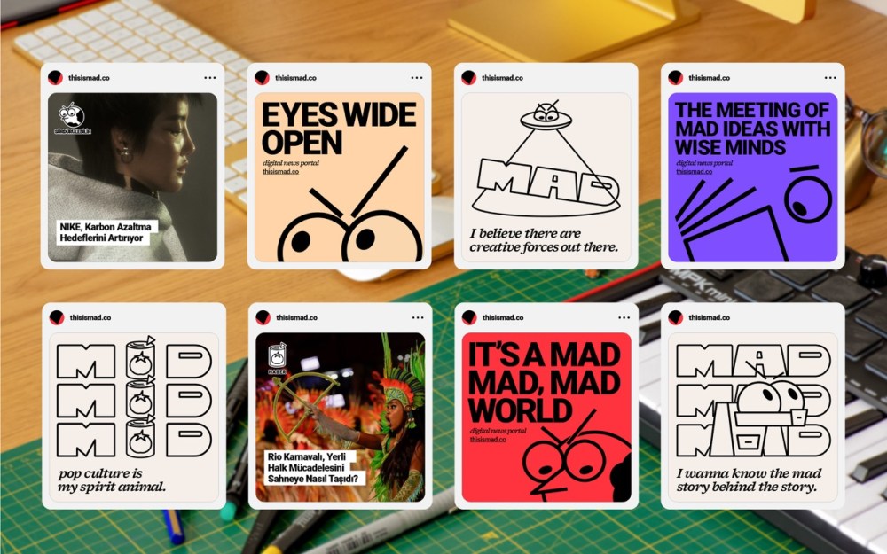
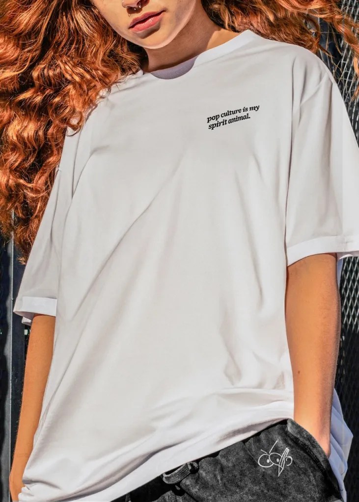
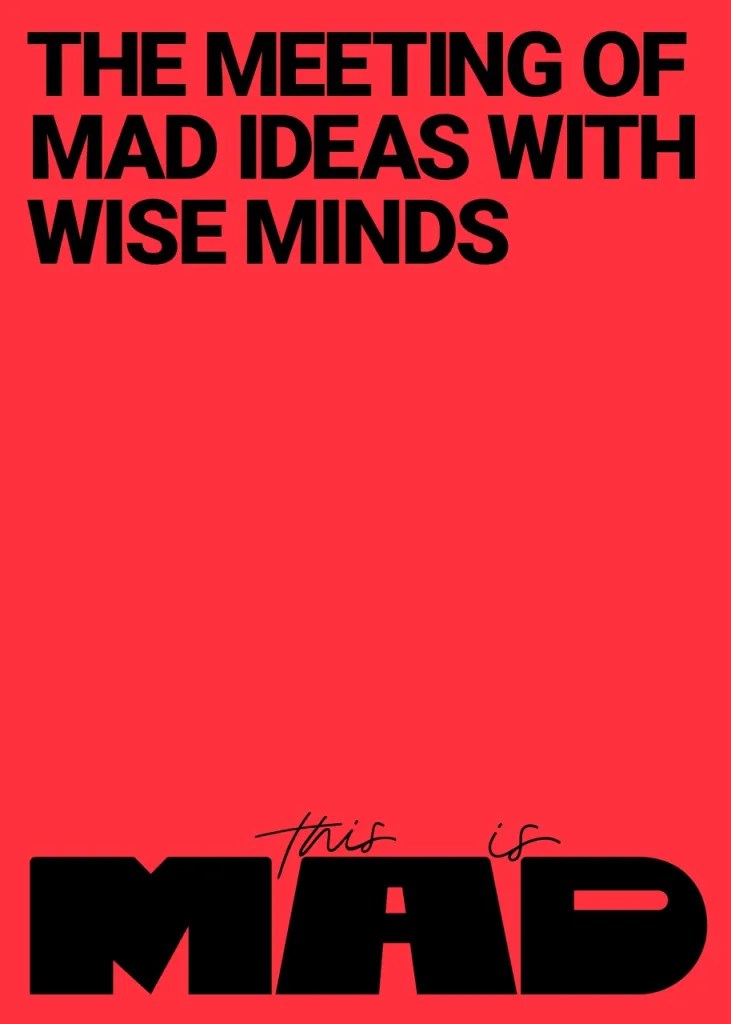
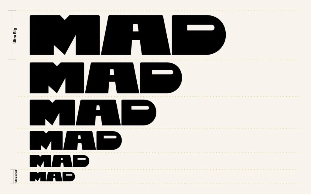
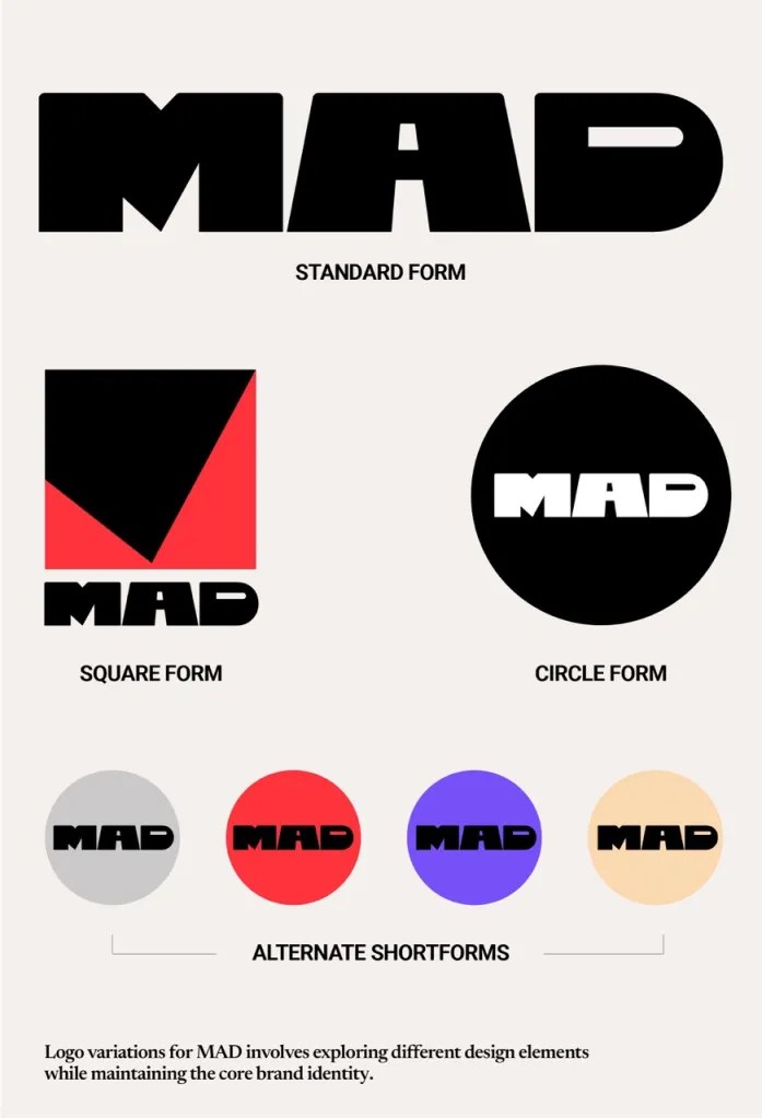
The logo itself is minimal yet striking, with retro influences. Its aesthetic draws on an 80s vibe, blended with pop art and modern elements, achieving a balance between nostalgia and forward-thinking design. The sharp lines and bold details convey MAD’s dynamic energy, while the flexibility of the logo offers limitless possibilities for future evolution.

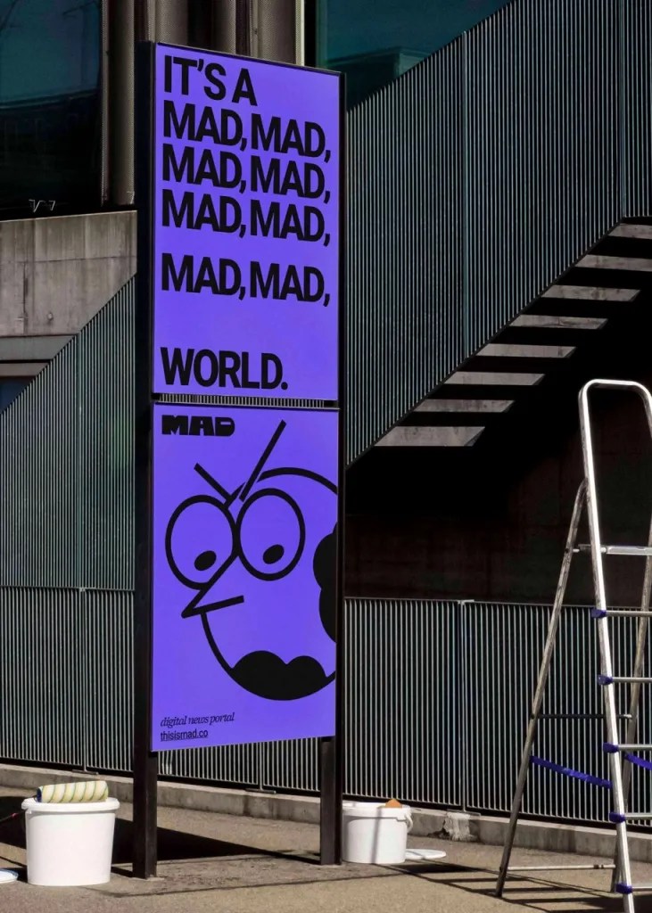
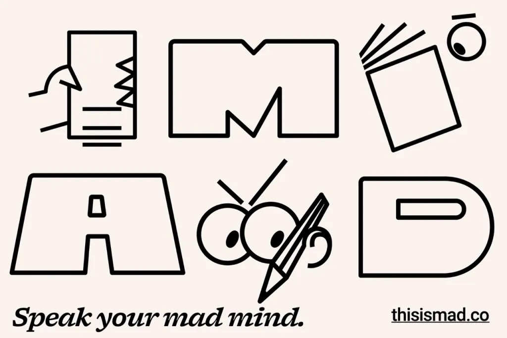
MAD’s logo is more than just a typographic solution—it is a character with a distinct personality. Each letter of the logo has multiple expressions—bold, curious, and slightly wild—to mirror the facets of the brand.
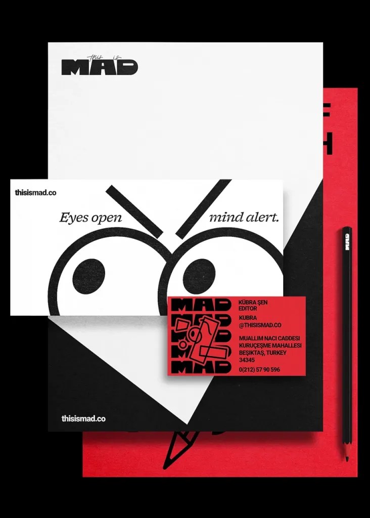
Inspired by the MAD logo, the mascots further expand the brand’s world. Each mascot is lively, energetic, and curious—perfectly capturing the spirit of MAD. Together, they enhance the brand system, adding an extra layer of engagement and playfulness.

One of our favorite project highlights is the Instagram story generator, designed to allow users to interact with MAD’s identity in a personal and playful way. This tool, which encourages users to make minor modifications to the logo’s letters, not only creates a personal connection with the brand but also adds an element of fun and entertainment, aligning perfectly with MAD’s mission to engage its audience creatively.

For Ba’ndo, working on MAD provided a chance to explore new frontiers in brand identity design. The outcome is more than just a logo or a set of visual guidelines; it’s a holistic system that embodies the spirit of creativity. MAD serves as a platform for sparking new ideas, inspiring bold moves, and connecting people across design, marketing, and advertising — and with it, a brand designed to continue to evolve and inspire the creative community, exploring brand identity design through dynamic, expansive, and fluid ecosystems.

The post Ba’ndo’s Identity for MAD Captures the Madness of Creativity appeared first on PRINT Magazine.

The Brooklyn Museum Unveils a Bold Rebrand for 200th Anniversary

The summer I moved to New York, the first stop on my culture to-do list was the Brooklyn Museum — it more than lived up to the hype. As the Brooklyn Museum celebrates its 200th anniversary, it has unveiled a refreshed brand identity as bold, vibrant, and multifaceted as the borough itself. The new logo, a sleek website, revamped signage, and a line of exclusive merch pay homage to the cultural gem’s rich history while charging into the future. But the refresh is more than a facelift, celebrating everything the Brooklyn Museum stands for: art, community, and a courageous and evolving conversation between the past and the present.

Anne Pasternak, the Shelby White and Leon Levy Director of the museum, sums it up perfectly: “We needed a new brand that meets the demands of the day, honors our rich history, and brings a whole lot of energy.” And energy is precisely what this rebrand delivers. The museum’s building—an architectural journey from neoclassical grandeur to modernist minimalism—served as inspiration. The new look blends approachable, modern sans-serif fonts with design elements that tie directly to the institution’s storied past.

Look closely at the new logo, and you’ll see dots framing the text—an ode to the ancient philosophers and playwrights whose names adorn the museum’s façade and a nod to its early days as a library. These dots pop up everywhere, from motion graphics to signage, adding a playful touch that keeps things fresh. The intertwined O’s in “Brooklyn” and the merged M’s and U’s in “Museum” symbolize connection, community, and how the museum brings together diverse voices, cultures, and ideas.

The color palette? Consider it Pantone Brooklyn. Grays echo the limestone walls of the building, balanced with bright, bold hues that shout out creativity. The effect is a reflection of the borough—gritty, colorful, and alive with possibility.

The brand reflects the Brooklyn Museum’s identity as a place where art meets education, community meets culture, and history meets what’s next.

The rebrand was brought to life behind the scenes by Brooklyn-based design studio Other Means in collaboration with the museum’s in-house team. After a year of research, collaboration, and conversations with audiences and staff, the result is a brand that reflects the Brooklyn Museum’s identity as a place where art meets education, community meets culture, and history meets what’s next.

So, the next time you’re in Brooklyn, don’t just stop by the museum—experience its brand-new chapter. Admire the kaleidoscopic colors, grab some fresh merch, or enjoy a weekend event. The Brooklyn Museum’s reimagined identity is as dynamic as the borough it calls home.

Photographs by Adrianna Glaviano.

The post The Brooklyn Museum Unveils a Bold Rebrand for 200th Anniversary appeared first on PRINT Magazine.

Someoddpilot’s Colorful, Gritty Tribute to Lollapalooza’s Alt-Culture Past

As Lollapalooza blew out the candles on its 20th birthday this year, the iconic Chicago music festival also unveiled an updated look that screams “next-gen cool.” The legendary fest started in 1991 as a scrappy counterculture roadshow and is now one of the world’s most sought-after multi-day music events. They joined forces with long-time design partner Someoddpilot to refresh and expand its identity for the new wave of festivalgoers (hello, Gen Z).

The brand update was a full-throttle extravaganza in true Lolla fashion, with the rollout beginning at Lollapalooza Chicago in 2023. If you were at Grant Park for this year’s mega show featuring Megan Thee Stallion, SZA, Hozier, and Chappell Roan, it was hard to miss the brand’s expanded digital and IRL footprint—vibrant pinks, electric blues, and dynamic graphics dancing on every surface. With over 10,000 branded touchpoints at the festival, Someoddpilot ensured Lolla’s identity was as omnipresent as the music blasting through the speakers.

Why the need for a brand refresh? Well, the festival’s audience has grown up and out—450,000 attendees last year alone—and with that, so have their expectations. Lollapalooza sought to meet this new crop of music lovers where they live: on TikTok, in the digital art world, and within the pulse of modern youth culture. So this year, C3 Presents and Live Nation, the festival’s parent brands, handed Someoddpilot the keys to drive Lolla’s brand into the future.

Someoddpilot certainly brought the goods. Born 25 years ago as an indie record label and known for another Windy City legend — the Pitchfork Music Festival — the Chicago-based agency was the perfect fit to bring Lolla’s brand identity into the now while staying true to its alt-culture origins. They dug deep into the 90s, when zines ruled, and the Xerox machine was the designer’s best friend and brought that gritty, DIY aesthetic into the 21st century.

Think cut-and-paste compositions, bold streaks from inkjet printers, grainy photos, and op-art graphics—all with a slick, vibrant twist. It’s a nod to the punk, metal, and electronic scenes that birthed Lollapalooza in the first place, but with a modern punch that resonates with today’s digital natives. It’s tangible nostalgia with a digital filter in the best possible way.

And it’s not just Chicago that’s getting the fresh look. Lollapalooza’s visual identity is going global, popping up at the festival’s offshoots in Chile, Argentina, Brazil, and even Mumbai. This year’s 20th birthday celebration also birthed a new festival logo—a cheeky nod to the past where “20” sits snugly in place of the original logo’s double O’s.

Someoddpilot and Lollapalooza smartly made the updated identity flexible—after all, a music festival is chaotic, colorful, and (let’s be honest) unpredictable. The new identity shines across social media, digital ads, out-of-home displays, and within the festival grounds.

As Lollapalooza strides into its third decade, it’s not just keeping pace with the times—it’s defining them. With Someoddpilot at the helm, the fest embraces its past and charges into the future, one Xeroxed graphic at a time. Here’s to 20 more years of music, madness, and killer design. Cheers, Lolla!

The post Someoddpilot’s Colorful, Gritty Tribute to Lollapalooza’s Alt-Culture Past appeared first on PRINT Magazine.

Sunrise Bakers’ Warm and Inviting New Brand by Bombay Design Centre

In the bustling heart of Dehradun, India, where the scent of freshly baked pista biscuits mingles with nostalgia, a beloved institution is getting a modern makeover. Sunrise Bakers, the 70-year-old gem that has been sweetening the lives of Doonites (locals from Dehradun) for generations, is stepping into the digital age with an e-commerce platform and a fresh look and feel, courtesy of the Bombay Design Centre.

Sunrise Bakers’ old logo

For decades, Sunrise Bakers has been more than just a bakery; it’s been a rite of passage for anyone visiting Dehradun. The bakery’s walls have witnessed the comings and goings of celebrities, politicians (an ex-prime minister among them), and everyday folks who can’t resist its iconic rusks and biscuits. But the digital age comes calling, even for beloved community institutions. The bakery tapped Bombay Design Centre to reimagine Sunrise Bakers for today’s tech-savvy, Instagram-loving generation.

What does it take to bring a 70-year-old brand into the 21st century? A lot of love, a deep respect for tradition, and a sprinkle of modern magic.

“We are immensely proud of our legacy and grateful for the unwavering support of our community,” says Rishika Jolly of Sunrise Bakers. “This overhaul is a testament to our commitment to preserving our heritage while embracing the future.” And that’s precisely what Bombay Design Centre set out to do—craft a dawn for Sunrise Bakers that’s as warm and inviting as fresh baked goods.

The brand strategy began with a deep dive into the bakery’s history, one that’s as golden as the crust of their beloved pista biscuits. Ankur Rander, CEO of Bombay Design Centre, describes the experience as thrilling and humbling. “Reimagining a legacy bakery for the new generation was quite exciting for us,” he says. “We aimed to ensure that every element of the new design honoured the bakery’s rich inheritance.”

The result is a brand identity that feels like a warm hug from your favorite aunt—familiar and comforting with a dash of contemporary flair. From the shelf-popping new packaging to an engaging new social media presence, Sunrise Bakers is ready to capture the hearts of a whole new generation. The new e-commerce platform allows the bakery to be just a click away, ensuring that no matter where you are, you can get a little taste of Dehradun delivered right to your door.

Sunrise Bakers has stayed true to its roots, proving you can teach an old bakery new tricks. With its established reputation and fresh design, Sunrise Bakers will remain a beloved destination for another 70 years—one that connects the past, present, and future with every crumbly buttery bite.

The post Sunrise Bakers’ Warm and Inviting New Brand by Bombay Design Centre appeared first on PRINT Magazine.